Occasionally I find myself wanting to draw several regression lines on the same plot, and of course ggplot2 has convenient facilities for this. As usual, don’t expect anything profound from this post, just a quick tip!
There are several reasons we might end up with a table of regression coefficients connecting two variables in different ways. For instance, see the previous post about ordinary and orthogonal regression lines, or as a commenter suggested: quantile regression. I’ve never used quantile regression myself, but another example might be plotting simulations from a regression or multiple regression lines for different combinations of predictors.
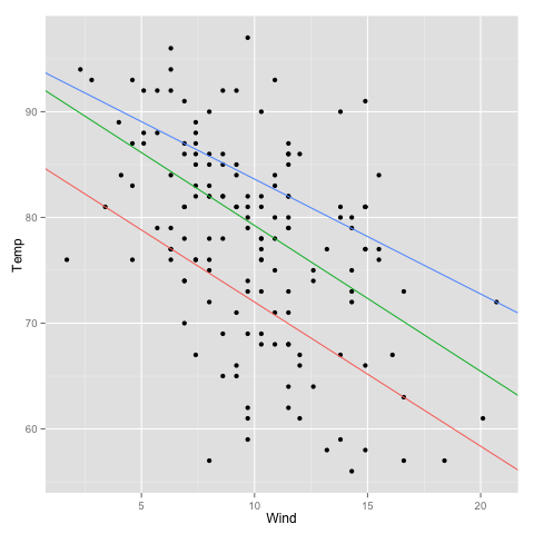
Let’s start with a couple of quantile regressions. Ordinary regression compares the mean difference in a response variable between different values of the predictors, while quantile regression models some chosen quantiles of the response variable. The rq function of Roger Koenker’s quantreg package does quantile regression. We extract the coefficient matrix and make a dataframe:
library(quantreg)
model.rq <- rq(Temp ~ Wind, airquality, tau=c(0.25, 0.5, 0.75))
quantile.regressions <- data.frame(t(coef(model.rq)))
colnames(quantile.regressions) <- c("intercept", "slope")
quantile.regressions$quantile <- rownames(quantile.regressions)
quantile.regressions
         intercept     slope  quantile
tau= 0.25 85.63636 -1.363636 tau= 0.25
tau= 0.50 93.03448 -1.379310 tau= 0.50
tau= 0.75 94.50000 -1.086957 tau= 0.75
The addition of the quantile column is optional if you don’t feel the need to colour the lines.
library(ggplot2)
scatterplot <- qplot(x=Wind, y=Temp, data=airquality)
scatterplot + geom_abline(aes(intercept=intercept, slope=slope,
  colour=quantile), data=quantile.regressions)
We use the fact that ggplot2 returns the plot as an object that we can play with and add the regression line layer, supplying not the raw data frame but the data frame of regression coefficients.

Hi! Thank you so much for this post. It really helped me how to apply what you have here to my own research. I have a follow up question: Is there a way to extend this graph to multiple quantile regression? In other words, how can one superimpose 3 quantile regression lines for just one predictor at a time, controlling for a second predictor, for example? I am very new to R and I have tried to superimpose the quantile regression lines on the partial regression plots but I haven’t had much success. Any insights would be greatly appreciated! Thank you again.
Hi! Thank you. Yes, displaying multiple regressions (quantile or otherwise) with different variables together could be nice. However, I don’t really know how to do it in a general way that is useful … One would have to fix the values of the other predictors (probably to multiple values). Sorry that I can’t be more helpful right now.