Showing a difference in mean between two groups, take 2

A couple of years ago, I wrote about the paradoxical difficulty of visualising a difference in means between two groups, while showing both the data and some uncertainty interval. I still feel like many ills in science come from our inability to interpret a simple comparison of means. Anything with more than two groups or a predictor that isn’t categorical makes things worse, of course. It doesn’t take much to overwhelm the intuition.

My suggestion at the time was something like this — either a panel that shows the data an another panel with coefficients and uncertainty intervals; or a plot that shows the with lines that represent the magnitude of the difference at the upper and lower limit of the uncertainty interval.

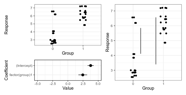
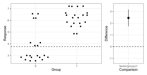
Alternative 1 (left), with separate panels for data and coefficient estimates, and alternative 2 (right), with confidence limits for the difference shown as vertical lines. For details, see the old post about these graphs.

Here is the fake data and linear model we will plot. If you want to follow along, the whole code is on GitHub. Group 0 should have a mean of 4, and the difference between groups should be two, and as the graphs above show, our linear model is not too far off from these numbers.

library(broom)

data <- data.frame(group = rep(0:1, 20))
data$response <- 4 + data$group * 2 + rnorm(20)

model <- lm(response ~ factor(group), data = data)
result <- tidy(model)

Since the last post, a colleague has told me about the Gardner-Altman plot. In a paper arguing that confidence intervals should be used to show the main result of studies, rather than p-values, Gardner & Altman (1986) introduced plots for simultaneously showing confidence intervals and data.

Their Figure 1 shows (hypothetical) systolic blood pressure data for a group of diabetic and non-diabetic people. The left panel is a dot plot for each group. The right panel is a one-dimensional plot (with a different scale than the right panel; zero is centred on the mean of one of the groups), showing the difference between the groups and a confidence interval as a point with error bars.

There are functions for making this kind of plot (and several more complex alternatives for paired comparisons and analyses of variance) in the R package dabestr from Ho et al. (2019). An example with our fake data looks like this:

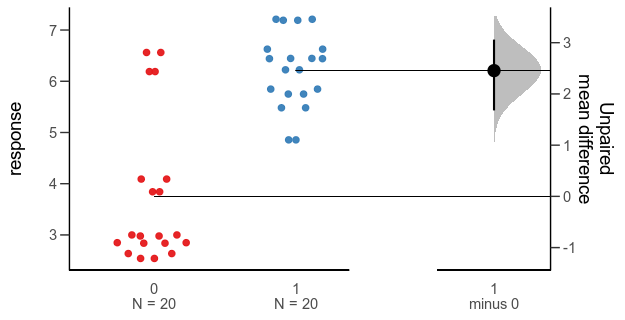
Alternative 3: Gardner-Altman plot with bootstrap confidence interval.

library(dabestr)

bootstrap <- dabest(data,
                    group,
                    response,
                    idx = c("0", "1"),
                    paired = FALSE)

bootstrap_diff <- mean_diff(bootstrap)

plot(bootstrap_diff)

While this plot is neat, I think it is a little too busy — I’m not sure that the double horizontal lines between the panels or the shaded density for the bootstrap confidence interval add much. I’d also like to use other inference methods than bootstrapping. I like how the scale of the right panel has the same unit as the left panel, but is offset so the zero is at the mean of one of the groups.

Here is my attempt at making a minimalistic version:

Alternative 4: Simplified Garner-Altman plot.

This piece of code first makes the left panel of data using ggbeeswarm (which I think looks nicer than the jittering I used in the first two alternatives), then the right panel with the estimate and approximate confidence intervals of plus/minus two standard errors of the mean), adjusts the scale, and combines the panels with patchwork.

library(ggbeeswarm)
library(ggplot2
library(patchwork)

ymin <- min(data$response)
ymax <- max(data$response)

plot_points_ga <- ggplot() +
  geom_quasirandom(aes(x = factor(group), y = response),
                   data = data) +
  xlab("Group") +
  ylab("Response") +
  theme_bw() +
  scale_y_continuous(limits = c(ymin, ymax))

height_of_plot <- ymax-ymin

group0_fraction <- (coef(model)[1] - ymin)/height_of_plot

diff_min <- - height_of_plot * group0_fraction

diff_max <- (1 - group0_fraction) * height_of_plot

plot_difference_ga <- ggplot() +
  geom_pointrange(aes(x = term, y = estimate,
                      ymin = estimate - 2 * std.error,
                      ymax = estimate + 2 * std.error),
                  data = result[2,]) +
  scale_y_continuous(limits = c(diff_min, diff_max)) +
  ylab("Difference") +
  xlab("Comparison") +
  theme_bw()

(plot_points_ga | plot_difference_ga) +
    plot_layout(widths = c(0.75, 0.25))

Literature

Gardner, M. J., & Altman, D. G. (1986). Confidence intervals rather than P values: estimation rather than hypothesis testing. British Medical Journal

Ho, J., Tumkaya, T., Aryal, S., Choi, H., & Claridge-Chang, A. (2019). Moving beyond P values: data analysis with estimation graphics. Nature methods.

Genes do not form networks

As a wide-eyed PhD student, I read a lot of papers about gene expression networks and was mightily impressed by their power. You can see where this is going, can’t you?

Someone on Twitter talked about their doubts about gene networks: how networks ”must” be how biology works, but that they weren’t sure that network methods actually had helped genetics that much, how there are compelling annotation term enrichments, and individual results that ”make sense”, but not many hard predictions. I promise I’m not trying to gossip about them behind their back, but I couldn’t find the tweets again. If you think about it, however, I don’t think genes must form networks at all, quite the opposite. But there are probably reasons why the network idea is so attractive.

(Edit: Here is the tweet I was talking about by Jeffrey Barrett! Thanks to Guillaume Devailly for pointing me to it.)

First, network representations are handy! There are all kinds of things about genes that can be represented as networks: coexpression, protein interactions, being mentioned in the same PubMed abstract, working on the same substrate, being annotated by the same GO term, being linked in a database such as STRING which tries to combine all kinds of protein–protein interactions understood broadly (Szklarczyk & al 2018), differential coexpression, co-differential expression (Hudson, Reverter & Dalrymple 2009), … There are all kinds of ways of building networks between genes: correlations, mutual information, Bayesian networks, structural equations models … Sometimes one of them will make an interesting biological phenomena stand out and become striking to the eye, or to one of the many ways to cluster nodes and calculate their centrality.

Second, networks are appealing. Birgitte Nerlich has this great blog post–On books, circuits and life–about metaphors for gene editing (the book of life, writing, erasing, cutting and editing) and systems biology (genetic engineering, circuits, wiring, the genetic program). Maybe the view of gene networks fits into the latter category, if we imagine that the extremely dated analogy with cybernetics (Peluffo 2015) has been replaced with the only slightly dated idea of a universal network science. After Internet and Albert, Jeong & Barabási (1999), what could be more apt than understanding genes as forming networks?

I think it’s fair to say that for genes to form networks, the system needs to be reasonably well described by a graph of nodes and edges. If you look at systems of genes that are really well understood, like the gap gene ”network”, you will see that they do not look like this at all. Look at Fig 3 in Jaeger (2011). Here, there is dynamic and spatial information not captured by the network topology that needs to be overlaid for the network view to make sense.

Or look at insulin signalling, in Fig 1 of Nyman et al (2014). Here, there are modified versions of proteins, non-gene products such as glucose and the plasma membrane, and again, dynamics, including both RNA and protein synthesis themselves. There is no justification for assuming that any of that will be captured by any topology or any weighting of genes with edges between them.

We are free to name biological processes networks if we want to; there’s nothing wrong with calling a certain process and group of related genes ”the gap gene network”. And we are free to use any network representation we want when it is useful or visually pleasing, if that’s what we’re going for. However, genes do not actually form networks.

Literature

Szklarczyk, D, et al. (2018) STRING v11: protein–protein association networks with increased coverage, supporting functional discovery in genome-wide experimental datasets. Nucleic acids research.

Hudson, N. J., Reverter, A., & Dalrymple, B. P. (2009). A differential wiring analysis of expression data correctly identifies the gene containing the causal mutation. PLoS computational biology, 5(5), e1000382.

Peluffo, A. E. (2015). The ”Genetic Program”: behind the genesis of an influential metaphor. Genetics, 200(3), 685-696.

Albert, R., Jeong, H., & Barabási, A. L. (1999). Diameter of the world-wide web. Nature, 401(6749), 130.

Jaeger, J. (2011). The gap gene network. Cellular and Molecular Life Sciences, 68(2), 243-274.

Nyman, E., Rajan, M. R., Fagerholm, S., Brännmark, C., Cedersund, G., & Strålfors, P. (2014). A single mechanism can explain network-wide insulin resistance in adipocytes from obese patients with type 2 diabetes. Journal of Biological Chemistry, 289(48), 33215-33230.