Using R: drawing several regression lines with ggplot2

Occasionally I find myself wanting to draw several regression lines on the same plot, and of course ggplot2 has convenient facilities for this. As usual, don’t expect anything profound from this post, just a quick tip!

There are several reasons we might end up with a table of  regression coefficients connecting two variables in different ways. For instance, see the previous post about ordinary and orthogonal regression lines, or as a commenter suggested: quantile regression. I’ve never used quantile regression myself, but another example might be plotting simulations from a regression or multiple regression lines for different combinations of predictors.

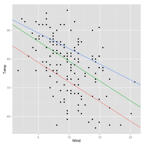
Let’s start with a couple of quantile regressions. Ordinary regression compares the mean difference in a response variable between different values of the predictors, while quantile regression models some chosen quantiles of the response variable. The rq function of Roger Koenker’s quantreg package does quantile regression. We extract the coefficient matrix and make a dataframe:

library(quantreg)
model.rq <- rq(Temp ~ Wind, airquality, tau=c(0.25, 0.5, 0.75))
quantile.regressions <- data.frame(t(coef(model.rq)))
colnames(quantile.regressions) <- c("intercept", "slope")
quantile.regressions$quantile <- rownames(quantile.regressions)
quantile.regressions
         intercept     slope  quantile
tau= 0.25 85.63636 -1.363636 tau= 0.25
tau= 0.50 93.03448 -1.379310 tau= 0.50
tau= 0.75 94.50000 -1.086957 tau= 0.75

The addition of the quantile column is optional if you don’t feel the need to colour the lines.

library(ggplot2)
scatterplot <- qplot(x=Wind, y=Temp, data=airquality)
scatterplot + geom_abline(aes(intercept=intercept, slope=slope,
  colour=quantile), data=quantile.regressions)

We use the fact that ggplot2 returns the plot as an object that we can play with and add the regression line layer, supplying not the raw data frame but the data frame of regression coefficients.

quantile_scatter

”How to draw the line” with ggplot2

In a recent tutorial in the eLife journal, Huang, Rattner, Liu & Nathans suggested that researchers who draw scatterplots should start providing not one but three regression lines. I quote,

Plotting both regression lines gives a fuller picture of the data, and comparing their slopes provides a simple graphical assessment of the correlation coefficient. Plotting the orthogonal regression line (red) provides additional information because it makes no assumptions about the dependence or independence of the variables; as such, it appears to more accurately describe the trend in the data compared to either of the ordinary least squares regression lines.

eLife_regressions

Not that new, but I do love a good scatterplot, so I decided to try drawing some lines. I use the temperature and wind variables in the air quality data set (NA values removed). We will  need Hadley Wickham’s ggplot2 and Bendix Carstensen’s, Lyle Gurrin’s and Claus Ekstrom’s MethComp.

library(ggplot2)
library(MethComp)

data(airquality)
data <- na.exclude(airquality)

Let’s first make the regular old scatterplot with a regression (temperature as response; wind as predictor):

plot.y <- qplot(y=Temp, x=Wind, data=data)
model.y <- lm(Temp ~ Wind, data)
coef.y <- coef(model.y)
plot.y + geom_abline(intercept=coef.y[1],
  slope=coef.y[2])

drawing_the_line_y

And then, a regular old scatterplot of the other regression:

plot.x <- qplot(y=Wind, x=Temp, data=data)
model.x <- lm(Wind ~ Temp, data)
coef(model.x)
plot.x + geom_abline(intercept=coef(model.x)[1],
  slope=coef(model.x)[2])

drawing_the_line_x

So far, everything is normal. To put both lines in the same plot, we’ll need to rearrange the coefficients a little. From the above regression we get the equation x = a + by, and we rearrange it to y = – a / b + (1 / b) x.

rearrange.coef <- function(coef) {
  alpha <- coef[1]
  beta <- coef[2]
  new.coef <- c(-alpha/beta, 1/beta)
  names(new.coef) <- c("intercept", "slope")
  return(new.coef)
}
coef.x <- rearrange.coef(coef(model.x))

The third regression line is different: orthogonal, total least squares or Deming regression. There is a function for that in the MethComp package.

deming <- Deming(y=airquality$Temp, x=airquality$Wind)
deming

We can even use the rearrange.coef function above to see that the coefficients of Deming regression does not depend on which variable is taken as the response or predictor:

rearrange.coef(deming)
 intercept      slope 
24.8083259 -0.1906826
Deming(y=airquality$Wind, x=airquality$Temp)[1:2]
 Intercept      Slope 
24.8083259 -0.1906826

So, here is the final plot with all three lines:

plot.y + geom_abline(intercept=coef.y[1],
  slope=coef.y[2], colour="red") +
  geom_abline(intercept=coef.x[1],
  slope=coef.x[2], colour="blue") +
  geom_abline(intercept=deming[1],
  slope=deming[2], colour="purple")

drawing_the_line_3

Now for the dénouement of this post. Of course, there’s already an R function for doing this. It’s even in the same package as I used for the Deming regression; I just didn’t immediately rtfm. It uses base R graphics, though, and I tend to prefer ggplot2:

plot(x=data$Wind, y=data$Temp)
bothlines(x=data$Wind, y=data$Temp, Dem=T, col=c("red", "blue", "purple"))

This is the resulting plot (and one can even check out the source code of bothlines and see that I did my algebra correctly).

drawing_the_line_bothlines

In this case, as well as in a few others that I tried, it seems like one of the ordinary regression lines (in this case the one with wind as response and temperature as predictor) is much closer to the Deming regression line than the other. I wonder under what circumstances that is the case, and if it tells anything useful about the variables. I welcome any thoughts on this matter from you, dear reader.

Literature

Huang L, Rattner A, Liu H, Nathans J. (2013) Tutorial: How to draw the line in biomedical research. eLife e00638 doi:10.7554/eLife.00638