Simulating shared segments between relatives

A few months ago I saw this nice figure from Amy Williams of the number of DNA segments that are expected to be shared between relatives. I thought it would be fun to simulate segment sharing with AlphaSimR.

Because DNA comes in chromosomes that don’t break up and recombine that much, the shared DNA between relatives tends to come in long chunks — segments that are identical by descent. The distribution of segment lengths can sometimes be used to tell apart relationships that would otherwise give the same average (e.g., Yengo et al. 2019, Qiao et al. 2021).

But let’s not do anything sophisticated. Instead, we take three very simple pedigrees — anyone who’s taken introductory genetics will recognize these ones — and look at relationships between full-sibs, half-sibs and cousins. We’ll also look at the inbred offspring of matings between full-sibs, half-sibs and cousins to see that the proportion that they share between their two copies of the genome lines up with the expected inbreeding.

There won’t be any direct comparison to the values that Williams’ simulation, because it simulated more distant relationships than this, starting with cousins and then moving further away. This is probably more interesting, especially for human genealogical genetics.

The code is on GitHub if you wants to follow along.

The pedigrees

Here are the three pedigrees, drawn with the kinship2 package:

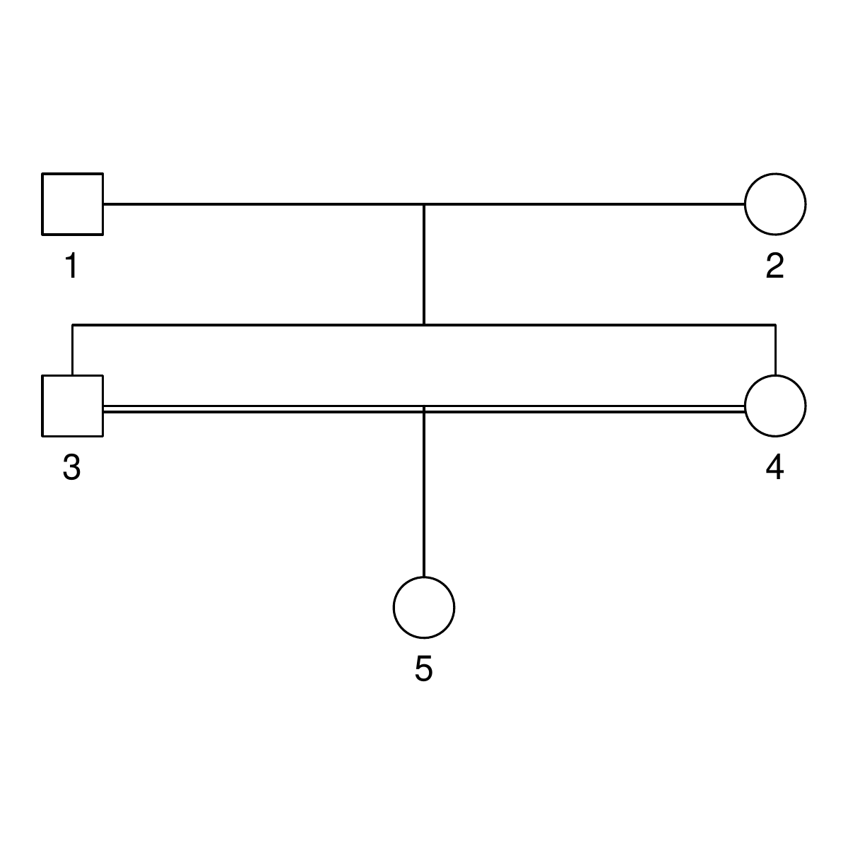
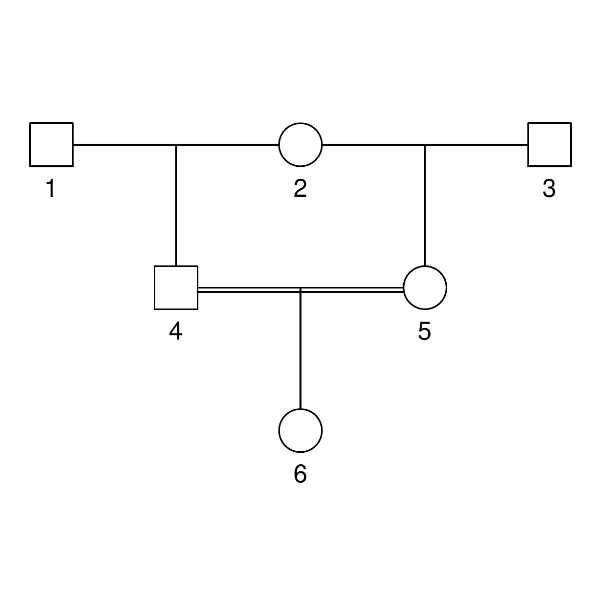
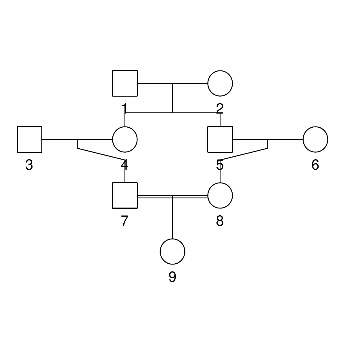
A pedigree, here, is really a table of individuals, where each column tells us their identifier, their parents, and optionally their sex, like this:

id, mother, father, sex
1, NA, NA, M
2, NA, NA, F
3, NA, NA, M
4, 2, 1, F
5, 2, 1, M
6, NA, NA, F
7, 4, 3, M
8, 6, 5, F
9, 8, 7, F

We can use GeneticsPed to check the relatedness and inbreeding if we don’t trust that I’ve entered the pedigrees right.

library(GeneticsPed)
library(purrr)
library(readr)

ped_fullsib <- read_csv("pedigrees/inbreeding_fullsib.txt")
ped_halfsib <- read_csv("pedigrees/inbreeding_halfsib.txt")
ped_cousin <- read_csv("pedigrees/inbreeding_cousin.txt")

inbreeding_ped <- function(ped) {

    inbreeding(Pedigree(ped))

}

print(map(list(ped_fullsib, ped_halfsib, ped_cousin), inbreeding_ped))
[[1]]
   1    2    3    4    5 
0.00 0.00 0.00 0.00 0.25 

[[2]]
    1     2     3     4     5     6 
0.000 0.000 0.000 0.000 0.000 0.125 

[[3]]
     1      2      3      4      5      6      7      8      9 
0.0000 0.0000 0.0000 0.0000 0.0000 0.0000 0.0000 0.0000 0.0625

Comparing haplotypes

We need some functions to compare haplotypes and individuals:

library(AlphaSimR)
library(dplyr)
library(purrr)
library(tibble)

## Find shared segments between two haplotypes expressed as vectors
## map is a vector of marker positions

compare_haplotypes <- function(h1, h2, map) {
    sharing <- h1 == h2

    runs <- rle(sharing)
    end <- cumsum(runs$lengths)
    start <- c(1, end[-length(end)] + 1)

    segments <- tibble(start = start,
                       end = end,
                       start_pos = map[start],
                       end_pos = map[end],
                       segment_length = end_pos - start_pos,
                       value = runs$values)

    segments[segments$value,]
}

We will have haplotypes of the variants that go together on a chromosome, and we want to find segments that are shared between them. We do this with a logical vector that tests each variant for equality, and then use the rle to turn this into run-length encoding. We extract the start and end position of the runs and then keep only the runs of equality.

Building on that function, we want to find the shared segments on a chromosome between two individuals. That is, we make all the pairwise comparisons between the haplotypes they carry and combine them.

## Find shared segments between two individuals (expressed as
## matrices of haplotypes) for one chromosome

compare_individuals_chr <- function(ind1, ind2, map) {

    h1_1 <- as.vector(ind1[1,])
    h1_2 <- as.vector(ind1[2,])

    h2_1 <- as.vector(ind2[1,])
    h2_2 <- as.vector(ind2[2,])

    sharing1 <- compare_haplotypes(h1_1, h2_1, map)
    sharing2 <- compare_haplotypes(h1_1, h2_2, map)
    sharing3 <- compare_haplotypes(h1_2, h2_1, map)
    sharing4 <- compare_haplotypes(h1_2, h2_2, map)

    bind_rows(sharing1, sharing2, sharing3, sharing4)
}

Finally, we use that function to compare individuals along all the chromosomes.

This function takes in a population and simulation parameter object from AlphaSimR, and two target individuals to be compared.

We use AlphaSimR‘s pullIbdHaplo function to extract tracked founder haplotypes (see below) and then loop over chromosomes to apply the above comparison functions.

## Find shared segments between two target individuals in a
## population

compare_individuals <- function(pop,
                                target_individuals,
                                simparam) {

    n_chr <- simparam$nChr

    ind1_ix <- paste(target_individuals[1], c("_1", "_2"), sep = "")
    ind2_ix <- paste(target_individuals[2], c("_1", "_2"), sep = "")

    ibd <- pullIbdHaplo(pop,
                        simParam = simparam)

    map <- simparam$genMap
    loci_per_chr <- map_dbl(map, length)

    chr_ends <- cumsum(loci_per_chr)
    chr_starts <- c(1, chr_ends[-n_chr] + 1)

    results <- vector(mode = "list",
                      length = n_chr)

    for (chr_ix in 1:n_chr) {

        ind1 <- ibd[ind1_ix, chr_starts[chr_ix]:chr_ends[chr_ix]]
        ind2 <- ibd[ind2_ix, chr_starts[chr_ix]:chr_ends[chr_ix]]

        results[[chr_ix]] <- compare_individuals_chr(ind1, ind2, map[[chr_ix]])
        results[[chr_ix]]$chr <- chr_ix
    }

    bind_rows(results)
}

(You might think it would be more elegant, when looping over chromosomes, to pull out the identity-by-descent data for each chromosome at a time. This won’t work on version 1.0.4 though, because of a problem with pullIbdHaplo which has been fixed in the development version.)

We use an analogous function to compare the haplotypes carried by one individual. See the details on GitHub if you’re interested.

Building the simulation

We are ready to run our simulation: This code creates a few founder individuals that will initiate the pedigree, and sets up a basic simulation. The key simulation parameter is to set setTrackRec(TRUE) to turn on tracking of recombinations and founder haplotypes.

source("R/simulation_functions.R")

## Set up simulation

founders <- runMacs(nInd = 10,
                    nChr = 25)

simparam <- SimParam$new(founders)

simparam$setTrackRec(TRUE)

founderpop <- newPop(founders,
                     simParam = simparam)

To simulate a pedigree, we use pedigreeCross, a built-in function to simulate a given pedigree, and then apply our comparison functions to the resulting simulated population.

## Run the simulation for a pedigree one replicate

simulate_pedigree <- function(ped,
                              target_individuals,
                              focal_individual,
                              founderpop,
                              simparam) {
    pop <- pedigreeCross(founderPop = founderpop,
                         id = ped$id,
                         mother = ped$mother,
                         father = ped$father,
                         simParam = simparam)
    shared_parents <- compare_individuals(pop,
                                          target_individuals,
                                          simparam)
    shared_inbred <- compare_self(pop,
                                  focal_individual,
                                  simparam)
    list(population = pop,
         shared_segments_parents = shared_parents,
         shared_segments_self_inbred = shared_inbred)
}

Results

First we can check how large proportion of the genome of our inbred individuals is shared between their two haplotypes, averaged over 100 replicates. That is, how much of the genome is homozygous identical by descent — what is their genomic inbreeding? It lines up with the expectation form pedigree: 0.25 for the half-sib pedigree, close to 0.125 for the full-sib pedigree and close to 0.0625 for the cousin pedigree. The proportion shared by the parents is, as it should, about double that.

      case inbred_self_sharing parent_sharing
  full-sib        0.25 (0.052)    0.5 (0.041)
  half-sib        0.13 (0.038)   0.25 (0.029)
    cousin       0.064 (0.027)   0.13 (0.022)

Table of the mean proportion of genome shared between the two genome copies in inbred individuals and between their parents. Standard deviations in parentheses.

This is a nice consistency check, but not really what we wanted. The point of explicitly simulating chromosomes and recombinations is to look at segments, not just total sharing.

With a little counting and summarisation, we can plot the distributions of segment lengths. The horizontal axis is the length of the segments expressed in centimorgan. The vertical axis is the number of shared
segments of this length or longer. Each line is a replicate.

If we look at the summaries (table below), full-sibs share on average 74 segments greater than 1 cM in length, half-sibs 37, and cousins 29.

In real data, short segments might be harder to detect, but because we’re using simulated fake data, we don’t have to worry about phasing errors or false positive sharing.

If we look only at long segments (> 20 cM), full-sibs share on average 46 segments, half-sibs 23, and cousins 13. (Also, similar to Williams’ simulations, none of the cousins simulated here had less than five long segments shared.)

  case     `1 cM`   `10 cM`  `20 cM`  `30 cM`  `40 cM`  
  full-sib 74 (5.2) 60 (4.2) 46 (3.6) 34 (4)   24 (3.8) 
  half-sib 37 (3.4) 30 (3.1) 23 (3.3) 17 (2.8) 13 (2.6) 
  cousin   29 (3.8) 20 (3.3) 13 (3.2) 7.6 (2)  4.3 (1.8)

Table of the mean number of shared segments of different minimum length. Standard deviations in parentheses.

We an also look at the average length of the segments shared, and note that while full-sibs and half-sibs differ in the number of segments, and total segment length shared (above), the length of individual segments is about the same:

  case     mean_length_sd
  full-sib 0.33 (0.032)  
  half-sib 0.34 (0.042)  
  cousin   0.21 (0.03)

Table of the mean length shared segments. Standard deviations in parentheses.

Limitations

Williams’ simulation, using the ped-sim tool, had a more detailed model of recombination in the human genome, with different interference parameters for each chromosome, sex-specific recombination and so on. In that way, it is much more realistic.
We’re not modelling any one genome in particular, but a very generic genome. Each chromosome is 100 cM long for example; one can imagine that a genome with many short chromosomes would give a different distribution. This can be changed, though; the chromosome size is the easiest, if we just pick a species.

Literature

Yengo, L., Wray, N. R., & Visscher, P. M. (2019). Extreme inbreeding in a European ancestry sample from the contemporary UK population. Nature communications, 10(1), 1-11.

Qiao, Y., Sannerud, J. G., Basu-Roy, S., Hayward, C., & Williams, A. L. (2021). Distinguishing pedigree relationships via multi-way identity by descent sharing and sex-specific genetic maps. The American Journal of Human Genetics, 108(1), 68-83.

Estimating recent population history from linkage disequilibrium with GONE and SNeP

In this post, we will look at running two programs that infer population history — understood as changes in linkage disequilibrium over time — from genotype data. The post will chronicle running them on some simulated data; it will be light on theory, and light on methods evaluation.

Linkage disequilibrium, i.e. correlation between alleles at different genetic variants, breaks down over time when alleles are shuffled by recombination. The efficiency of that process depends on the distance between the variants (because variants close to each other on the same chromosome will recombine less often) and the population size (because more individuals means more recombinations). Those relationships mean that the strength of linkage disequilibrium at a particular distance between variants is related to the population size at a particular time. (Roughly, and assuming a lot.) There are several methods that make use of the relationship between effective population size, recombination rate and linkage disequilibrium to estimate population history.

The programs

The two programs we’ll look at are SNeP and GONE. They both first calculate different statistics of pairwise linkage disequilibrium between markers. SNeP groups pairs of markers into groups based on the distance between them, and estimates the effective population size for each group and how many generations ago each group represents. GONE goes further: it uses a formula for the expected linkage disequilibrium from a sequence of effective population sizes and a genetic algorithm to find such a sequence that fits the observed linkage disequilibrium at different distances.

Paper about GONE: Santiago, E., Novo, I., Pardiñas, A. F., Saura, M., Wang, J., & Caballero, A. (2020). Recent demographic history inferred by high-resolution analysis of linkage disequilibrium. Molecular Biology and Evolution, 37(12), 3642-3653.

Paper about SNeP: Barbato, M., Orozco-terWengel, P., Tapio, M., & Bruford, M. W. (2015). SNeP: a tool to estimate trends in recent effective population size trajectories using genome-wide SNP data. Frontiers in genetics, 6, 109.

These methods are suited for estimating recent population history in single closed populations. There are other methods, e.g. the Pairwise Markovian coealescent and methods based on Approximate Bayesian Computation, that try to reach further back in time or deal with connected populations.

(Humorously, barring one capitalisation difference, GONE shares it’s name with an unrelated program related to effective population sizes, GONe … There are not enough linkage disequilibrium puns to go around, I guess.)

Some fake data

First, let us generate some fake data to run the programs on. We will use the Markovian coalescent simulator MaCS inside AlphaSimR. That is, we won’t really make use of any feature of AlphaSimR except that it’s a convenient way to run MaCS.

There is a GitHub repo if you want to follow along.

We simulate a constant population, a population that decreased in size relatively recently, a population that increased in size recently, and a population that decreased in longer ago. The latter should be outside of what these methods can comfortably estimate. Finally, let’s also include a population that has migration from an other (unseen) population. Again, that should be a case these methods struggle with.

Simulated true population histories. Note that the horizontal axis is generations ago, meaning that if you read left to right, it runs backwards in time. This is typical when showing population histories like this, but can be confusing. Also not the different scales on the horizontal axis.

library(AlphaSimR)
library(purrr)
library(tibble)

## Population histories

recent_decrease <- tibble(generations = c(1, 50, 100, 150),
                          Ne = c(1000, 1500, 2000, 3000))

recent_increase <- tibble(generations = c(1, 50, 100, 150),
                          Ne = c(3000, 2000, 1500, 1000))

ancient_decrease <- tibble(generations = recent_decrease$generations + 500,
                           Ne = recent_decrease$Ne)

We can feed these population histories (almost) directly into AlphaSimR’s runMacs2 function. The migration case is a little bit more work because we will to modify the command, but AlphaSimR still helps us. MaCS takes a command line written using the same arguments as the paradigmatic ms program. The runMacs2 function we used above generates the MaCS command line for us; we can ask it to just return the command for us to modify. The split argument tells us that we want two populations that split 100 generations ago.

runMacs2(nInd = 100,
         Ne = recent_decrease$Ne[1],
         histGen = recent_decrease$generations[-1],
         histNe = recent_decrease$Ne[-1],
         split = 100,
         returnCommand = TRUE)

The resulting command looks like this:

"1e+08 -t 1e-04 -r 4e-05 -I 2 100 100  -eN 0.0125 1.5 -eN 0.025 2 -eN 0.0375 3 -ej 0.025001 2 1"

The first part is the number of basepairs on the chromosome, -t flag is for the population mutation rate \theta = 4 N_e \mu, -r for the recombination rate (also multiplied by four times the effective population size). The -eN arguments change the population size, and the -ej argument is for splitting and joining populations.

We can check that these numbers make sense: The population mutation rate of 10-4 is the typical per nucleotide mutation rate of 2.5 × 10⁻⁸ multiplied by four times the final population size of 1000. The scaled recombination rate of 4 × 10⁻⁵ is typical per nucleotide recombination rate of 10-8 multiplied by the same.

The population size changes (-eN arguments) are of the format scaled time followed by a scaling of the final population size. Times are scaled by four times the final population size, again. This means that 0.0125 followed by 1.5 refers to that 4 × 0.0125 × 1000 = 50 generations ago population size was 1.5 times the final population size, namely 1500. And so on.

-I (I assume for ”island” as in the ”island model”) sets up the two populations, each with 100 individuals and a migration rate between them. We modify this by setting it to 200 for the first population (because we want diploid individuals, so we need double the number of chromosomes) and 0 for the other; that is, this ghost population will not be observed, only used to influence the first one by migration. Then we set the third parameter, that AlphaSimR has not used: the migration rate. Again, this is expressed as four times the final population size, so for a migration rate of 0.05 we put 200.

Now we can run all cases to generate samples of 100 individuals.

migration_command <- "1e+08 -t 1e-04 -r 4e-05 -I 2 200 0 200  -eN 0.0125 1.5 -eN 0.025 2 -eN 0.0375 3 -ej 0.025001 2 1"

pops <- list(pop_constant = runMacs2(nInd = 100,
                                     nChr = 5,
                                     histNe = NULL,
                                     histGen = NULL,
                                     Ne = 1000),
             
             pop_recent = runMacs2(nInd = 100,
                                   nChr = 5,
                                   Ne = recent_decrease$Ne[1],
                                   histGen = recent_decrease$generations[-1],
                                   histNe = recent_decrease$Ne[-1]),
             
             pop_increase = runMacs2(nInd = 100,
                                     nChr = 5,
                                     Ne = recent_increase$Ne[1],
                                     histGen = recent_increase$generations[-1],
                                     histNe = recent_increase$Ne[-1]),
             
             pop_ancient = runMacs2(nInd = 100,
                                    nChr = 5,
                                    Ne = ancient_decrease$Ne[1],
                                    histGen = ancient_decrease$generations[-1],
                                    histNe = ancient_decrease$Ne[-1]),
             
             pop_migration = runMacs(nInd = 100,
                                     nChr = 5,
                                     manualCommand = migration_command,
                                     manualGenLen = 1))

Both GONE and SNeP work with text files in Plink ped/map format. Look in the repository if you want to see the not too exciting details of how we extract 10 000 markers and save them to Plink format together with their positions.

Running GONE

GONE source code and binaries are found in their GitHub repository, which we can clone or simply download from the web. As I’m running on Linux, we will use the binaries in the Linux subfolder. Before doing anything else, we will have to set the permissions for each of the binaries stored in the PROGRAMMES directory, with chmod u+x to make them executable.

GONE consists of a set of binaries and a bash script that runs them in order. As the as the script assumes it’s always running from the directory where you put GONE and always writes the output files into the same directory, the easiest way to handle it is to duplicate the entire GONE directory for every run. This also duplicates the INPUT_PARAMETERS_FILE file that one would modify to change settings. Then, invoking GONE with default settings would be as simple as opening a terminal, moving to the working directory and running the script, feeding it the base name of the Plink file:

./script_GONE.sh pop_constant

Thus, we write a prep script like this that copies the entire folder, puts the data into it, and then runs GONE:

#!/bin/bash

## Gone needs all the content of the operating system-specific subfolder to be copied
## into a working directory to run from. Therefore we create the "gone" directory
## and copy in the Linux version of the software from the tools directory.

mkdir gone

cd gone

cp -r ../tools/GONE/Linux/* .

## Loop over all the cases and invoke the GONE runscript. Again, because GONE
## needs the data to be in the same directory, we copy the data files into the
## working directory.

for CASE in pop_constant pop_recent pop_ancient pop_migration pop_increase; do

  cp ../simulation/${CASE}.* .
  
  ./script_GONE.sh ${CASE}
  
done

GONE puts its output files (named with the prefixes Output_Ne_, Output_d2_ and OUTPUT_ followed by the base name of the input files) in the same directory. The most interesting is Output_Ne_ which contains the estimates and the all caps OUTPUT_ file that contains logging information about the run.

Estimates look like this:

Ne averages over 40 independent estimates.
Generation      Geometric_mean
1       1616.29
2       1616.29
3       1616.29
4       1616.29
5       1291.22
6       1221.75
7       1194.16
8       1157.95
...

And the log looks like this:

TOTAL NUMBER OF SNPs
10000


HARDY-WEINBERG DEVIATION
-0.009012       Hardy-Weinberg deviation (sample)
-0.003987       Hardy-Weinberg deviation (population)


CHROMOSOME 1
 NIND(real sample)=100
 NSNP=2000
 NSNP_calculations=2000
 NSNP_+2alleles=0
 NSNP_zeroes=0
 NSNP_monomorphic=0
 NIND_corrected=100.000000
 freq_MAF=0.005000
 F_dev_HW (sample)=-0.009017
 F_dev_HW (pop)=-0.003992
 Genetic distances available in map file
...

I will now discuss a couple of issues I ran into. Note, this should not be construed as any kind of criticism of the programs or their authors. Everyone is responsible for their own inability to properly read manuals; I just leave them here in case they are helpful to someone else.

  • If you forget to set the permissions of the binaries, the error message will look like this:/
DIVIDE .ped AND .map FILES IN CHROMOSOMES
./script_GONE.sh: line 96: ./PROGRAMMES/MANAGE_CHROMOSOMES2: Permission denied
RUNNING ANALYSIS OF CHROMOSOMES ...
cp: cannot stat 'chromosome*': No such file or directory
bash: ./PROGRAMMES/LD_SNP_REAL3: Permission denied
...
  • Whereas Plink allows various different kinds of allele symbols in .ped files, GONE does not like allele codes that don’t look like A, C, G or T. The error message for other symbols looks like this:
DIVIDE .ped AND .map FILES IN CHROMOSOMES
RUNNING ANALYSIS OF CHROMOSOMES ...
CHROMOSOME ANALYSES took 0 seconds
Running GONE
 Format error in file outfileLD
 Format error in file outfileLD
 Format error in file outfileLD
 Format error in file outfileLD
 Format error in file outfileLD
...

Running SNeP

SNeP is only available as binaries on its Sourceforge page. Again, I’m using Linux binaries, so I downloaded the Linux binary from there and put it into a tools folder. The binary can be run from any directory, controlling the settings with command line flags. This would run SNeP on one of our simulated datasets, using the Haldane mapping function and correction of linkage disequilibrium values for sample size; these seem to be reasonable defaults:

./SNeP1.1 -ped simulation/pop_constant.ped -out snep/pop_constant -samplesize 2 -haldane

Thus, we write a run script like this:

#!/bin/bash

## As opposed to GONE, SNeP comes as one binary that can run from any directory. We still create
## a working directory to keep the output files in.

mkdir snep

## We loop over all cases, reading the data from the "simulation" directory,
## and directing the output to the "snep" directory. The settings are to
## correct r-squared for sample size using the factor 2, and to use the Haldane
## mapping function. We direct the output to a text file for logging purposes.

for CASE in pop_constant pop_recent pop_ancient pop_migration pop_increase; do

  ./tools/snep/SNeP1.1 \
    -ped simulation/${CASE}.ped \
    -out snep/${CASE} \
    -samplesize 2 \
    -haldane > snep/${CASE}_out.txt
  
done

SNeP creates two ouptut files with the given prefix, one with the extension .NeAll with the estimates a log file with the suffix SNeP.log file. Above, we also save the standard output to another log file.

Estimates look like this:

GenAgo	Ne	dist	r2	r2SD	items
13	593	3750544	0.0165248	0.0241242	37756
15	628	3272690	0.017411	0.0256172	34416
18	661	2843495	0.0184924	0.0281098	30785
20	681	2460406	0.0200596	0.0310288	27618
24	721	2117017	0.0214468	0.0313662	24898
...

Issues I ran into:

  • There are two versions of SNeP on Sourceforge, version 1.1 and version 11.1. According to the readme, SNeP requires ”GCC 4.8.2 or newer”, which I guess is a way to say that it needs a recent enough version of GLIBC, the runtime library that includes the C++ standard library. SNeP 1.11 appears to depend on GLIBC 2.29, and because I have 2.27, I had to use SNeP version 1.1 instead. It might be possible that it doesn’t require the new version of glibc, and that one could build from source on my system — but the source is not available, so who knows; this is a problem with distributing software as binaries only.
  • You cannot specify just a file name for your output. It needs to be a directory followed by a file name; that is, ”snep_constant” is not okay, but ”./snep_constant” is. The error looks like this:
/tools/snep/SNeP1.1 -ped constant.ped -out snep_constant
*************************************
*                SNeP               *
*                v1.1               *
*       barbatom@cardiff.ac.uk      *
*************************************

Sat Dec 25 13:09:38 2021

The -out path provided gives an error, aborting.

The moment you’ve been waiting for

Let’s read the results and look at the estimates!

Estimates from GONE, with default settings, and SNeP, with reasonable setting used in the SNeP paper, applied to simulated data from different scenarios. Grey dots are estimates, and black lines the true simulated population history. The estimates go on for a while, but as per the GONE paper’s recommendations, we should not pay attention to estimates further back in time where these methods are not accurate. That is, we should probably concentrate on the first 100 generations or so.

Again, this isn’t a systematic methods evaluation, so this shouldn’t be taken as a criticism of the programs or methods. But we can note that in these circumstances, the estimates capture some features of the simulated population histories but gets other features quite wrong. GONE estimates a recent decrease in the scenario with a recent decrease, but not the further decreases before, and a recent increase when there was a recent increase, but overestimates its size by a few thousand. In the migration scenario, GONE shows the kind of artefact the authors tell us to expect, namely a drastic population size drop. Unexpectedly, though, it estimates a similar drastic drop in the scenario with constant population size. SNeP captures the recent decrease, but underestimates its size. In fact, SNeP estimates a similar shape in all scenarios, both for increased, decreased and constant populations.

The plotting code looks something like this (see GitHub for the details): we create the file names, read all the output files into the same data frame with map_dfr, label them by what case they belong to by joining with the data frame of labels (with inner_join from dplyr) and make a plot with ggplot2. The true_descriptions data frame contains the true population histories used to simulate the data.

library(ggplot2)
library(readr)

cases <- tibble(case = c("pop_constant",
                         "pop_recent",
                         "pop_ancient",
                         "pop_migration",
                         "pop_increase"),
                description = c("Constant",
                                "Recent decrease",
                                "Ancient decrease",
                                "Recent decrease with migration",
                                "Recent increase"))

snep_file_names <- paste("snep/", cases$case, ".NeAll", sep = "")
names(snep_file_names) <- cases$case

snep <- map_dfr(snep_file_names, read_tsv, .id = "case")


snep_descriptions <- inner_join(snep, cases)
snep_descriptions$description <- factor(snep_descriptions$description,
                                        levels = cases$description)

## Make both a plot of the entire range of estimates, and a plot of the
## first 200 generations, which is the region where estimates are expected
## to be of higher quality
plot_snep_unconstrained <- ggplot() +
  geom_point(aes(x = GenAgo, y = Ne),
             data = snep_descriptions,
             colour = "grey") +
  facet_wrap(~ description,
             scale = "free_y",
             ncol = 2) +
  geom_segment(aes(x = start,
                   y = Ne,
                   xend = end,
                   yend = Ne),
               data = true_descriptions) +
  theme_bw() +
  theme(panel.grid = element_blank(),
        strip.background = element_blank()) +
  xlab("Generations ago")

plot_snep <- plot_snep_unconstrained +
  coord_cartesian(xlim = c(0, 200), ylim = c(0, 3000))

När kartan inte stämmer med terrängen gäller terrängen

When the results of a method don’t agree with the parameters of simulated data, the problem can either lie with the method or with the simulated data. And in this case, coalescent simulation is known to have problems with linkage disequilibrium. Here is a figure (Fig A, of appendix 2) of Nelson et al. (2020) who study the problems with coalescent simulations over long regions (such as the ones we simulated here).

The problem occurs for variants that are far apart (e.g. at around 100 = 1 expected recombinations between loci), where there should still be linkage disequilibrium, whereas the coalescent simulator (in this figure, ”msprime (Hudson)”) gives too low linkage disequilibrium. When we try to estimate effective population size late in population history, the methods rely on linkage equilibrium between markers far apart, and if they have too low linkage disequilibrium, the estimated population size should be too large. This does not appear to be what is going on here, but there might be more subtle problems with the simulated linkage disequilibrium that fools these methods; we could try something like Nelson et al.’s hybrid method or a forward simulation instead.

Literature

Barbato, M., Orozco-terWengel, P., Tapio, M., & Bruford, M. W. (2015). SNeP: a tool to estimate trends in recent effective population size trajectories using genome-wide SNP data. Frontiers in genetics, 6, 109.

Nelson, D., Kelleher, J., Ragsdale, A. P., Moreau, C., McVean, G., & Gravel, S. (2020). Accounting for long-range correlations in genome-wide simulations of large cohorts. PLoS genetics, 16(5), e1008619.

Santiago, E., Novo, I., Pardiñas, A. F., Saura, M., Wang, J., & Caballero, A. (2020). Recent demographic history inferred by high-resolution analysis of linkage disequilibrium. Molecular Biology and Evolution, 37(12), 3642-3653.

Advent of Code observations

Let’s talk about something fun: the Advent of Code, where each day from the 1st to the 25th of December a new programming puzzle is presented for you to solve. A friend roped me into trying it this year, and I decided to try it in Python for learning purposes. Now halfway in, the difficulty level of the puzzles has increased, and I’m probably not doing all of them. Time to write down some reflections!

First, as one might expect, I have learned more Python this December than in several years of thinking ”I ought to learn a little Python at some point”. I’ve also started liking Python much more. Most of my professional Python experiences have been about running other peoples’ research code — sometimes with relative ease, and sometimes with copious dependence management. Dependence problems don’t make any language seem appealing. Advent of Code, on the other hand, is exactly what makes programming fun: small self-contained problems with well-defined solutions, test cases already prepared, and absolutely no need to install a years-old version of scikit-learn. And there is a lot to like about Python: list comprehensions (they are just fabulous!), automatic unpacking of tuples (yum!), numpy and pandas.

”The events leading up to the Second World War do not include the Second World War”

Second, it’s fun to notice what my most common errors are. I am a committed and enthusiastic R user, and you can tell from my errors: for the first few puzzles, I tended to accidentally write functions that returned None, because I unthinkingly relied on the R convention that the last expression in a function is automatically returned. The second most common error, frustratingly, is IndentationError: unexpected indent from having empty lines in my functions that are not indented. See, I like having whitespace between ”paragraphs” of code. While I’ve gotten over my gripes with some other common Python features, it still puzzles me that anyone would think that’s it’s a good idea to demand empty lines to be correctly indented. Even more puzzling, popular programmer’s text editor Atom, in its default configuration, deletes ”unncessary” whitespaces upon saving a Python source file.

After those, as expected, I’ve been making off-by-one errors like I was querying the UCSC Genome Browser for the first time (see this beautiful Biostars post for an explanation of that somewhat niche joke). I knew that Python counts from 0 where R counts from 1, but the difficulties don’t stop there. You also need to think about slices and ranges.

This gives you the first two elements of a list in Python:

pylist = ["a", "b", "c", "d"]
pylist[0:2]

This gives you the first two elements of a list in R:

rlist <- list("a", "b", "c", "d")
rlist[1:2]

That is, 1:2 in R includes the last element, 2, whereas 0:2 in Python doesn’t. This is well known, well documented, mentioned in every tutorial — I still get it wrong.

When we add ranges that go backwards, like in this function from Day 5, and you can see where this poor R user needs to scratch his head (and write more tests):

def get_range(start, end):
	if (start > end):
		return range(start, end - 1, -1)
	else:
		return range(start, end + 1)

When I wrote about my common errors on Twitter, fellow quantitative geneticist Lorena Batista warned me about Python’s assignment, which works very differently from R’s. She was right. This has bitten me already. The way assignment works in Python, always passing around references to objects unless explicitly told to copy them, does not fit my intuitions about assignment at all. I feel uneasy about it and how it interacts with mutability — here we try to write proper functions that don’t have strange side effects, and then we clobber the parameters of the function instead. This will take some getting used to if I’m going to use Python more seriously.

I don’t want to start any language quarrels, but even I see how Python feels cleaner than R in certain ways. Maybe getting ranges to go backwards doesn’t feel as natural, but at least you can expect the standard library to consistent case when naming things, whereas in R you will see model.matrix, pivot_longer, and stringsAsFactors in the same script (but the latter not for long, bye default factor conversion, you will not be missed). On the other hand, Python suffers from confusion about where the relevant functions can be found: some live as static methods in an object named like the module, some live in the objects themselves, and some are free-floating. In R, almost everything is free-floating, and if some package has objects with methods (like the SimParam class in AlphaSimR) you will remember because it’s the exception.

Parsing is half the problem

A nice insight from the Advent of Code is that parsing is more important than I thought. I don’t mean that parsing custom text file formats is annoying and time consuming, even if it is. What I mean is that the second part of parsing, after you’ve solved the immediate problem of getting data out of a file, is data modelling.

Take for example Day 12, a graph-related problem. If you have have the computational wherewithal to parse the map into an adjacency list, you are already well on your way to solving the problem.

Or, take my favourite problem so far, Day 8: Seven Segment Search. This involved unscrambling some numbers from an imagined faulty display.

The data looks like this example, and it’s not super important what it means, except that the words are scrambled digits, and that each row represents one set of observations:

be cfbegad cbdgef fgaecd cgeb fdcge agebfd fecdb fabcd edb | fdgacbe cefdb cefbgd gcbe
edbfga begcd cbg gc gcadebf fbgde acbgfd abcde gfcbed gfec | fcgedb cgb dgebacf gc
fgaebd cg bdaec gdafb agbcfd gdcbef bgcad gfac gcb cdgabef | cg cg fdcagb cbg

It’s always ten words, followed by the delimiter, followed by another four words. This looks a little like a data frame, and I’m accustomed to thinking about tabular data structures. Therefore, unthinking, I used pandas to read this into a data frame, which I then sliced into two.

import pandas
import numpy as np

data = pandas.read_table("day8.txt", sep = " ", header = None)

digits = data.iloc[:, :10]
output = data.iloc[:, 11:15]

That was good enough to easily solve the first part, which was about counting particular digits (i.e., words with particular numbers of characters in them):

def count_simple_digits(digits):
    """ Count 1, 4, 7, 8 in a column of digits """
    simple = [digit for digit in digits if len(digit) in [2, 4, 3, 7]]
    return len(simple)

sum([count_simple_digits(output[column]) for column in output])

Then comes part two, which was trickier, but more rewarding. I was pretty proud about my matrix-based solution, but that’s not the point here; I’m skipping over the functions that contain the solution. The point is that when I came to applying them to the real data, I had to do it in a clunky and I dare say unpythonic way:

## Apply to actual data
sorted_digits = digits.apply(sort_digits, axis = 0)
sorted_outputs = output.apply(sort_digits, axis = 0)

decoded = []

for ix in range(digits.shape[0]):
    segment_sum = np.sum(get_segments_shared(sorted_digits.iloc[ix]), axis = 1).tolist()
    matched_digits = match_digits(segment_sum, segment_sums_normal)
    decoded.append(decode_output(sorted_outputs.iloc[ix].tolist(), sorted_digits.iloc[ix].tolist(), matched_digits))

Look at that indexing over rows, which is not a smooth operation on a data frame. My problem here is that I stored the data on the same set of digits over ten columns (and four more columns for the words after the delimiter), when it would have been much more natural to have each data point pertaining to the same set of digits stored together in one structure — anything that you can easily iterate over without an indexed for loop.

The lesson, which applies to R code as well, is to not always reach for the tabular data structure just because it’s familiar and comes with a nice read_csv function, but to give more thought to data modelling.

Using R: plyr to purrr, part 1

This is the second post about my journey towards writing more modern Tidyverse-style R code; here is the previous one. We will look at the common case of taking subset of data out of a data frame, making some complex R object from them, and then extracting summaries from those objects.

More nostalgia about plyr

I miss the plyr package. Especially ddply, ldply, and dlply, my favourite trio of R functions of all times. Yes, the contemporary Tidyverse package dplyr is fast and neat. And those plyr functions operating on arrays were maybe overkill; I seldom used them. But plyr was so smooth, so beautiful, and — after you’ve bashed your head against it for some time and it changed your mind — so intuitive. The package still exists, but it’s retired, and we shouldn’t keep writing R code like it’s 2009, should we?

I used to like to do something like this: take a data frame, push it through a function that returns some complex object, store those objects in a list, and then map various functions over that list to extract the parts I care about. What is the equivalent in the new idiom? To do the same thing but with the purrr package, of course! purrr replaces the list-centric parts of plyr, while dplyr covers data frame-centric summarisation, mutation and so on.

For this example we will be using the lm function on subsets of data and store the model object. It’s the simple case that everyone reaches for to demonstrate these features, but it’s a bit dubious. If you find yourself fitting a lot of linear models to subsets, maybe there are other models you should think about Especially here, when the fake data just happens to come from a multilevel model with varying intercepts … But in this case, let’s simulate a simple linear regression and look at the coefficients we get out.

set.seed(20210807)

n_groups <- 10
group_sizes <- rpois(n_groups, 10)
n <- sum(group_sizes)

fake_data <- tibble(id = 1:n,
                    group = rep(1:n_groups,
                                times = group_sizes),
                    predictor = runif(n, 0, 1))
group_intercept <- rnorm(n_groups, 0, 1)

fake_data$response <- fake_data$predictor * 10 +
  group_intercept[fake_data$group] +
  rnorm(n)

And here is the plyr code: First, dlply takes us from a data frame, splitting it by group, to a list of linear models. Then, ldply takes us from the list of models to a data frame of coefficients. tidy is a function from the wonderful broom package which extracts the same information as you would get in the rather unwieldy object from summary(lm), but as a data frame.

library(plyr)
library(broom)

fit_model <- function(data) {
  lm(response ~ predictor, data)
}

models <- dlply(fake_data,
                     "group",
                     fit_model)
result <- ldply(models, tidy)

This is what the results might looks like. Notice how ldply adds the split labels nicely into the group column, so we know which rows came from which subset.

   group        term   estimate std.error  statistic      p.value
1      1 (Intercept) -0.2519167 0.5757214 -0.4375670 6.732729e-01
2      1   predictor 10.6136902 1.0051490 10.5593207 5.645878e-06
3      2 (Intercept)  3.1528489 0.6365294  4.9531864 7.878498e-04
4      2   predictor  8.2075766 1.1458702  7.1627452 5.292586e-05
5      3 (Intercept) -0.8103777 0.6901212 -1.1742542 2.786901e-01
...

split/map: The modern synthesis

If we pull out purrr, we can get the exact same table like so. The one difference is that we get a tibble (that is, a contemporary, more well-behaved data frame) out of it instead of a base R data.frame.

library(purrr)

models <- map(split(fake_data,
                    fake_data$group),
                    fit_model)
result <- map_df(models,
                 tidy,
                 .id = "group")
# A tibble: 80 x 6
   group term        estimate std.error statistic  p.value
                            
 1 1     (Intercept)     1.67     0.773      2.16 6.32e- 2
 2 1     predictor       8.67     1.36       6.39 2.12e- 4
 3 2     (Intercept)     4.11     0.566      7.26 4.75e- 5
 4 2     predictor       8.19     1.11       7.36 4.30e- 5
 5 3     (Intercept)    -7.50     0.952     -7.89 9.99e- 5
 6 3     predictor      11.5      1.75       6.60 3.03e- 4
 7 4     (Intercept)   -19.8      0.540    -36.7  7.32e-13
 8 4     predictor      11.5      0.896     12.8  5.90e- 8
 9 5     (Intercept)   -12.4      1.03     -12.0  7.51e- 7
10 5     predictor       9.69     1.82       5.34 4.71e- 4
# … with 70 more rows

First, the base function split lets us break the data into subsets based on the values of a variable, which in this case is our group variable. The output of this function is a list of data frames, one for each group.

Second, we use map to apply a function to each element of that list. The function is the same modelling function that we used above, which shoves the data into lm. We now have our list of linear models.

Third, we apply the tidy function to each element of that list of models. Because we want the result to be one single data frame consolidating the output from each element, we use map_df, which will combine the results for us. (If we’d just use map again, we would get a list of data frames.) The .id argument tells map to add the group column that indicates what element of the list of models each row comes from. We want this to be able to identify the coefficients.

If we want to be fancy, we can express with the Tidyverse-related pipe and dot notation:

library(magrittr)

result <- fake_data %>%
  split(.$group) %>%
  map(fit_model) %>%
  map_df(tidy, .id = "group")

Nesting data into list columns

This (minus the pipes) is where I am at in most of my R code nowadays: split with split, apply with map and combine with map_dfr. This works well and looks neater than the lapply/Reduce solution discussed in part 0.

We can push it a step further, though. Why take the linear model out of the data frame, away from its group labels any potential group-level covariates — isn’t that just inviting some kind of mix-up of the elements? With list columns, we could store the groups in a data frame, keeping the data subsets and any R objects we generate from them together. (See Wickham’s & Grolemund’s R for Data Science for a deeper case study of this idea.)

library(dplyr)
library(tidyr)

fake_data_nested <- nest(group_by(fake_data, group),
                         data = c(id, predictor, response))

fake_data_models <- mutate(fake_data_nested,
                           model = map(data,
                                       fit_model),
                           estimates = map(model,
                                           tidy))

result <- unnest(fake_data_models, estimates)

First, we use the nest function to create a data frame where each row is a group, and the ”data” column contains the data for that subset.

Then, we add two list columns to that data frame: our list of models, and then our list of data frames with the coefficients.

Finally, we extract the estimates into a new data frame with unnest. The result is the same data frame of coefficients and statistics, also carrying along the data subsets, linear models and coefficents.

The same code with pipes:

fake_data %>% 
  group_by(group) %>% 
  nest(data = c(id, predictor, response)) %>% 
  mutate(model = map(data, fit_model),
         estimates = map(model, tidy)) %>% 
  unnest(estimates) -> ## right way assignment just for kicks
  result

I’m still a list column sceptic, but I have to concede that this is pretty elegant. It gets the job done, it keeps objects that belong together together so that there is no risk of messing up the order, and it is not that much more verbose. I especially like that we can run the models and extract the coefficients in the same mutate call.

Coda: mixed model

Finally, I can’t resist comparing the separate linear models to a linear mixed model of all the data.

We use lme4 to fit a varying-intercept model, a model that puts the same coefficient on the slope between the response and predictor in each group, but allows the intercepts to vary between groups, assuming them to be drawn from the same normal distribution. We put the coefficients from the linear models fit in each group separately and the linear mixed model together in the same data frame to be able to plot them.

library(ggplot2)
library(lme4)

model <- lmer(response ~ (1|group) + predictor,
              fake_data)

lm_coef <- pivot_wider(result,
                       names_from = term,
                       values_from = estimate,
                       id_cols = group)

lmm_coef <- cbind(group = levels(model@flist$group),
                  coef(model)$group)

model_coef <- rbind(transform(lm_coef, model = "lm"),
                    transform(lmm_coef, model = "lmm"))

colnames(model_coef)[2] <- "intercept"

ggplot() +
  geom_point(aes(x = predictor,
                 y = response,
                 colour = factor(group)),
             data = fake_data) +
  geom_abline(aes(slope = predictor,
                  intercept = intercept,
                  colour = factor(group),
                  linetype = model),
              data = model_coef) +
  theme_bw() +
  theme(panel.grid = element_blank())

As advertised, the linear mixed model has the same slope in every group, and intercepts pulled closer to the mean. Now, we know that this is a good model for these fake data because we created them, and in the real world, that is obviously not the case … The point is: if we are going to fit a more complex model of the whole data, we want to be able to explore alternatives and plot them together with the data. Having elegant ways to transform data frames and summarise models at our disposal makes that process smoother.

A plot of genes on chromosomes

Marta Cifuentes and Wayne Crismani asked on Twitter if there is a web tool similar to the Arabidopsis Chromosome Map Tool that makes figures of genes on chromosomes for humans. This will not really be an answer to the question — not a web tool, not conveniently packaged — but I thought that would be a nice plot to make in R with ggplot2. We will use the ggrepel package to help with labelling, and get information from the Ensembl REST API with httr and jsonlite.

The plot and the final code to generate it

Below I will go through the functions that get us there, but here is the end product. The code is on GitHub as usual.

## Some Ensembl genes to test with

ensembl_genes <- c("ENSG00000125845", ## BMP2
                   "ENSG00000181690", ## PLAG1
                   "ENSG00000177508", ## IRX3
                   "ENSG00000140718") ## FTO

chr_sizes <- get_chromosome_sizes_from_ensembl(species = "homo_sapiens")

coords <- get_coordinates_from_ensembl(ensembl_genes)

plot_genes_test <- plot_genes(coords,
                              chr_sizes)

We will use Ensembl and access the genes via Ensembl Gene IDs. Here, I’ve looked up the Ensembl Gene IDs for four genes I like (in humans).

We need to know how long human chromosomes are in order to plot them, so we have a function for that; we also need to get coordinates for the genes, and we have a function for that. They are both below. These functions call up the Ensembl REST API to get the data from the Ensembl database.

Finally, there is a plotting function that takes the coordinates and the chromosome sizes as input and return a ggplot2 plot.

Getting the data out of the Ensembl REST API

Now, starting from the top, we will need to define those functions to interact with the Ensembl REST API. This marvellous machine allows us to get data out of the Ensembl database over HTTP, writing our questions in the URL. It is nicely described with examples from multiple languages on the Ensembl REST API website.

An alternative to using the REST API would be to download gene locations from BioMart. This was my first thought. BioMart is more familiar to me than the REST API, and it also has the nice benefit that it is easy to download every gene and store it away for the future. However, there isn’t a nice way to get chromosome lengths from BioMart, so we would have to download them from somewhere else. This is isn’t hard, but I thought using the REST API for both tasks seemed nicer.

## Plot showing the location of a few genomes on chromosomes

library(httr)
library(jsonlite)
library(ggplot2)
library(ggrepel)
library(purrr)

## Get an endpoint from the Ensembl REST api and return parsed JSON

get_from_rest_api <- function(endpoint_string,
                              server = "https://rest.ensembl.org/") {
  rest <- GET(paste(server, endpoint_string, sep = ""),
              content_type("application/json"))
  
  stop_for_status(rest)
  
  fromJSON(toJSON(content(rest)))
}

This first function gets content by sending a request, checking whether it worked (and stopping with an error if it didn’t), and then unpacking the content into an R object.

## Get chromosomes sizes from the Ensembl REST API

get_chromosome_sizes_from_ensembl <- function(species) {

  json <- get_from_rest_api(paste("info/assembly/", species, sep = ""))

  data.frame(name = as.character(json$top_level_region$name),
             length = as.numeric(json$top_level_region$length),
             stringsAsFactors = FALSE)
}

This second function asks for the genome assembly information for a particular species with the GET info/assembly/:species endpoint, and extracts the chromosome lengths into a data frame. The first part of data gathering is done, now we just need the coordinates fort the genes of interest.

## Get coordinates from Ensembl ids

get_coordinates_from_ensembl <- function(ensembl_ids) {
 
  map_dfr(ensembl_ids,
          function(ei) {
            json <- get_from_rest_api(paste("lookup/id/", ei, sep = ""))
            
            data.frame(position = (json$start + json$end)/2,
                       chr = json$seq_region_name,
                       display_name = json$display_name,
                       stringsAsFactors = FALSE)
          })
}

This function asks for the gene information for each gene ID we’ve given it with the GET lookup/id/:id endpoint, and extracts the rough position (mean of start and end coordinate), chromosome name, and the ”display name”, which in the human case will be a gene symbol. (For genes that don’t have a gene symbol, we would need to set up this column ourselves.)

At this point, we have the data we need in two data frames. That means it’s time to make the plot.

Plotting code

We will build a plot with two layers: first the chromosomes (as a geom_linerange) and then the gene locations (as a geom_text_repel from the ggrepel package). The text layer will move the labels around so that they don’t overlap even when the genes are close to each other, and by setting the nudge_x argument we can move them to the side of the chromosomes.

Apart from that, we change the scale to set he order of chromosomes and reverse the scale of the y-axis so that chromosomes start at the top of the plot.

The function returns a ggplot2 plot object, so one can do some further customisation after the fact — but for some features one would have to re-write things inside the function.

plot_genes <- function(coordinates,
                       chromosome_sizes) {

  ## Restrict to chromosomes that are in data  
  chrs_in_data <-
    chromosome_sizes[chromosome_sizes$name %in% coordinates$chr,]
  chr_order <- order(as.numeric(chrs_in_data$name))
  
  ggplot() +
    geom_linerange(aes(x = name,
                       ymin = 1,
                       ymax = length/1e6),
                   size = 2,
                   colour = "grey",
                   data = chrs_in_data) +
    geom_text_repel(aes(x = chr,
                        y = position/1e6,
                        label = display_name),
                    nudge_x = 0.33,
                    data = coordinates) +
    scale_y_reverse() +
    ## Fix ordering of chromosomes on x-axis
    scale_x_discrete(limits = chrs_in_data$name[chr_order],
                     labels = chrs_in_data$name[chr_order]) +
    theme_bw() +
    theme(panel.grid = element_blank()) +
    xlab("Chromosome") +
    ylab("Position (Mbp)")
  
}

Possible extensions

One feature from the Arabidopsis inspiration that is missing here is the position of centromeres. We should be able to use the option ?bands=1 in the GET info/assembly/:species to get cytogenetic band information and separate p and q arms of chromosomes. This will not be universal though, i.e. not available for most species I care about.

Except to make cartoons of gene positions, I think this might be a nice way to make plots of genome regions with very course resolution, i.e. linkage mapping results, where one could add lines to show genomic confidence intervals, for example.

Convincing myself about the Monty Hall problem

Like many others, I’ve never felt that the solution to the Monty Hall problem was intuitive, despite the fact that explanations of the correct solution are everywhere. I am not alone. Famously, columnist Marilyn vos Savant got droves of mail from people trying to school her after she had published the correct solution.

The problem goes like this: You are a contestant on a game show (based on a real game show hosted by Monty Hall, hence the name). The host presents you with three doors, one of which contains a prize — say, a goat — and the others are empty. After you’ve made your choice, the host opens one of the doors, showing that it is empty. You are now asked whether you would like to stick to your initial choice, or switch to the other door. The right thing to do is to switch, which gives you 2/3 probability of winning the goat. This can be demonstrated in a few different ways.

A goat is a great prize. Image: Casey Goat by Pete Markham (CC BY-SA 2.0)

So I sat down to do 20 physical Monty Hall simulations on paper. I shuffled three cards with the options, picked one, and then, playing the role of the host, took away one losing option, and noted down if switching or holding on to the first choice would have been the right thing to do. The results came out 13 out of 20 (65%) wins for the switching strategy, and 7 out of 20 (35%) for the holding strategy. Of course, the Monty Hall Truthers out there must question whether this demonstration in fact happened — it’s too perfect, isn’t it?

The outcome of the simulation is less important than the feeling that came over me as I was running it, though. As I was taking on the role of the host and preparing to take away one of the losing options, it started feeling self-evident that the important thing is whether the first choice is right. If the first choice is right, holding is the right strategy. If the first choice is wrong, switching is the right option. And the first choice, clearly, is only right 1/3 of the time.

In this case, it was helpful to take the game show host’s perspective. Selvin (1975) discussed the solution to the problem in The American Statistician, and included a quote from Monty Hall himself:

Monty Hall wrote and expressed that he was not ”a student of statistics problems” but ”the big hole in your argument is that once the first box is seen to be empty, the contestant cannot exchange his box.” He continues to say, ”Oh, and incidentally, after one [box] is seen to be empty, his chances are no longer 50/50 but remain what they were in the first place, one out of three. It just seems to the contestant that one box having been eliminated, he stands a better chance. Not so.” I could not have said it better myself.

A generalised problem

Now, imagine the same problem with a number d number of doors, w number of prizes and o number of losing doors that are opened after the first choice is made. We assume that the losing doors are opened at random, and that switching entails picking one of the remaining doors at random. What is the probability of winning with the switching strategy?

The probability of picking the a door with or without a prize is:

\Pr(\text{pick right first}) = \frac{w}{d}

\Pr(\text{pick wrong first}) = 1 - \frac{w}{d}

If we picked a right door first, we have w – 1 winning options left out of d – o – 1 doors after the host opens o doors:

\Pr(\text{win\textbar right first}) = \frac{w - 1}{d - o - 1}

If we picked the wrong door first, we have all the winning options left:

\Pr(\text{win\textbar wrong first}) = \frac{w}{d - o - 1}

Putting it all together:

\Pr(\text{win\textbar switch}) = \Pr(\text{pick right first}) \cdot \Pr(\text{win\textbar right first}) + \\   + \Pr(\text{pick wrong first}) \cdot \Pr(\text{win\textbar wrong first}) = \\  = \frac{w}{d} \frac{w - 1}{d - o - 1} + (1 - \frac{w}{d}) \frac{w}{d - o - 1}

As before, for the hold strategy, the probability of winning is the probability of getting it right the first time:

\Pr(\text{win\textbar hold}) = \frac{w}{d}

With the original Monty Hall problem, w = 1, d = 3 and o = 1, and therefore

\Pr(\text{win\textbar switch}) = \frac{1}{3} \cdot 0 + \frac{2}{3} \cdot 1

Selvin (1975) also present a generalisation due to Ferguson, where there are n options and p doors that are opened after the choice. That is, w = 1, d = 3 and o = 1. Therefore,

\Pr(\text{win\textbar switch}) = \frac{1}{n} \cdot 0 + (1 - \frac{1}{n}) \frac{1}{n - p - 1} =  \frac{n - 1}{n(n - p - 1)}

which is Ferguson’s formula.

Finally, in Marilyn vos Savant’s column, she used this thought experiment to illustrate why switching is the right thing to do:

Here’s a good way to visualize what happened. Suppose there are a million doors, and you pick door #1. Then the host, who knows what’s behind the doors and will always avoid the one with the prize, opens them all except door #777,777. You’d switch to that door pretty fast, wouldn’t you?

That is, w = 1 still, d = 106 and o = 106 – 2.

\Pr(\text{win\textbar switch}) = 1 - \frac{1}{10^6}

It turns out that the solution to the generalised problem is that it is always better to switch, as long as there is a prize, and as long as the host opens any doors. One can also generalise it to choosing sets of more than one door. This makes some intuitive sense: as long as the host takes opens some doors, taking away losing options, switching should enrich for prizes.

Some code

To be frank, I’m not sure I have convinced myself of the solution to the generalised problem yet. However, using the code below, I did try the calculation for all combinations of total number of doors, prizes and doors opened up to 100, and in all cases, switching wins. That inspires some confidence, should I end up on a small ruminant game show.

The code below first defines a wrapper around R’s sampling function, which has a very annoying alternative behaviour when fed a vector of length one, to be able to build a computational version of my physical simulation. Finally, we have a function for the above formulae. (See whole thing on GitHub if you are interested.)

## Wrap sample into a function that avoids the "convenience"
## behaviour that happens when the length of x is one

sample_safer <- function(to_sample, n) {
  assert_that(n <= length(to_sample))
  if (length(to_sample) == 1)
    return(to_sample)
  else {
    return(sample(to_sample, n))
  }
}


## Simulate a generalised Monty Hall situation with
## w prizes, d doors and o doors that are opened.

sim_choice <- function(w, d, o) {
  ## There has to be less prizes than unopened doors
  assert_that(w < d - o) 
  wins <- rep(1, w)
  losses <- rep(0, d - w)
  doors <- c(wins, losses)
  
  ## Pick a door
  choice <- sample_safer(1:d, 1)
  
  ## Doors that can be opened
  to_open_from <- which(doors == 0)
  
  ## Chosen door can't be opened
  to_open_from <- to_open_from[to_open_from != choice]
  
  ## Doors to open
  to_open <- sample_safer(to_open_from, o)
  
  ## Switch to one of the remaining doors
  possible_switches <- setdiff(1:d, c(to_open, choice))
  choice_after_switch <- sample_safer(possible_switches , 1)
  
  result_hold <- doors[choice]
  result_switch <- doors[choice_after_switch]
  c(result_hold,
    result_switch)
}


## Formulas for probabilities

mh_formula <- function(w, d, o) {
  ## There has to be less prizes than unopened doors
  assert_that(w < d - o) 
  
  p_win_switch <- w/d * (w - 1)/(d - o - 1) +
                     (1 - w/d) * w / (d - o - 1) 
  p_win_hold <- w/d
  c(p_win_hold,
    p_win_switch)
}


## Standard Monty Hall

mh <- replicate(1000, sim_choice(1, 3, 1))
> mh_formula(1, 3, 1)
[1] 0.3333333 0.6666667
> rowSums(mh)/ncol(mh)
[1] 0.347 0.653

The Monty Hall problem problem

Guest & Martin (2020) use this simple problem as their illustration for computational model building: two 12 inch pizzas for the same price as one 18 inch pizza is not a good deal, because the 18 inch pizza contains more food. Apparently this is counter-intuitive to many people who have intuitions about inches and pizzas.

They call the risk of having inconsistencies in our scientific understanding because we cannot intuitively grasp the implications of our models ”The pizza problem”, arguing that it can be ameliorated by computational modelling, which forces you to spell out implicit assumptions and also makes you actually run the numbers. Having a formal model of areas of circles doesn’t help much, unless you plug in the numbers.

The Monty Hall problem problem is the pizza problem with a vengeance; not only is it hard to intuitively grasp what is going on in the problem, but even when presented with compelling evidence, the mental resistance might still remain and lead people to write angry letters and tweets.

Literature

Guest, O, & Martin, AE (2020). How computational modeling can force theory building in psychological science. Preprint.

Selvin, S (1975) On the Monty Hall problem. The American Statistician 29:3 p.134.

Shell stuff I didn’t know

I generally stay away from doing anything more complicated in a shell script than making a directory and running an R script or a single binary, and especially avoid awk and sed as much as possible. However, sometimes the shell actually does offer a certain elegance and convenience (and sometimes deceitful traps).

Here are three things I only learned recently:

Stripping directory and suffix from file names

Imagine we have a project where files are named with the sample ID followed by some extension, like so:

project/data/sample1.g.vcf
project/data/sample2.g.vcf
project/data/sample3.g.vcf

Quite often, we will want to grab all the in a directory and extract the base name without extension and without the whole path leading up to the file. There is a shell command for this called basename:

basename -s .g.vcf project/data/sample*.g.vcf
sample1
sample2
sample3

The -s flag gives the suffix to remove.

This is much nicer than trying to regexp it, for example with R:

library(stringr)

files <- dir("project/data")
basename <- str_match(files, "^.*/(.+)\\.g\\.vcf")

Look at that second argument … ”^.*/(.+)\\.g\\.vcf” What is this?! And let me tell you, that was not my first attempt at writing that regexp either. Those of us who can interpret this gibberish must acknowledge that we have learned to do so only through years of suffering.

For that matter, it’s also than the bash suffix and prefix deletion syntax, which is one of those things I think one has to google every time.

for string in project/data/*.g.vcf; do
    nosuffix=${string%.g.vcf}
    noprefix=${nosuffix#project/data/}
    echo $noprefix
done

Logging both standard out and standard error

When sending jobs off to a server to be run without you looking at them, it’s often convenient to save the output to a file. To redirect standard output to a file, use ”>”, like so:

./script_that_prints_output.sh > out_log.txt

However, there is also another output stream used to record (among other things) error messages (in some programs; this isn’t very consistent). Therefore, we should probably log the standard error stream too. To redirect standard error to a file:

./script_that_prints_output.sh 2> error_log.txt

And to redirect both to the same file:

./script_that_prints_output.sh > combined_log.txt 2>&1

The last bit is telling the shell to redirect the standard error stream to standard out, and then both of them get captured in the file. I didn’t know until recently that one could do this.

The above code contained some dots, and speaking of that, here is a deceitful shell trap to trip up the novice:

The dot command (oh my, this is so bad)

When working on a certain computer system, there is a magic invocation that needs to be in the script to be able to use the module system. It should look like this:

. /etc/profile.d/modules.sh

That means ”source the script found at /etc/profiles.d/modules.sh” — which will activate the module system for you.

It should not look like this:

./etc/profile.d/modules.sh
bash: ./etc/profile.d/modules.sh: No such file or directory

That means that bash tries to find a file called ”etc/profile.d/modules.sh” located in the current directory — which (probably) doesn’t exist.

If there is a space after the dot, it is a command that means the same as source, i.e. run a script from a file. If there is no space after the dot, it means a relative file path — also often used to run a script. I had never actually thought about it until someone took away the space before the dot, and got the above error message (plus something else more confusing, because a module was missing).

My talk at the ChickenStress Genomics and Bioinformatics Workshop

A few months ago I gave a talk at the ChickenStress Genomics and Bioinformatics Workshop about genetic mapping of traits and gene expression.

ChickenStress is a European training network of researchers who study stress in chickens, as you might expect. It brings together people who work with (according to the work package names) environmental factors, early life experiences and genetics. The network is centered on a group of projects by early stage researchers — by the way, I think that’s a really good way to describe the work of a PhD student — and organises activities like this workshop.

I was asked to talk about our work from my PhD on gene expression and behaviour in the chicken (Johnsson & al. 2018, Johnsson & al. 2016), concentrating on concepts and methods rather than results. If I have any recurring readers, they will already know that brief is exactly what I like to do. I talked about the basis of genetic mapping of traits and gene expression, what data one needs to do it, and gave a quick demo for a flavour of an analysis workflow (linear mixed model genome-wide association in GEMMA).

Here are slides, and the git repository of the demo:

Using R: setting a colour scheme in ggplot2

Note to self: How to quickly set a colour scheme in ggplot2.

Imagine we have a series of plots that all need a uniform colour scale. The same category needs to have the same colour in all graphics, made possibly with different packages and by different people. Instead of hard-coding the colours and the order of categories, we can put them in a file, like so:

library(readr)
colours <- read_csv("scale_colours.csv")
# A tibble: 5 x 2
  name   colour 
      
1 blue   #d4b9da
2 red    #c994c7
3 purple #df65b0
4 green  #dd1c77
5 orange #980043

Now a plot with default colours, using some made-up data:

x <- 1:100

beta <- rnorm(5, 1, 0.5)

stroop <- data.frame(x,
                     sapply(beta, function(b) x * b + rnorm(100, 1, 10)))
colnames(stroop)[2:6] <- c("orange", "blue", "red", "purple", "green") 

data_long <- pivot_longer(stroop, -x)

plot_y <- qplot(x = x,
                y = value,
                colour = name,
                data = data_long) +
  theme_minimal() +
  theme(panel.grid = element_blank())

Now we can add the custom scale like this:

plot_y_colours <- plot_y + 
  scale_colour_manual(limits = colours$name,
                      values = colours$colour)


Using R: simple Gantt chart with ggplot2

Jeremy Yoder’s code for a simple Gantt chart on the Molecular Ecologist blog uses geom_line and gather to prepare the data structure. I like using geom_linerange and a coord_flip, which lets you use start and end columns directly without pivoting.

Here is a very serious data frame of activities:

# A tibble: 6 x 4
  activity       category        start               end                
                                                  
1 Clean house    preparations    2020-07-01 00:00:00 2020-07-03 00:00:00
2 Pack bags      preparations    2020-07-05 10:00:00 2020-07-05 17:00:00
3 Run to train   travel          2020-07-05 17:00:00 2020-07-05 17:15:00
4 Sleep on train travel          2020-07-05 17:15:00 2020-07-06 08:00:00
5 Procrastinate  procrastination 2020-07-01 00:00:00 2020-07-05 00:00:00
6 Sleep          vacation        2020-07-06 08:00:00 2020-07-09 00:00:00

And here is the code:


library(ggplot2)
library(readr)

activities <- read_csv("activities.csv")

## Set factor level to order the activities on the plot
activities$activity <- factor(activities$activity,
                              levels = activities$activity[nrow(activities):1])
    
plot_gantt <- qplot(ymin = start,
                    ymax = end,
                    x = activity,
                    colour = category,
                    geom = "linerange",
                    data = activities,
                    size = I(5)) +
    scale_colour_manual(values = c("black", "grey", "purple", "yellow")) +
    coord_flip() +
    theme_bw() +
    theme(panel.grid = element_blank()) +
    xlab("") +
    ylab("") +
    ggtitle("Vacation planning")