Using R: Animal model with hglm and Stan (with Cholesky trick)

A few weeks ago I posted about fitting the quantitative genetic animal model with MCMCglmm and R-INLA. Since then, I listened to a talk by Lars Rönnegård, one of the creators of the hglm package, and this paper was published in GSE about animal models in Stan.

hglm

The hglm package fits hierarchical generalised linear models. That includes the animal model with pedigree or genomic relatedness. Hierarchical generalised linear models also allow you to model the dispersion of random effects, which lets you do tricks like variance QTL mapping (Rönnegård & Valdar 2011), breeding values for variances (Rönnegård et al. 2010) or genomic prediction models with predictors of marker variance (Mouresan, Selle & Rönnegård 2019). But let’s not get ahead of ourselves. How do we fit an animal model?

Here is the matrix formulation of the animal model that we skim through in every paper. It’s in this post because we will use the design matrix interface to hglm, which needs us to give it these matrices (this is not a paper, so we’re not legally obliged to include it):

\mathbf{y} = \mu + \mathbf{X} \mathbf{b} + \mathbf{Z} \mathbf{a} + \mathbf{e}

The terms are the the trait value, intercept, fixed coefficients and their design matrix, genetic coefficients and their design matrix, and the residual. The design matrix Z will contain one row and column for each individual, with a 1 to indicate its position in the phenotype table and pedigree and the rest zeros. If we sort our files, it’s an identity matrix.

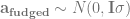
The trick with the genetic coefficients is that they’re correlated, with a specific known correlation structure that we know from the pedigree (or in genomic models, from markers). It turns out (Lee, Nelder & Pawitan 2017, chapter 8) that you can change the Z matrix around so that it lets you fit the model with an identity covariance matrix, while still accounting for the correlations between relatives. You replace the random effects for relatedness with some transformed random effects that capture the same structure. One way to do this is with Cholesky decomposition.

\mathbf{Z_{fudged}} = \mathbf{Z_0} \mathbf{L}

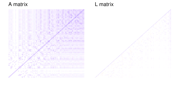
As an example of what the Cholesky decomposition does, here is slice of the additive relationship matrix of 100 simulated individuals (the last generation of one replicate of these simulations) and the resulting matrix from Cholesky decomposition.

So instead of

\mathbf{a} \sim N(0, \mathbf{A} \sigma)

We can fit

\mathbf{a_{fudged}} \sim N(0, \mathbf{I} \sigma)

This lets us fit the animal model with hglm, by putting in a modified Z matrix.

Assuming we have data frames with a pedigree and a phenotype (like, again, from these simulations):

library(AGHmatrix)
library(hglm)

A  <- Amatrix(ped)

Z0  <- diag(1000)
L <- t(chol(A))
Z  <- Z0 %*% L
X <- model.matrix(~1, pheno)

model <- hglm(y = pheno$pheno,
              X = X,
              Z = Z,
              conv = 1e-8)

est_h2  <- model$varRanef / (model$varRanef + model$varFix)

(I found the recommendation to decrease the convergence criterion from the default for animal models in a YouTube video by Xia Chen.)

Stan

When we turn to Stan, we will meet the Cholesky trick again. Stan is a software for Markov Chain Monte Carlo, built to fit hierarchical linear models, and related high-dimensional models, more effectively than other sampling strategies (like Gibbs). rstan is a helpful package for running Stan from within R.

Nishio & Arakawa (2019) recently published a Stan script to fit an animal model, comparing Stan to a Gibbs sampler (and a related MCMC sampler that they also didn’t publish the code for). If we look into their Stan model code, they also do a Cholesky decomposition to be able to use an identity matrix for the variance.

First, they decompose the additive relationship matrix that the program takes in:

transformed data{
  matrix[K,K] LA;
  LA = cholesky_decompose(A);
}

And then, they express the model like this:

vector[N] mu;
vector[K] a;
a_decompose ~ normal(0, 1);
a = sigma_G * (LA * a_decompose);
mu = X * b + Z * a;
Y ~ normal(mu, sigma_R);

We can add this line to the generated quantities block of the Stan program to get heritability estimates directly:

real h2;
h2 = sigma_U / (sigma_U + sigma_E)

Here, we’ve saved their model to a stan file, and now we can run it from R:

pheno$scaled_pheno <- as.vector(scale(pheno$pheno))

model_stan <- stan(file = "nishio_arakawa.stan",
                   data = list(Y = pheno$scaled_pheno,
                               X = X,
                               A = A,
                               Z = Z0,
                               J = 1,
                               K = 1000,
                               N = 1000))

est_h2_stan <- summary(model_stan, pars = "h2")$summary

Important note that I always forget: It's important to scale your traits before you run this model. If not, the priors might be all wrong.

The last line pulls out the summary for the heritability parameter (that we added above). This gives us an estimate and an interval.

The paper also contains this entertaining passage about performance, which reads as if it was a response to a comment, actual or anticipated:

R language is highly extensible and provides a myriad of statistical and graphical techniques. However, R language has poor computation time compared to Fortran, which is especially well suited to numeric computation and scientific computing. In the present study, we developed the programs for GS and HMC in R but did not examine computation time; instead, we focused on examining the performance of estimating genetic parameters and breeding values.

Yes, two of their samplers (Gibbs and HMC) were written in R, but the one they end up advocating (and the one used above), is in Stan. Stan code gets translated into C++ and then compiled to machine code.

Stan with brms

If rstan lets us run Stan code from R and examine the output, brms lets us write down models in relatively straightforward R syntax. It’s like the MCMCglmm of the Stan world. We can fit an animal model with brms too, by directly plugging in the relationship matrix:

model_brms <- brm(scaled_pheno ~ 1 + (1|animal),
                  data = pheno,
                  family = gaussian(),
                  cov_ranef = list(animal = A),
                  chains = 4,
                  cores = 1,
                  iter = 2000)

Then, we can pull out the posterior samples for the variability, here expressed as standard errors, compute the heritability and then get the estimates (and interval, if we want):

posterior_brms <- posterior_samples(model_brms,
                                    pars = c("sd_animal", "sigma"))

h2_brms  <- posterior_brms[,1]^2 /
    (posterior_brms[,1]^2 + posterior_brms[,2]^2)

est_h2_brms <- mean(h2_brms)

(Code is on GitHub: both for the graphs above, and the models.)

Exploratory analysis of a banana

This post is just me amusing myself by exploring a tiny data set I have lying around. The dataset and the code is on Github.

In 2014 (I think), I was teaching the introductory cell biology labs (pictures in the linked post) in Linköping. We were doing a series of simple preparations to look at cells and organelles: a cheek swab gives you a view of dead mammalian cells with bacteria on them; Elodea gives you a nice chloroplast view; a red bell pepper gives you chromoplasts; and a banana stained with iodine gives you amyloplasts. Giving the same lab six times in a row, it became apparent how the number of stained amyloplasts decreased as the banana ripened.

I took one banana, sliced in into five pieces (named A-E), and left it out to ripen. Then I stained (with Lugol’s iodine solution) and counted the number of amyloplasts per cell in a few cells (scraped off with a toothpick) from the end of each piece at day 1, 5, and 9.

First, here is an overview of the data. On average, we go from 17 stained amyloplasts on day 1, to 5 on day five and 2 on day nine.

If we break the plot up by slices, we see decline in every slice and variability between them. Because I only sampled each slice once per day, there is no telling whether this is variation between parts of the banana or between samples taken (say, hypothetically, because I might have stuck the toothpick in more or less deeply, or because the ripeness varies from the middle to the peel).

How can we model this? Let’s first fit a linear model where the number of amyloplasts decline at a constant rate per day, allowing for different starting values and different declines for each slice. We can anticipate that a Gaussian linear model will have some problems in this situation.

We fit a linear model and pull out the fitted values for each day–slice combination:

model_lm  <- lm(amyloplasts ~ day * slice,
                data = banana)

levels <- expand.grid(slice = unique(banana$slice),
                      day = unique(banana$day),
                      stringsAsFactors = FALSE)

pred_lm  <- cbind(levels,
                  predict(model_lm,
                          newdata = levels,
                          interval = "confidence"))

Then, to investigate the model’s behaviour, we can simulate data from the model, allowing for uncertainty in the fitted parameters, with the sim function from the arm package.

We make a function to simulate data from the linear model given a set of parameters, then simulate parameters and feed the first parameter combination to the function to get ourselves a simulated dataset.

y_rep_lm  <- function(coef_lm, sigma, banana) {
    slice_coef  <- c(0, coef_lm[3:6])
    names(slice_coef)  <- c("A", "B", "C", "D", "E")

    slice_by_day_coef  <- c(0, coef_lm[7:10])
    names(slice_by_day_coef)  <- c("A", "B", "C", "D", "E")   

    banana$sim_amyloplasts  <- 
        coef_lm[1] +
        slice_coef[banana$slice] +
        banana$day * (coef_lm[2] + slice_by_day_coef[banana$slice]) +
        rnorm(nrow(banana), 0, sigma)
    banana
}

sim_lm  <- sim(model_lm)

sim_banana  <- y_rep_lm(sim_lm@coef[1,], sim_lm@sigma[1], banana)

The result looks like this (black dots) compared with the real data (grey dots).

The linear model doesn’t know that the number of amyloplasts can’t go below zero, so it happily generates absurd negative values. While not apparent from the plots, the linear model also doesn’t know that amyloplasts counts are restricted to be whole numbers. Let’s fit a generalized linear model with a Poisson distribution, which should be more suited to this kind of discrete data. The log link function will also turn the linear decrease into an exponential decline, which seems appropriate for the decline in amyloplasts.

model_glm <- glm(amyloplasts ~ day * slice,
                 data = banana,
                 family = poisson(link = log))

pred_glm <- predict(model_glm,
                    newdata = levels,
                    se.fit = TRUE)

results_glm <- data.frame(levels,
                          average = pred_glm$fit,
                          se = pred_glm$se.fit,
                          stringsAsFactors = FALSE)
  
y_rep_glm  <- function(coef_glm, banana) {
    slice_coef  <- c(0, coef_glm[3:6])
    names(slice_coef)  <- c("A", "B", "C", "D", "E")

    slice_by_day_coef  <- c(0, coef_glm[7:10])
    names(slice_by_day_coef)  <- c("A", "B", "C", "D", "E")
    

    latent  <- exp(coef_glm[1] +
        slice_coef[banana$slice] +
        banana$day * (coef_glm[2] + slice_by_day_coef[banana$slice])) 

    banana$sim_amyloplasts  <- rpois(n = nrow(banana),
                                     lambda = latent)
    banana
}

sim_glm  <- sim(model_glm)

sim_banana_glm  <- y_rep_glm(sim_glm@coef[2,], banana)

This code is the same deal as above, with small modifications: glm instead of lm, with some differences in the interface. Then a function to simulate data from a Poisson model with an logarithmic link, that we apply to one set of parameters values.

There are no impossible zeros anymore. However, there seems to be many more zeros in the real data than in the simulated data, and consequently, as the number of amyloplasts grow small, we overestimate how many there should be.

Another possibility among the standard arsenal of models is a generalised linear model with a negative binomial distribution. As opposed to the Poisson, this allows greater spread among the values. We can fit a negative binomial model with Stan.

library(rstan)

model_nb  <- stan(file = "banana.stan",
                  data = list(n = nrow(banana),
                              n_slices = length(unique(banana$slice)),
                              n_days = length(unique(banana$day)),
                              amyloplasts = banana$amyloplasts,
                              day = banana$day - 1,
                              slice = as.numeric(factor(banana$slice)),
                              prior_phi_scale = 1))

y_rep  <- rstan::extract(model_nb, pars = "y_rep")[[1]]

Here is the Stan code in banana.stan:

data {
    int n;
    int n_slices;
    int <lower = 0> amyloplasts[n];
    real <lower = 0> day[n];
    int <lower = 1, upper = n_slices> slice[n];
    real prior_phi_scale;
}
parameters {
    real initial_amyloplasts[n_slices];
    real decline[n_slices];
    real < lower = 0> phi_rec;
}
model {
    phi_rec ~ normal(0, 1);
    for (i in 1:n) {
        amyloplasts[i] ~ neg_binomial_2_log(initial_amyloplasts[slice[i]] +
		                            day[i] * decline[slice[i]],
					    (1/phi_rec)^2);
    }
}
generated quantities {
    vector[n] y_rep;
    for (i in 1:n) {
        y_rep[i] = neg_binomial_2_rng(exp(initial_amyloplasts[slice[i]] +
		                          day[i] * decline[slice[i]]),
				      (1/phi_rec)^2);
    }
}

This model is similar to the Poisson model, except that the negative binomial allows an overdispersion parameter, a small value of which corresponds to large variance. Therefore, we put the prior on the reciprocal of the square root of the parameter.

Conveniently, Stan can also make the simulated replicated data for us in the generated quantities block.

What does the simulated data look like?

Here we have a model that allows for more spread, but in the process, generates some extreme data, with hundreds of amyloplasts per cell in some slices. We can try to be procrustean with the prior and constrain the overdispersion to smaller values instead:

model_nb2 <- stan(file = "banana.stan",
                  data = list(n = nrow(banana),
                              n_slices = length(unique(banana$slice)),
                              n_days = length(unique(banana$day)),
                              amyloplasts = banana$amyloplasts,
                              day = banana$day - 1,
                              slice = as.numeric(factor(banana$slice)),
                              prior_phi_scale = 0.1))

y_rep2  <- rstan::extract(model_nb2, pars = "y_rep")[[1]]

That looks a little better. Now, we’ve only looked at single simulated datasets, but we can get a better picture by looking at replicate simulations. We need some test statistics, so let us count how many zeroes there are in each dataset, what the maximum value is, and the sample variance, and then do some visual posterior predictive checks.

 
check_glm  <- data.frame(n_zeros = numeric(1000),
                         max_value = numeric(1000),
                         variance = numeric(1000),
                         model = "Poisson",
                         stringsAsFactors = FALSE)

check_nb  <- data.frame(n_zeros = numeric(1000),
                        max_value = numeric(1000),
                        variance = numeric(1000),
                        model = "Negative binomial",
                        stringsAsFactors = FALSE)

check_nb2  <- data.frame(n_zeros = numeric(1000),
                         max_value = numeric(1000),
                         variance = numeric(1000),
                         model = "Negative binomial 2",
                         stringsAsFactors = FALSE)


for (sim_ix in 1:1000) {
    y_rep_data  <- y_rep_glm(sim_glm@coef[sim_ix,], banana)
    check_glm$n_zeros[sim_ix]  <- sum(y_rep_data$sim_amyloplasts == 0)
    check_glm$max_value[sim_ix] <- max(y_rep_data$sim_amyloplasts)
    check_glm$variance[sim_ix] <- var(y_rep_data$sim_amyloplasts)

    check_nb$n_zeros[sim_ix]  <- sum(y_rep[sim_ix,] == 0)
    check_nb$max_value[sim_ix]  <- max(y_rep[sim_ix,])
    check_nb$variance[sim_ix]  <- var(y_rep[sim_ix,])

    check_nb2$n_zeros[sim_ix]  <- sum(y_rep2[sim_ix,] == 0)
    check_nb2$max_value[sim_ix]  <- max(y_rep2[sim_ix,])
    check_nb2$variance[sim_ix]  <- var(y_rep2[sim_ix,])
}

check  <- rbind(check_glm,
                check_nb,
                check_nb2)

melted_check  <- gather(check, "variable", "value", -model)

check_data  <- data.frame(n_zeros = sum(banana$amyloplasts == 0),
                          max_value = max(banana$amyloplasts),
                          variance = var(banana$amyloplasts))

Here is the resulting distribution of these three discrepancy statistics in 1000 simulated datasets for the three models (generalised linear model with Poisson distribution and the two negative binomial models). The black line is the value for real data.

When viewed like this, it becomes apparent how the negative binomial models do not fit that well. The Poisson model struggles with the variance and the number of zeros. The negative binomial models get closer to the number of zeros in the real data, they still have too few, while at the same time having way too high maximum values and variance.

Finally, let’s look at the fitted means and intervals from all the models. We can use the predict function for the linear model and Poisson model, and for the negative binomial models, we can write our own:

pred_stan <- function(model, newdata) {
    samples <- rstan::extract(model)
    initial_amyloplasts <- data.frame(samples$initial_amyloplasts)
    decline  <- data.frame(samples$decline)
    names(initial_amyloplasts) <- names(decline) <- c("A", "B", "C", "D", "E")

    ## Get posterior for levels
    pred  <- matrix(0,
                    ncol = nrow(newdata),
                    nrow = nrow(initial_amyloplasts))

    for (obs in 1:ncol(pred)) {
        pred[,obs]  <- initial_amyloplasts[,newdata$slice[obs]] +
            (newdata$day[obs] - 1) * decline[,newdata$slice[obs]]
    }

    ## Get mean and interval
    newdata$fit  <- exp(colMeans(pred))
    intervals <- lapply(data.frame(pred), quantile, probs = c(0.025, 0.975))
    newdata$lwr  <- exp(unlist(lapply(intervals, "[", 1)))
    newdata$upr  <- exp(unlist(lapply(intervals, "[", 2)))

    newdata
}

pred_nb <- pred_stan(model_nb, levels)
pred_nb2 <- pred_stan(model_nb2, levels)

In summary, the three generalised linear models with log link function pretty much agree about the decline of amyloplasts during the later days, which looks more appropriate than a linear decline. They disagree about the uncertainty about the numbers on the first day, which is when there are a lot. Perhaps coincidentally, this must also be where the quality of my counts are the lowest, because it is hard to count amyloplasts on top of each other.