A genetic mapping animation in R

Cullen Roth posted a beautiful animation of quantitative trait locus mapping on Twitter. It is pretty amazing. I wanted to try to make something similar in R with gganimate. It’s not going to be as beautiful as Roth’s animation, but it will use the same main idea of showing both a test statistic along the genome, and the underlying genotypes and trait values. For example, Roth’s animation has an inset scatterplot that appears above the peak after it’s been reached; to do that I think we would have to go a bit lower-level than gganimate and place our plots ourselves.

First, we’ll look at a locus associated with body weight in chickens (with data from Henriksen et al. 2016), and then a simulated example. We will use ggplot2 with gganimate and a magick trick for combining the two animations. Here are some pertinent snippets of the code; as usual, find the whole thing on Github.

LOD curve

We will use R/qtl for the linkage mapping. We start by loading the data file (Supplementary Dataset from Henriksen et al. 2016). A couple of individuals have missing covariates, so we won’t be able to use them. This piece of code first reads the cross file, and then removes the two offending rows.

library(qtl)

## Read cross file
cross <- read.cross(format = "csv",
                    file = "41598_2016_BFsrep34031_MOESM83_ESM.csv")

cross <- subset(cross, ind = c("-34336", "-34233"))

For nice plotting, let’s restrict ourselves to fully informative markers (that is, the ones that tell the two founder lines of the cross apart). There are some partially informative ones in the dataset too, and R/qtl can get some information out of them thanks to genotype probability calculations with its Hidden Markov Model. They don’t make for nice scatterplots though. This piece of code extracts the genotypes and identifies informative markers as the ones that only have genotypes codes 1, 2 or 3 (homozygote, heterozygote and other homozygote), but not 5 and 6, which are used for partially informative markers.

## Get informative markers and combine with phenotypes for plotting

geno <- as.data.frame(pull.geno(cross,
                                chr = 1))

geno_values <- lapply(geno, unique)
informative <- unlist(lapply(geno_values,
    function(g) all(g %in% c(1:3, NA))))

geno_informative <- geno[informative]

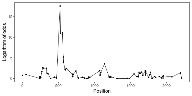
Now for the actual scan. We run a single QTL scan with covariates (sex, batch that the chickens were reared in, and principal components of genotypes), and pull out the logarithm of the odds (LOD) across chromosome 1. This piece of code first prepares a design matrix of the covariates, and then runs a scan of chromosome 1.

## Prepare covariates
pheno <- pull.pheno(cross)

covar <- model.matrix(~ sex_number + batch + PC1 + PC2 + PC3 + PC4 + 
                        PC5 + PC6 + PC7 + PC8 + PC9 + PC10,
                      pheno,
                      na.action = na.exclude)[,-1]

scan <- scanone(cross = cross,
                pheno.col = "weight_212_days",
                method = "hk",
                chr = 1,
                addcovar = covar)

Here is the LOD curve along chromosome 1 that want to animate. The peak is the biggest-effect growth locus in this intercross, known as ”growth1”.

With gganimate, animating the points is as easy as adding a transition layer. This piece of code first makes a list of some formatting for our graphics, then extracts the LOD scores from the scan object, and makes the plot. By setting cumulative in transition_manual the animation will add one data point at the time, while keeping the old ones.

library(ggplot2)
library(gganimate)

formatting <- list(theme_bw(base_size = 16),
                   theme(panel.grid = element_blank(),
                         strip.background = element_blank(),
                         legend.position = "none"),
                   scale_colour_manual(values =
                         c("red", "purple", "blue")))

lod <- as.data.frame(scan)
lod <- lod[informative,]
lod$marker_number <- 1:nrow(lod)

plot_lod <- qplot(x = pos,
                  y = lod,
                  data = lod,
                  geom = c("point", "line")) +
  ylab("Logarithm of odds") +
  xlab("Position") +
  formatting +
  transition_manual(marker_number,
                    cumulative = TRUE)

Plot of the underlying data

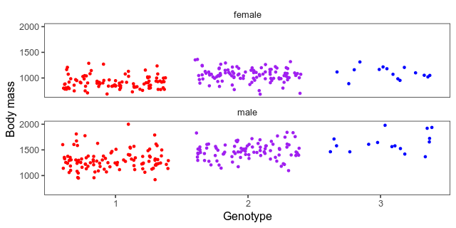
We also want a scatterplot of the data. Here what a jittered scatterplot will look like at the peak. The horizontal axes are genotypes (one homozygote, heterozygote in the middle, the other homozygote) and the vertical axis is the body mass in grams. We’ve separated the sexes into small multiples. Whether to give both sexes the same vertical axis or not is a judgement call. The hens weigh a lot less than the roosters, which means that it’s harder to see patterns among them when put on the same axis as the roosters. On the other hand, if we give the sexes different axes, it will hide that difference.

This piece of code builds a combined data frame with informative genotypes and body mass. Then, it makes the above plot for each marker into an animation.

library(tidyr)

## Combined genotypes and weight
geno_informative$id <- pheno$id
geno_informative$w212 <- pheno$weight_212_days
geno_informative$sex <- pheno$sex_number

melted <- pivot_longer(geno_informative,
                       -c("id", "w212", "sex"))

melted <- na.exclude(melted)

## Add marker numbers
marker_numbers <- data.frame(name = rownames(scan),
                             marker_number = 1:nrow(scan),
                             stringsAsFactors = FALSE)

melted <- inner_join(melted, marker_numbers)

## Recode sex to words
melted$sex_char <- ifelse(melted$sex == 1, "male", "female")

plot_scatter <- qplot(x = value,
                     geom = "jitter",
                     y = w212,
                     colour = factor(value),
                     data = melted) +
  facet_wrap(~ factor(sex_char),
             ncol = 1) +
  xlab("Genotype") +
  ylab("Body mass") +
  formatting +
  transition_manual(marker_number)

Combining the animations

And here is the final animation:

To put the pieces together, we use this magick trick (posted by Matt Crump). That is, animate the plots, one frame for each marker, and then use the R interface for ImageMagick to put them together and write them out.

gif_lod <- animate(plot_lod,
                   fps = 2,
                   width = 320,
                   height = 320,
                   nframes = sum(informative))

gif_scatter <- animate(plot_scatter,
                       fps = 2,
                       width = 320,
                       height = 320,
                       nframes = sum(informative))


## Magick trick from Matt Crump

mgif_lod <- image_read(gif_lod)
mgif_scatter <- image_read(gif_scatter)

new_gif <- image_append(c(mgif_lod[1], mgif_scatter[1]))
for(i in 2:sum(informative)){
  combined <- image_append(c(mgif_lod[i], mgif_scatter[i]))
  new_gif <- c(new_gif, combined)
}

image_write(new_gif, path = "out.gif", format = "gif")

Literature

Henriksen, Rie, et al. ”The domesticated brain: genetics of brain mass and brain structure in an avian species.” Scientific reports 6.1 (2016): 1-9.

#TidyTuesday: horror films, squirrels and commuters

Tidy Tuesday is a fun weekly activity where a lot of R enthusiasts make different visualisations, and possibly modelling, of the same dataset. You can read more about it at their Github page. I participated for three weeks, and here is a recap. I will show excerpts of the code, but you can read the whole thing by clicking through to Github.

2019-10-22 Horror films

Data: https://github.com/rfordatascience/tidytuesday/tree/master/data/2019/2019-10-22

My code: https://github.com/mrtnj/rstuff/blob/master/tidytuesday/horror_movies.R

In time for Halloween, we got a dataset with horror film data from IMDB. (Yes, I will be mixing the terms ”film” and ”movie” wildly.)

The first week, I started with making a pretty boring plot, the way I’d normally plot things (white background, small multiples, you know the drill). I wanted to look at distribution over the year, so I plotted what month films are released and the distribution of review scores and budgets each month. After thinking about it for a while, I thought a logarithmic scale would make sense for budgets, that span a huge range. Also, after realising that the budget column actually didn’t contain dollars, but a mix of currencies, I decided not to try to convert, but use only the US dollar budgets.

I don’t often run into dates, to using the date functions from readr and lubridate was new to me, as was the built-in vector month.abb:

library(dplyr)
library(egg)
library(ggplot2)
library(ggimage)
library(lubridate)
library(readr)
library(stringr)

movies <- read_csv("horror_movies.csv")

## Parse dates

movies$release_parsed  <- parse_date(movies$release_date,
                                     format = "%d-%b-%y",
                                     locale = locale("en")) 

movies$release_year <- ifelse(is.na(movies$release_parsed),
                              movies$release_date,
                              year(movies$release_parsed))

movies$release_month  <- month.abb[month(movies$release_parsed)]

Here, we parse the release data, and extract the release year, treating films that only have a release year separately.

I also put in means with confidence intervals, like so, and a line for the mean review rating:

model  <- lm(review_rating ~ release_month, movies)

fit  <- data.frame(release_month = month.abb,
                   predict(model,
                           newdata = data.frame(release_month = month.abb),
                                                interval = "confidence"),
                   stringsAsFactors = FALSE)

grand_mean_rating  <- mean(movies$review_rating,
                           na.rm = TRUE)

As an example of the plotting code, here is the middle panel for ratings. As usual with ggplot2, we layer geometries on top of each other (here: violin plots, points with range bars, and a horizontal line, followed by a lot of formatting.

plot_rating <- ggplot() +
    geom_violin(aes(x = release_month,
                    y = review_rating),
                fill = "grey",
                colour = NA,
                data = movies) +
    scale_x_discrete(limits = month.abb) +
    geom_pointrange(aes(x = release_month,
                        y = fit,
                        ymax = upr,
                        ymin = lwr),
                    data = fit) +
    geom_hline(yintercept = grand_mean_rating,
               linetype = 2,
               colour = "red") +
    ylim(0, 10) +
    theme_bw(base_size = 12) +
    theme(panel.grid = element_blank()) +
    xlab("") +
    ylab("Review rating")

There is similar code for the other two panels. Finally, I used ggarrange from the egg package to put everything together. In summary, most horror films are released in October, probably around Halloween. The review ratings of films released in this horror season are also a tiny bit higher than during the rest of the year, but there is not much of a difference in the budgets.

After that, and after seeing some of the fun horror-themed graphs other people made, I decided to make something more colourful. Here is a plot on the same theme, showing each day and year separately, an appropriately horrendous colour scheme, and a pumpkin icon to indicate the date of Halloween. I like this plot better because it shows more of the data. It shows the increase at Halloween. We also see some spikes at other dates, like 1 January of some years. It also shows how the dataset ends at Halloween 2017.

The code for this plot is mostly a lot of theme formatting. The ggplot2 theme function takes a lot of arguments I’ve never used before.

movies$yday  <- yday(movies$release_parsed)

daycount <- summarise(group_by(movies, yday, release_year), n = n())

First, we turn dates into days of the year, and count the number of film releases.

halloween  <-  yday("2019-10-31")

pumpkin_data  <- data.frame(x = halloween,
                            y = -1,
                            image = "pumpkin.png",
                            stringsAsFactors = FALSE)

Then, we set up the date of Halloween and a data frame for the pumpkin icon. We’re going to use geom_image from the ggimage package to add this icon to each subplot.

breaks  <- yday(paste("2019-", 1:12, "-01", sep = ""))

plot_year <- ggplot() +
    geom_point(aes(x = yday,
                   y = n),
               colour = "green",
               data = na.exclude(dc)) +
    geom_image(aes(x = x,
                   y = y,
                   image = image),
               data = pumpkin_data) +
    facet_wrap(~ release_year,
               ncol = 2) +
    scale_x_continuous(breaks = breaks,
                       labels = month.abb) +
    ylim(-3, NA) +
    labs(caption = "Pumpkin icon by Good Ware from www.flatiron.com.") +
    theme(panel.grid = element_blank(),
          strip.background = element_blank(),
          text = element_text(family = "mono",
                              colour = "grey",
                              size = 16),
          axis.text = element_text(family = "mono",
                                   colour = "green",
                                   size = 14),
          axis.ticks = element_line(colour = "green"),
          strip.text = element_text(family = "mono",
                                    colour = "grey",
                                    size = 16),
          plot.background = element_rect(fill = "black"),
          panel.background = element_rect(fill = "black")) +
    xlab("") +
    ylab("Horror films released on this day") +
    ggtitle("When horror films are released")

A lot of other people made graphs that highlight the increase in horror film releases around Halloween in different ways. Here are some that I like:

And, looking deeper, there is a pattern within months too:

Finally, I also like this plot, that makes a case for a U-shaped relationship between budget and rating:

And for contrast, another that makes a different case with the same data:

This seems to be a recurrent theme when it comes to interpretation and quantitative analysis in the Tidy Tuesday datasets. People make different modeling choices, or visualisation choices (which are modeling choices) about what to lump together, what to separate into bins, how to transform the data, and how to show uncertainty. In some cases, as with the pattern of film releases around Halloween, they all find similar results. In some other cases, they don’t.

2019-10-28 NYC Squirrel Census

Data: https://github.com/rfordatascience/tidytuesday/tree/master/data/2019/2019-10-29

My code: https://github.com/mrtnj/rstuff/blob/master/tidytuesday/nyc_squirrels.R

This week, the data was about the location and activities of squirrels in New York central park on certain times. I had this vision of an animated map of squirrel locations. I ended up with an animation, but no map. The colour of the squirrel icon shows the main fur colour of the squirrels (grey, black, cinnamon), and the size shows adults and juveniles.

I had never used gganimate before (only animation, as in this post about the Game of Life), but I had seen Thomas Lin Pedersen tweet about it, and I wanted to try.

library(dplyr)
library(gganimate)
library(ggimage)
library(ggplot2)
library(readr)

squirrels <- read_csv("nyc_squirrels.csv")

## Parse the date
squirrels$date_parsed  <- parse_date(as.character(squirrels$date), format = "%m%d%Y")

## Give each observation a unique ID (to use as group in the
## animation, so as to not have points turn into one another but fade
## instead.
squirrels$key  <- 1:nrow(squirrels)

## Associate the different squirrel colours with the filenames of
## icons in different colours (manually filled with GIMP).
squirrels$image  <- "squirrel.png"
squirrels$image[squirrels$primary_fur_color == "Cinnamon"]  <- "squirrel_cinnamon.png"
squirrels$image[squirrels$primary_fur_color == "Gray"]  <- "squirrel_grey.png"
squirrels$image[is.na(squirrels$primary_fur_colour)]  <- NA

Again, we need to parse the date. We already have latitude and longitude. We need a unique identifier for each observation, to tell gganimate that we want each squirrel to be in its own group. Then, we associate squirrel colours with three different files with a squirrel icon in different colours.

First, we make two image scatterplot layers, setting the sizes of adults and juveniles manually. The colour is deal with by mapping the image column containing the file names to the image aesthetic. We add some formatting, and then, the transition_states layer, which is where the graph turns from still and boring to magical moving pictures. This will animate a series of discrete ”states”, which here consist of the date pasted together with the shift (AM or PM squirrel observation shift). The special ”{closest_state}” variable in the title string puts this state name as plot title.

plot_colour <- ggplot() +
    geom_image(aes(y = long, x = lat, image = image, group = key),
               size = 0.04,
               data = filter(squirrels, age == "Adult")) +
    geom_image(aes(y = long, x = lat, image = image, group = key),
               size = 0.03,
               data = filter(squirrels, age == "Juvenile")) +
    theme_bw(base_size = 16) +
    theme(panel.grid = element_blank()) +
    xlab("Latitude") +
    ylab("Longitude") +
    labs(title = "{closest_state}",
         caption = "Data from NYC Squirrel Census. Squirrel icon made by Freepik from www.flatiron.com.") +
    transition_states(paste(date_parsed, shift),
                      state_length = 2,
                      transition_length = 1)

## Render it and write to file
animate(plot_colour,
        fps = 10,
        nframes = 400,
        end_pause = 20,
        rewind = FALSE,
        width = 1000,
        height = 1000)

I was faffing around unsuccessfully with different map packages to try to find something of Central Park. It seems ggmaps is the way to go. Several other participants made nice maps:

However, I think this was my favourite:

https://github.com/ryantimpe/TidyTuesday/blob/master/2019w44/2019w44.R

The original Squirrel Census Report seems to be amazing object, too, with a beautiful map.

2019-11-05 Biking and walking to work in the US (and Sweden)

Data: https://github.com/rfordatascience/tidytuesday/tree/master/data/2019/2019-11-05

My code: https://github.com/mrtnj/rstuff/blob/master/tidytuesday/commute.R

This week I felt I had to make a map. The end result doesn’t look like much, but it took a while. Here are the average percentages of commuters who walk and bike to work in different US states 2008-2012 with data from the American Community Survey:

library(dplyr)
library(ggplot2)
library(readr)
library(usmap)

commute <- read_csv("commute.csv")

## Map data from the usmap package
state_map  <- us_map(regions = "state")

## There are some incompletely labelled states; fix them
missing  <- setdiff(commute$state, state_map$full)

commute$state_modified <- commute$state
commute$state_modified[commute$state == "Ca"] <- "California"
commute$state_modified[commute$state == "Massachusett"]  <- "Massachusetts"

We get map coordinates for the US states from the usmap package (because the one in maps doesn’t have Alaska and Hawaii).

Then we fix some mislabelling in the data.

## Get the average per state
state_average  <- summarise(group_by(commute, state_modified, mode),
                            average = sum(percent * n)/sum(n))

## Combine averages and coordinates
combined  <- inner_join(state_average,
                        state_map,
                        by = c("state_modified" = "full"))

We take a weighted average of the percentages per state and join the state averages with the state map coordinates. The map I posted on Twitter didn’t weight the average, but I think that is a bit better. There is still the issue that states have different populations and different distributions of large and small cities, but that’s the nature of things. In summary, there is not much biking going on, but some more walking to work.

plot_map  <- ggplot() +
    geom_polygon(aes(x = x, y = y, fill = average, group = group),
                 colour = "black",
                 data = combined) +
    facet_wrap(~ mode) +
    scale_fill_continuous(low = "white",
                          high = "blue",
                          name = "Percent commuters") +
    theme_bw(base_size = 16) +
    theme(panel.grid = element_blank(),
          strip.background = element_blank(),
          axis.text = element_blank(),
          axis.ticks = element_blank(),
          legend.position = "bottom") +
    xlab("") +
    ylab("") +
    labs(caption = "Cycling and walking to work 2008-2012 in the American Community Survey.")

The US seems to live up to its reputation as a motorised country. But I have no feeling for the scale of the data. For comparision, here is a map of Sweden with some not too recent data (2005-2006, from this VTI report>). The map is from the swemap package.