I hope that Genetics will continue running expository papers about their old classics, like this one by Philip Meneely about Luria & Delbrück (1943). Luria & Delbrück performed an experiment on bacteriophage resistance in Escherichia coli, growing bacterial cultures, exposing them to a phage, and then plating and counting the survivors, who have become resistant to the phage. They considered two hypotheses: either resistance occurs adaptively, in response to the phage, or it occurs by mutation some time during the growth of the culture but before the phages are added. They find the latter to be the case, and this is an example of how mutations happen irrespective of their effects of fitness, in a sense at random. Their analysis is based on a model of bacterial growth and mutation, and the aim of this exercise is to explore this model by simulating some data.
First, we assume that mutation happens with a fixed mutation rate 


That is, every generation i, the mutants that occur move from the susceptible to the resistant category. The number of mutants that happen among the susceptible is binomially distributed:

This is an R function to simulate a culture:
culture <- function(generations, mu) {
n_susceptible <- numeric(generations)
n_resistant <- numeric(generations)
n_mutants <- numeric(generations)
n_susceptible[1] <- 1
for (i in 1:(generations - 1)) {
n_mutants[i] <- rbinom(n = 1, size = n_susceptible[i], prob = mu)
n_susceptible[i + 1] <- 2 * (n_susceptible[i] - n_mutants[i])
n_resistant[i + 1] <- 2 * (n_resistant[i] + n_mutants[i])
}
data.frame(generation = 1:generations,
n_susceptible,
n_resistant,
n_mutants)
}
cultures <- replicate(1000, culture(30, 2e-8), simplify = FALSE)
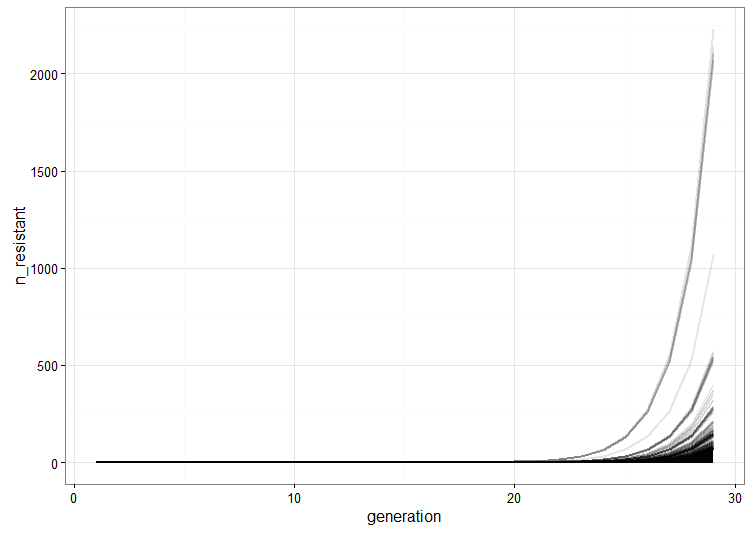
We run a few replicate cultures and plot the number of resistant bacteria. This graph shows the point pretty well: Because of random mutation and exponential growth, the cultures where mutations happen to arise relatively early will give rise to a lot more resistant bacteria than the ones were the first mutations are late. Therefore, there will be a lot of variation between the cultures because of their different histories.
combined <- Reduce(function (x, y) rbind(x, y), cultures)
combined$culture <- rep(1:1000, each = 30)

resistant_plot <- qplot(x = generation, y = n_resistant, group = culture,
      data = combined, geom = "line", alpha = I(1/10), size = I(1)) + theme_bw()
We compare this to what happens under the alternative hypothesis where resistance arises as a consequence of introduction of the phage with some resistance rate (this is not the same as the mutation rate above, even though we’re using the same value). Then the number of resistant cells in a culture will be: 
resistant <- unlist(lapply(cultures, function(x) max(x$n_resistant)))

acquired_resistant <- rbinom(n = 1000, size = 2^29, 2e-8)

resistant_combined <- rbind(transform(data.frame(resistant = acquired_resistant), model = "acquired"),
                            transform(data.frame(resistant = resistant), model = "mutation"))

resistant_histograms <- qplot(x = resistant, data = resistant_combined,bins = 10) +
  facet_wrap(~ model, scale = "free_x")
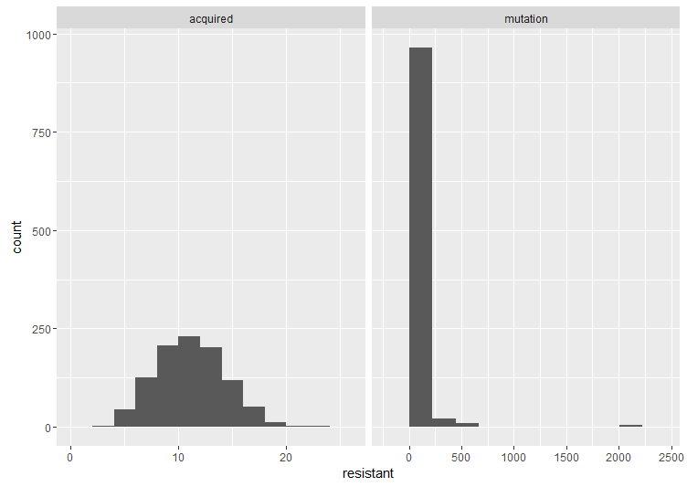
Here are two histograms side by side to compare the cases. The important thing is the shape. If the acquired resistance hypothesis holds, the number of resistant bacteria in replicate cultures follows a Poisson distribution, because it arises when one counts the number of binomially distributed events that occur in a given number of trials. The interesting thing about the Poisson distribution in this case is that its mean is equal to the variance. However, under the mutation model (as we’ve already illustrated), there is a lot of variation between cultures. These fluctuations make the variance much larger than the mean, which is also what Luria and Delbrück found in their data. Therefore, the results are inconsistent with acquired mutation, and hence the experiment is called the Luria–Delbrück fluctuation test.
mean(resistant)
var(resistant)
mean(acquired_resistant)
var(acquired_resistant)
Literature
Luria, S. E., & Delbrück, M. (1943). Mutations of bacteria from virus sensitivity to virus resistance. Genetics, 28(6), 491.
Meneely, P. M. (2016). Pick Your Poisson: An Educational Primer for Luria and Delbrück’s Classic Paper. Genetics, 202(2), 371-375.

Hello, I think your approach to reproducing kind results is inspiring. I think it’d be a great way to learn the arguments of seminal papers.
I think your approach was solid, but I’d like to ask whether you’ve tried the simmer package. It looks like a great tool for discrete simulations.
Hi!
Thank you! I haven’t looked that much into discrete event simulation tools, but maybe I should. By the way, when looking at the vignette of the simmer package, I like their use of magrittr notation.
This is very, very cool. I remember reading the Luria-Delbruck paper in grad school and your model is a great visual way to explain the logic behind it.
I did have one little issue with running the script you posted on GitHub. After defining resistant_histograms, I inserted a line to view the plots and I’m getting the following errors:
stat_bin: binwidth defaulted to range/30. Use ‘binwidth = x’ to adjust this.
stat_bin: binwidth defaulted to range/30. Use ‘binwidth = x’ to adjust this.
On the actual plot, each side is coming out with 30 bins rather than the 10 that are specified in the script. The one on the ”mutation” side (the right) looks okay that way, but the one on the ”acquired” side comes out with gaps in the distribution. For some reason there seem to be some empty bins scatter across the distribution, even though the overall distribution appears correct.
Anyway, it’s not a big deal, but I can’t figure out why ”bins=10” in the qplot function is being ignored. I’m new to using R, so it may be a simple error on my part or there may be an easy way around this, but I just thought I’d mention it in case you have any idea what might be going on.
Regardless of that minor issue, thanks for posting this! I love to see classic papers like this one revisited.
Thanks! I think the bins argument was added in ggplot2 2.0.0, before that binwidth was the way to go. I didn’t think about it, but that was a bit inconsiderate to people who haven’t updated ggplot2 in a while.
I actually just installed ggplot2 this week, but for some reason install.packages(”ggplot2”) didn’t get the latest release. Anyway, once I updated to ggplot2 2.0.0, the results from your script look great!
Thanks very much for your help!