Convincing myself about the Monty Hall problem

Like many others, I’ve never felt that the solution to the Monty Hall problem was intuitive, despite the fact that explanations of the correct solution are everywhere. I am not alone. Famously, columnist Marilyn vos Savant got droves of mail from people trying to school her after she had published the correct solution.

The problem goes like this: You are a contestant on a game show (based on a real game show hosted by Monty Hall, hence the name). The host presents you with three doors, one of which contains a prize — say, a goat — and the others are empty. After you’ve made your choice, the host opens one of the doors, showing that it is empty. You are now asked whether you would like to stick to your initial choice, or switch to the other door. The right thing to do is to switch, which gives you 2/3 probability of winning the goat. This can be demonstrated in a few different ways.

A goat is a great prize. Image: Casey Goat by Pete Markham (CC BY-SA 2.0)

So I sat down to do 20 physical Monty Hall simulations on paper. I shuffled three cards with the options, picked one, and then, playing the role of the host, took away one losing option, and noted down if switching or holding on to the first choice would have been the right thing to do. The results came out 13 out of 20 (65%) wins for the switching strategy, and 7 out of 20 (35%) for the holding strategy. Of course, the Monty Hall Truthers out there must question whether this demonstration in fact happened — it’s too perfect, isn’t it?

The outcome of the simulation is less important than the feeling that came over me as I was running it, though. As I was taking on the role of the host and preparing to take away one of the losing options, it started feeling self-evident that the important thing is whether the first choice is right. If the first choice is right, holding is the right strategy. If the first choice is wrong, switching is the right option. And the first choice, clearly, is only right 1/3 of the time.

In this case, it was helpful to take the game show host’s perspective. Selvin (1975) discussed the solution to the problem in The American Statistician, and included a quote from Monty Hall himself:

Monty Hall wrote and expressed that he was not ”a student of statistics problems” but ”the big hole in your argument is that once the first box is seen to be empty, the contestant cannot exchange his box.” He continues to say, ”Oh, and incidentally, after one [box] is seen to be empty, his chances are no longer 50/50 but remain what they were in the first place, one out of three. It just seems to the contestant that one box having been eliminated, he stands a better chance. Not so.” I could not have said it better myself.

A generalised problem

Now, imagine the same problem with a number d number of doors, w number of prizes and o number of losing doors that are opened after the first choice is made. We assume that the losing doors are opened at random, and that switching entails picking one of the remaining doors at random. What is the probability of winning with the switching strategy?

The probability of picking the a door with or without a prize is:

\Pr(\text{pick right first}) = \frac{w}{d}

\Pr(\text{pick wrong first}) = 1 - \frac{w}{d}

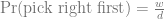
If we picked a right door first, we have w – 1 winning options left out of d – o – 1 doors after the host opens o doors:

\Pr(\text{win\textbar right first}) = \frac{w - 1}{d - o - 1}

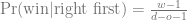
If we picked the wrong door first, we have all the winning options left:

\Pr(\text{win\textbar wrong first}) = \frac{w}{d - o - 1}

Putting it all together:

\Pr(\text{win\textbar switch}) = \Pr(\text{pick right first}) \cdot \Pr(\text{win\textbar right first}) + \\   + \Pr(\text{pick wrong first}) \cdot \Pr(\text{win\textbar wrong first}) = \\  = \frac{w}{d} \frac{w - 1}{d - o - 1} + (1 - \frac{w}{d}) \frac{w}{d - o - 1}

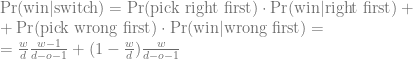
As before, for the hold strategy, the probability of winning is the probability of getting it right the first time:

\Pr(\text{win\textbar hold}) = \frac{w}{d}

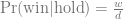
With the original Monty Hall problem, w = 1, d = 3 and o = 1, and therefore

\Pr(\text{win\textbar switch}) = \frac{1}{3} \cdot 0 + \frac{2}{3} \cdot 1

Selvin (1975) also present a generalisation due to Ferguson, where there are n options and p doors that are opened after the choice. That is, w = 1, d = 3 and o = 1. Therefore,

\Pr(\text{win\textbar switch}) = \frac{1}{n} \cdot 0 + (1 - \frac{1}{n}) \frac{1}{n - p - 1} =  \frac{n - 1}{n(n - p - 1)}

which is Ferguson’s formula.

Finally, in Marilyn vos Savant’s column, she used this thought experiment to illustrate why switching is the right thing to do:

Here’s a good way to visualize what happened. Suppose there are a million doors, and you pick door #1. Then the host, who knows what’s behind the doors and will always avoid the one with the prize, opens them all except door #777,777. You’d switch to that door pretty fast, wouldn’t you?

That is, w = 1 still, d = 106 and o = 106 – 2.

\Pr(\text{win\textbar switch}) = 1 - \frac{1}{10^6}

It turns out that the solution to the generalised problem is that it is always better to switch, as long as there is a prize, and as long as the host opens any doors. One can also generalise it to choosing sets of more than one door. This makes some intuitive sense: as long as the host takes opens some doors, taking away losing options, switching should enrich for prizes.

Some code

To be frank, I’m not sure I have convinced myself of the solution to the generalised problem yet. However, using the code below, I did try the calculation for all combinations of total number of doors, prizes and doors opened up to 100, and in all cases, switching wins. That inspires some confidence, should I end up on a small ruminant game show.

The code below first defines a wrapper around R’s sampling function, which has a very annoying alternative behaviour when fed a vector of length one, to be able to build a computational version of my physical simulation. Finally, we have a function for the above formulae. (See whole thing on GitHub if you are interested.)

## Wrap sample into a function that avoids the "convenience"
## behaviour that happens when the length of x is one

sample_safer <- function(to_sample, n) {
  assert_that(n <= length(to_sample))
  if (length(to_sample) == 1)
    return(to_sample)
  else {
    return(sample(to_sample, n))
  }
}


## Simulate a generalised Monty Hall situation with
## w prizes, d doors and o doors that are opened.

sim_choice <- function(w, d, o) {
  ## There has to be less prizes than unopened doors
  assert_that(w < d - o) 
  wins <- rep(1, w)
  losses <- rep(0, d - w)
  doors <- c(wins, losses)
  
  ## Pick a door
  choice <- sample_safer(1:d, 1)
  
  ## Doors that can be opened
  to_open_from <- which(doors == 0)
  
  ## Chosen door can't be opened
  to_open_from <- to_open_from[to_open_from != choice]
  
  ## Doors to open
  to_open <- sample_safer(to_open_from, o)
  
  ## Switch to one of the remaining doors
  possible_switches <- setdiff(1:d, c(to_open, choice))
  choice_after_switch <- sample_safer(possible_switches , 1)
  
  result_hold <- doors[choice]
  result_switch <- doors[choice_after_switch]
  c(result_hold,
    result_switch)
}


## Formulas for probabilities

mh_formula <- function(w, d, o) {
  ## There has to be less prizes than unopened doors
  assert_that(w < d - o) 
  
  p_win_switch <- w/d * (w - 1)/(d - o - 1) +
                     (1 - w/d) * w / (d - o - 1) 
  p_win_hold <- w/d
  c(p_win_hold,
    p_win_switch)
}


## Standard Monty Hall

mh <- replicate(1000, sim_choice(1, 3, 1))
> mh_formula(1, 3, 1)
[1] 0.3333333 0.6666667
> rowSums(mh)/ncol(mh)
[1] 0.347 0.653

The Monty Hall problem problem

Guest & Martin (2020) use this simple problem as their illustration for computational model building: two 12 inch pizzas for the same price as one 18 inch pizza is not a good deal, because the 18 inch pizza contains more food. Apparently this is counter-intuitive to many people who have intuitions about inches and pizzas.

They call the risk of having inconsistencies in our scientific understanding because we cannot intuitively grasp the implications of our models ”The pizza problem”, arguing that it can be ameliorated by computational modelling, which forces you to spell out implicit assumptions and also makes you actually run the numbers. Having a formal model of areas of circles doesn’t help much, unless you plug in the numbers.

The Monty Hall problem problem is the pizza problem with a vengeance; not only is it hard to intuitively grasp what is going on in the problem, but even when presented with compelling evidence, the mental resistance might still remain and lead people to write angry letters and tweets.

Literature

Guest, O, & Martin, AE (2020). How computational modeling can force theory building in psychological science. Preprint.

Selvin, S (1975) On the Monty Hall problem. The American Statistician 29:3 p.134.

Showing a difference in mean between two groups, take 2

A couple of years ago, I wrote about the paradoxical difficulty of visualising a difference in means between two groups, while showing both the data and some uncertainty interval. I still feel like many ills in science come from our inability to interpret a simple comparison of means. Anything with more than two groups or a predictor that isn’t categorical makes things worse, of course. It doesn’t take much to overwhelm the intuition.

My suggestion at the time was something like this — either a panel that shows the data an another panel with coefficients and uncertainty intervals; or a plot that shows the with lines that represent the magnitude of the difference at the upper and lower limit of the uncertainty interval.

Alternative 1 (left), with separate panels for data and coefficient estimates, and alternative 2 (right), with confidence limits for the difference shown as vertical lines. For details, see the old post about these graphs.

Here is the fake data and linear model we will plot. If you want to follow along, the whole code is on GitHub. Group 0 should have a mean of 4, and the difference between groups should be two, and as the graphs above show, our linear model is not too far off from these numbers.

library(broom)

data <- data.frame(group = rep(0:1, 20))
data$response <- 4 + data$group * 2 + rnorm(20)

model <- lm(response ~ factor(group), data = data)
result <- tidy(model)

Since the last post, a colleague has told me about the Gardner-Altman plot. In a paper arguing that confidence intervals should be used to show the main result of studies, rather than p-values, Gardner & Altman (1986) introduced plots for simultaneously showing confidence intervals and data.

Their Figure 1 shows (hypothetical) systolic blood pressure data for a group of diabetic and non-diabetic people. The left panel is a dot plot for each group. The right panel is a one-dimensional plot (with a different scale than the right panel; zero is centred on the mean of one of the groups), showing the difference between the groups and a confidence interval as a point with error bars.

There are functions for making this kind of plot (and several more complex alternatives for paired comparisons and analyses of variance) in the R package dabestr from Ho et al. (2019). An example with our fake data looks like this:

Alternative 3: Gardner-Altman plot with bootstrap confidence interval.

library(dabestr)

bootstrap <- dabest(data,
                    group,
                    response,
                    idx = c("0", "1"),
                    paired = FALSE)

bootstrap_diff <- mean_diff(bootstrap)

plot(bootstrap_diff)

While this plot is neat, I think it is a little too busy — I’m not sure that the double horizontal lines between the panels or the shaded density for the bootstrap confidence interval add much. I’d also like to use other inference methods than bootstrapping. I like how the scale of the right panel has the same unit as the left panel, but is offset so the zero is at the mean of one of the groups.

Here is my attempt at making a minimalistic version:

Alternative 4: Simplified Garner-Altman plot.

This piece of code first makes the left panel of data using ggbeeswarm (which I think looks nicer than the jittering I used in the first two alternatives), then the right panel with the estimate and approximate confidence intervals of plus/minus two standard errors of the mean), adjusts the scale, and combines the panels with patchwork.

library(ggbeeswarm)
library(ggplot2
library(patchwork)

ymin <- min(data$response)
ymax <- max(data$response)

plot_points_ga <- ggplot() +
  geom_quasirandom(aes(x = factor(group), y = response),
                   data = data) +
  xlab("Group") +
  ylab("Response") +
  theme_bw() +
  scale_y_continuous(limits = c(ymin, ymax))

height_of_plot <- ymax-ymin

group0_fraction <- (coef(model)[1] - ymin)/height_of_plot

diff_min <- - height_of_plot * group0_fraction

diff_max <- (1 - group0_fraction) * height_of_plot

plot_difference_ga <- ggplot() +
  geom_pointrange(aes(x = term, y = estimate,
                      ymin = estimate - 2 * std.error,
                      ymax = estimate + 2 * std.error),
                  data = result[2,]) +
  scale_y_continuous(limits = c(diff_min, diff_max)) +
  ylab("Difference") +
  xlab("Comparison") +
  theme_bw()

(plot_points_ga | plot_difference_ga) +
    plot_layout(widths = c(0.75, 0.25))

Literature

Gardner, M. J., & Altman, D. G. (1986). Confidence intervals rather than P values: estimation rather than hypothesis testing. British Medical Journal

Ho, J., Tumkaya, T., Aryal, S., Choi, H., & Claridge-Chang, A. (2019). Moving beyond P values: data analysis with estimation graphics. Nature methods.

Reflektioner om högskolepedagogik: undervisning online

Den senaste i serien högskolepedagogiska kurser var en workshop om e-lärande, alltså undervisning online. Det är användbart både för genuina distanskurser, för kurser som behöver hållas på distans i nödfall därför att det råkar vara pandemi, och för vilka kurser som helst — eftersom varje kurs med självaktning har ett inslag av online-aktiviteter numera. Vi använder ju alltid en digital lärplattform till att dela material, hantera inlämningar, meddelanden och diskussioner, även om kursen också har klassrumsaktiviteter.

Jag har hittils inte behövt spela in några föreläsningar eller demonstrationer, men nu är jag bättre förberedd ifall det skulle behövas. En fördel med att behöva lyssna på mig själv alldeles för noggrant för att kunna skriva textningen: Jag insåg att jag, i min nedkortade föreläsning, gav en ganska torftig förklaring av ett visst genetiskt koncept (för insatta: ja, det var naturligtvis kopplingsojämvikt). Om jag skulle använda den i faktisk undervisning måste jag spela in den delen igen med en bättre förklaring.

Screenshot av mig som spelar in en föreläsning med undertexten 'don't bother to talk to me'

Den automatiska textningen har det inte lätt med min engelska kombinerad med genetisk terminologi. Jag minns inte vad jag sa här, men det var något helt annat.

Annars var det mest intressanta att prata (och i någon mån klaga) med andra deltagare om det senaste årets distansundervisning. Ett återkommande klagomål under det gångna året är hur trist det är att föreläsa för en skärm, jämfört med att göra det inför en publik i ett rum. Jag håller med: Det är både tråkigare och mer stressande att prata till en skärm, och det blir knappast bättre när det är en inspelning på gång. Men å andra sidan, varför är det så viktigt att titta på åhörarnas ansikten? Vet vi att studenterna hänger med för att de ser ut att hänga med — eller att de inte hänger med för att de ser ut att uttråkat titta ut i rymden? Nej, såklart inte. Det är klart att det är trevligt för mig att se dem jag talar till, men jag har svårt att se att det ger mig någon användbar information om vad de förstår och inte, om jag inte frågar dem.

Och på motsatt håll: är det viktigt att studenterna ser mitt ansikte? Även det omvända klassrummet, i all sin påstådda radikalitet, verkar en smula fixerat vid föreläsningar. Å ena sidan känns det seriöst med en videoföreläsning, i alla fall om den inte är för tafflig — att jag tagit tiden och ansträngningen att samla ihop och spela in materialet. Och det finns ett visst underhållningsvärde, som inte är att förakta, i att läraren visar sitt ansikte och har ett personligt tilltal. Å andra sidan, all kritik som finns mot föreläsningsformen (med undantaget att man inte kan spola tillbaka och se den igen) kan riktas mot den förinspelade föreläsningen. Den eventuella lilla interaktivitet som finns i en live-föreläsning försvinner också. Det viktiga är att studenterna lär sig så bra som möjligt, och frågan är om de blir bättre föreberedda för en lektion eller ett seminarium av att få en inspelad föreläsning än de skulle bli av få läsanvisningar eller en förberedelseuppgift.