Journal club of one: ”Short copy number variations potentially associated with tonic immobility response in newly hatched chicks”

(‘Journal club of one’ will be quick notes on papers, probably mostly about my favourite topics — genetics and the noble chicken.)

Abe, Nagao & Inoue-Murayama (2013), recently published this paper in PLOS ONE about copy number variants and tonic immobility in two kinds of domestic chicken. This obviously interests me for several reasons: I’m working on the genetic basis of some traits in the chicken; tonic immobility is a fun and strange behaviour — how it works and if it has any adaptive importance is pretty much unknown, but it is a classic from the chicken literature — and the authors use QTL regions derived directly from the F2 generation of cross that I’m working on — we’ve published one paper so far on the F8 generation.

Results: They use arrays and qPCR to search for copy number variants in three regions on chromosome one in two breeds (White Leghorn and Nagoya, a Japanese breed). After quite a bit of filtering they end up with a few variants that differ between the breeds. The breeds also differ in their tonic immobility behaviour with Leghorns going into tonic immobility after three attempts on average and lying still for 75 s and Nagoya taking 4.5 attempts and lying for 100 s on average. But the copy number variants were not associated with tonic immobility attempts or duration within breeds, so there is not really any evidence that they affect tonic immobility behaviour.

Comments:

Apart from the issue that the regions (more than 60 Mb) will contain lots of other variants, we do not know whether these regions affect tonic immobility behaviour in these breeds in the first place. The intercross that the QTL come from is a wild by domestic Red Junglefowl x White Leghorn cross, and while Nagoya seem a very interesting breed that is distant from White Leghorn they are not junglefowl. When it comes to the Leghorn side of the experiments, I wouldn’t be surprised White Leghorn bred on a Swedish research institute and a Japanese research institute differed quite a bit. The breed differences in tonic immobility is not necessarily due to the genetic variants identified in this particular cross, especially since behaviour is probably very polygenic, and an F2 QTL study by necessity only scratches the surface.

In the discussion the authors bring up power: There were 71 Nagoya and 39 White Leghorn individuals and the experiment might be unable to reliably detect associations within the breeds. That does seem likely, but making a good informed guess about the expected effect is not so easy. A hint could come from looking at the effect sizes in the QTL study, but there is no guarantee that genetic background will not affect them. I don’t know really what this calculation comes from: ”Sample sizes would need to be increased more than 20-fold over the current study design” — maybe 11 tested copy number variants times two breeds? To me, that seems both overly optimistic, because it assumes that the entire breed difference would be due to these three QTL on chromosome 1, and overly pessimistic, since it assumes that the three QTL would fractionate into 11 variants.

Finally, with all diversity in the chicken, there’s certainly a place both for within and between population studies of various chickens with all kinds of genomic! Comparing breeds with different selection histories should be very interesting for distinguishing early ‘domestication QTL’ from ‘productivity QTL’ selected under modern chicken breeding. And I wish somebody would figure out a little more about how tonic immobility works.

Literature

Abe H, Nagao K, Inoue-Murayama M (2013) Short Copy Number Variations Potentially Associated with Tonic Immobility Responses in Newly Hatched Chicks. PLoS ONE 8(11): e80205. doi:10.1371/journal.pone.0080205

Tre rekommendationer

1. Imre Lakatos, Science and pseudoscience

Vetenskapsfilosofi är något folk i allmänhet, och jag själv i synnerhet, borde läsa mer av och tänka mer på. Svårt verkar det också — trots käcka bilder och Richard Feynman-citat. Imre Lakatos var en vetenskapsfilosof vars namn jag stött på här och där, men inte läst något av förrän alldeles nyligen. Via Dynamic Ecology hittade jag en länk till ett av hans föredrag:

As opposed to Popper the methodology of scientific research programmes does not offer instant rationality. One must treat budding programmes leniently: programmes may take decades before they get off the ground and become empirically progressive. Criticism is not a Popperian quick kill, by refutation. Important criticism is always constructive: there is no refutation without a better theory. Kuhn is wrong in thinking that scientific revolutions are sudden, irrational changes in vision. … On close inspection both Popperian crucial experiments and Kuhnian revolutions turn out to be myths: what normally happens is that progressive research programmes replace degenerating ones.

2. Trudy Mackay, The genetic architecture of quantitative traits

Jag var på ESEB-konferensen i Lissabon i somras och det var helt fantastiskt på snart sagt alla sätt (mitt glada jollrande om konferensen finns här och här). Bland det bästa var det här föredraget från Trudy Mackay — en av dem som bokstavligen skrev boken om kvantitativ genetik.  Mackay pratade om hennes grupps arbete med genetisk kartläggning av kvantitativa egenskaper i bananflugor och om gen–gen-interaktioner, som det verkar finnas förvånansvärt många av — vilket gör saker mer komplicerade och roligare. Naturligtvis blir det ganska tekniskt efter hand och presentationsbilderna är tyvärr oläsliga, men det rekommenderas ändå varmt. Dessutom börjar Mackay med en genomgång av vad kvantitativ genetik är, varför det är viktigt och varför en kan lära sig så mycket från bananflugor. Det här är ett av mina favoritcitat:

Those of you who don’t work with flies might be surprised to learn that flies vary for any phenotype that an investigator has the imagination to develop a quantitative assay for.

Några fler föredrag från konferensen har publicerats och det kommer bli fler på ESEB2013:s YouTube-kanal.

3. Richard Lenski, Telliamed Revisited

Richard Lenski är evolutionsbiolog som förmodligen är mest känd för sitt Long Term Evolution Experiment — ett evolutionsexperiment med bakterien Escherichia coli. På sin blogg skriver han bland annat om vad de hittat i det experimentet — börja till exempel med den här posten:

Fitness is the central phenotype in evolutionary theory; it integrates and encapsulates the effects of all mutations and their resulting phenotypic changes on reproductive success.  Fitness depends, of course, on the environment, and here we measure fitness in the same medium and other conditions as used in the LTEE.  We estimate the mean fitness of a sample from a particular population at a particular generation by competing the sample against the ancestral strain, and we distinguish them based on a neutral genetic marker.  Prior to the competition, both competitors have been stored in a deep freezer, then revived, and acclimated separately for several generations before they are mixed to start the assay proper.  Fitness is calculated as the ratio of their realized growth rates as the ancestor and its descendants compete head-to-head under the conditions that prevailed for 500 … or 5000 … or 50,000 generations.

Fall is the data analysis season

fall

Dear diary,

I spent a lot of my summer in the lab, and my fall has been mostly data analysis, with a little writing and a couple of courses thrown in there. Data analysis means writing code, and nowadays I do most of my work with the help of R. R has even replaced python and perl for most ad hoc scripting. Case in point: I recently wrote an R script to generate and run a (long) series of tar commands for me. It might sound weird, but R can do these silly tasks just as well as any scripting language and even when its statistical functions play no role, its tabular data structures often come in handy.

Working on multiple similar but not identical projects also means I’ve got to reread and rework some old scripts, and I often find that when return to reuse some piece code, I’ve learned enough to rewrite it in a better way. Inspired by this paper, I’m trying to slowly improve my programming practices. The assertthat package is a new friend, and the next step is getting better testing routines going, probably with the aid of testthat. (Speaking of learning R, did you know that you get the underscore sign in ESS by double tapping the key? Just pressing it once makes an assignment arrow. I didn’t realise until the other day and I feel very stupid for it.)

We’ve been running a second season of the introduction to R seminars with the lab, also including some gene expression and massively parallel resequencing data. (The latter not so much with R, though.) I’ve learned quite a bit, and hopefully refined my R teaching skills a little. I have the impression that doing lots of in-seminar exercises has been helpful, and this time around I put a lot more emphasis on organising analysis code into scripts.

I’ve also gotten to play a bit more with quantitative genetics models with MCMCglmm, which is great fun. Speaking of MCMC, Gelman & co’s Bayesian Data Analysis 3rd edition has come out! My copy is on its way, and I’ve also bought Dirk Edelbuettel’s Rcpp book. Looking forward to that.

During November, my blog hits set a new record (almost doubling the previous most visited month), thanks to links from Matt Asher’s Probability and statistics blog and Sam Clifford’s blog . It’s very flattering to be linked by two statistics bloggers that I’ve read, one of which was already in my RSS reader.

By the way, I will be at the Evolution in Sweden meeting in Uppsala in January. If you’re there, say hi!

Pig and chimp dna just won’t splice — eller: ta en titt på Wikipedia och mejla mig

Okej, titeln hänvisar till South Park som ju verkligen inte är en särskilt bra serie. Men det visar sig att South Park-figuren Dr. Alphonso Mephesto (så!) har en sorts verklig motsvarighet — verkligheten överträffar dikten och så vidare. Det finns tydligen en genetiker som driver en egen hypotes om människans utveckling: att vi kommer från hybrider mellan schimpanser och grisar. Det finns som bekant ingen åsikt som är så konstig att det inte är någon som driver den. Och på något sätt har The Daily Mail, som är tämligen ökänd för sin dåliga vetenskapsjournalistik, fått för sig att skriva om det. Och direkt från the Daily Mails hemsida kommer den till Aftonbladet.

Eugene McCarthy heter han som driver idén att människan är en schimpans–grishybrid. Det är han förmodligen ganska ensam om att tro — varför framgår nog om en läser hans väldigt långdragna hemsida. Jag har bara läst den länkade artikeln där han än så länge kommit fram till att det inte finns något som tyder på att schimpanser och grisar kan få fertil avkomma, att det finns andra förklaringar till kroppsliga likheter mellan människor och grisar samt att människan genetiskt inte särskilt liknar grisen men däremot schimpansen. Vad som talar för hans hypotes har han inte hunnit med.

Men det var inte hypotesen som sådan jag tänkte skriva om utan vetenskapsjournalistik. (Om du verkligen undrar om grisarna och schimpanserna, se PZ Myers bloggpost. Myers är för övrigt professor i biologi, så hans akademiska position smäller klart högre än min, och han har valt ett annat South Park-klipp som illustration.) Det är såklart väldigt lätt att skälla på de som skrivit artiklarna i Daily Mail och Aftonbladet — det borde väl vem som helst fatta att ”teorin” ifråga är ett påhitt från en tok? Eller? Jag vet faktiskt inte! Jag tycker kanske att den som skriver ett referat borde kunna ta sig tillbaka till källan och se att det inte är något publicerat forskningsresultat, utan en ganska suspekt egen hemsida. Men när det gäller påståendet att människan är en schimpans-grishybrid? Det låter absurt, men det finns det också en hel del riktig forskning som gör. Forskare och vetenskapskommunikatörer är dessutom väldigt förtjusta i att hitta på slående och uppseendeväckande rubriker och sammanfattningar. Det kanske faktiskt inte är så lätt att veta vad som är rimligt och inte.

Det är utan tvivel så att forskare — inklusive små doktorander som undertecknad — ibland kan vara dryga på Twitter eller skriva arga mejl när de tycker någon har publicerat något dumt. Och de är, precis som journalister och reportrar upptagna och under ständig tidspress. Men de flesta bör vara vana vid och intresserade av att förklara vetenskap. Så om du är reporter, sitter med en artikel i knät och undrar vad det betyder och om det är trovärdigt — ring någon! Skicka ett mejl! Det ingår faktiskt i vårt jobb att dela med oss av kunskap. Även om någon som jag absolut inte är expert på det mesta inom biologi, så har vi i alla fall haft mycket övning i att läsa och utvärdera vetenskapliga påståenden.

Morning coffee: pleiotropy

kaffekatt

In the simplest terms pleiotropy means genetic side-effects: a pleiotropic gene is a gene that does several things and a pleiotropic variant is a variant that makes its carrier different from carriers of other variants in more than one trait. It’s just that the words ‘gene’ , ‘trait’ and ‘different’ are somewhat ambiguous. Paaby & Rockman (2013) have written a nice analytical review about the meaning of pleiotropy. In their terminology, molecular gene pleiotropy is when the product of a gene is involved in more than one biological process. Developmental pleiotropy, on the other hand, deals with genetic variants: a variant is developmentally pleiotropic if it affects more than one trait. This is the sense of the word I’d normally think of. Third, selectional pleiotropy is deals with variants that affect several aspects of fitness, possibly differently for different individuals.

Imagine that we have found a variant associated with two variables. Have we got a pleiotropic variant on our hands? If the variables are just different measures of the same thing, clearly we’re dealing with one trait. But imagine that the variables are actually driven by largely different factors. They might respond to different environmental stimuli and have mostly separate genetic architectures. If so, we have two different traits and a pleiotropic variant affecting both. My point is that it depends on the actual functional relationship between the traits. Without knowing something about how the organism works we can’t count traits. With that in mind, it seems very bold to say things about variants in general and traits in general. Paaby & Rockman’s conclusion seems to be that genetic mapping is not the way to go, because of low power to detect variants of small effect, and instead they bring up alternative statistical and quantitative genetics methods to demonstrate pleiotropy on a large scale. I agree that these results reinforce that pleiotropy must be important, in some sense of the word. But I think the opposite approach still has value: the way to figure out how important pleiotropy is for any given suite of traits is to study them mechanistically.

(Zombie kitty by Anna Nygren.)

Isfiskarnas färglösa blod och förlorade hemoglobingener

Blodet är rött på grund av det syrebärande proteinet hemoglobin. Nu finns det i och för sig många andra djur som har andra lösningar, men bland ryggradsdjur är det rött blod och hemoglobin som gäller. Vi klarar oss inte något vidare utan — det finns flera olika sorters genetiska anemier som beror på mutationer i generna för hemoglobin. Men det finns fiskar kring Antarktis, isfiskar, som klarar sig utan både hemoglobin och röda blodkroppar. Det är inte några avlägsna släktingar som skildes från andra fiskar innan hemoglobinet kom till — de kommer från förfäder som hade hemoglobin men har förlorat det.

Sidell & O’Brien (2006) har en bild på isfiskarnas grå blod: se figur 1.

Det finns flera gener som kodar för olika delar av hemoglobinproteinet. Isfiskarna saknar proteinet, saknar helt gener för betaglobin men har kvar rester av en gen för alfaglobin. Kopior av gener som muterat sönder på olika sätt brukar kallas pseudogener. En gen kan bli pseudogen om en bit av den försvinner eller en mutation introducerar en ny signalsekvens. Det kan vara en stoppsignal, så att proteinet slutar för tidigt eller en splitssignal, så att icke-kodande sekvenser som inte brukar höra hemma i den kodande delen hamnar där — och så vidare. Isfiskarnas alfaglobingen är bara ett fragment och en art har dessutom tappat en bit till. När en gen väl förlorat sin funktion finns det inte mycket som hindrar att den muterar sönder ännu mer eller försvinner. Och att försvinna helt verkar vara just det öde som drabbat isfiskarnas betaglobin.

På land fungerar det som sagt väldigt dåligt att vara ryggradsdjur utan hemoglobin. Men syre löser sig bättre i kallt än varmt vatten och dessutom har isfiskarna ovanligt stora hjärtan och ovanligt mycket blod. Åsikterna går isär om ifall det färglösa blodet är en anpassning, alltså något som fungerar bättre än rött blod i kallt vatten, men om vi ska tro Sidells & O’Briens sammanfattning av läget är svaret antagligen nej. Det är uppenbarligen en lösning som fungerar, men om den har någon fördel är det oklart vilken det skulle vara.

Icefishuk

(En isfisklarv. Foto: Uwe Kils. CC:BY-SA 3.0 via Wikimedia Commons.)

Men det finns en art hemoglobinlösa isfiskar, Neopagetopsis ionah, som avviker från mönstret (Near, Parker & Dietrich 2006). Den här arten har kvar en sin trasiga betaglobingen, och den har faktiskt inte bara en utan två pseudogener av betaglobin, som verkar komma från olika ursprung och är trasiga på olika sätt. Det verkar som att N. ionah behåller en äldre längre version av sekvensen — efter att betaglobin gått sönder men innan den förlorats helt. Som om det behövdes ett exempel på att genom är röriga och att arters evolutionära historia ibland är något bisarr: pseudogenerna är alltså olika fragment av olika betaglobingener, där den ena mest liknar den från en avlägsnare släkting till isfiskarna. Pseudogenerna verkar ha uppstått i en korsning mellan en anfader eller -moder till isfiskarna och en föregångare till släktingarna i Nothotheniidae där det blivit en misslyckad rekombination mellan de olika versionerna av genen.

Normalt innehåller globinfamiljen både vuxenvarianter och embryovarianter av hemoglobin. Det ovanstående, i alla sin rörighet, är alltså inte ens hela saken. Och isfiskarna saknar röda blodkroppar också, men det är en annan historia.

Litteratur

Near, Parker & Dietrich (2006). A Genomic Fossil Reveals Key Steps in Hemoglobin Loss by the Antarctic IcefishesMol Biol Evol doi: 10.1093/molbev/msl071

Sidell & O’Brien (2006). When bad things happen to good fish: the loss of hemoglobin and myoglobin expression in Antarctic icefishes. J Exp Biol doi: 10.1242/​jeb.02091

Bracketing part of a dna sequence in Javascript

Sometimes you just need a quick script to make life easier. This is an example of a small task: You have a dna sequence extracted from some bigger corpus, such as a reference genome sequence, and you know that there is something interesting going on 200 bp into the sequence. So you’ve downloaded a fasta file, and you want the computer to count 200 bases of flanking sequence and highlight the interesting thing for you. This problem arises naturally when designing primers, for example. You can use any scripting language you want, but if you want it to be used by a person who does not (yet) use command line based tools, if you’d like it to run on their computer that runs a different operating system than yours does, and if want to make a graphical user interface as quickly as possible — Javascript is actually an excellent weapon of choice.

Therefore, the other day, I wrote this little thing in Javascript. Mind you, it was ages since I last touched Javascript or html, and it’s certainly not a thing of beauty. But it does save time and I think I’ve avoided the most egregious errors. Everything is contained in the html page, so it’s actually a small bioinformatics script that runs in the browser.

Here is the Javascript part: a single procedure that extracts the parameters (the sequence and the number of flanking bases before and after), uses regular expressions to remove any fasta header, whitespaces and newlines, slices the resulting cleaned sequence up in three pieces, and outputs it with some extra numbers.

function bracketSequence (form) {
   var before = form.flank_before.value;
   var after = form.flank_after.value;
   var seq = form.sequence.value;

   // Find and remove fasta header
   fastaHeader = seq.match(/^>.*[\r\n|\n|\r]/, "");
   seq = seq.replace(/(^>.*(\r\n|\n|\r))/, "");

   // Remove whitespace and newlines
   seq = seq.replace(/(\r\n|\n|\r| )/gm, "");

   seqBefore = seq.slice(0, before);
   seqCore = seq.slice(before, seq.length - after);
   seqAfter = seq.slice(seq.length - after, seq.length);
   form.output.value = seqBefore + "[" + seqCore + "]" + seqAfter;

   form.fasta_header.value = fastaHeader;

   document.getElementById("core_length").innerHTML = seqCore.length;
   document.getElementById("before_length").innerHTML = seqBefore.length;
   document.getElementById("after_length").innerHTML = seqAfter.length;
}

I know, I know — the regular expressions look like emoticons that suffered through a serious accident. The fasta header expression ”^>.*[\r\n|\n|\r]/” matches the beginning of the file up to any linebreak character. The other expression ”(\r\n|\n|\r| )” just matches linebreaks and whitespace. This means the fasta header has to start with the ”>”; it cannot have any whitespace before. Other than whitespace, strange characters in the sequence should be preserved and counted.

The input and output uses a html form and a couple of named pieces of html (‘spans’). Here we put two textboxes to input the numbers, a big textarea for the sequence, and then a textarea, a textbox and some spans for the output. The onClick action of the button runs the procedure.

<form name="form" action="" method="get">

<p>Flanking bases before: <input type="text" name="flank_before"
value="" /></p>

<p>Flanking bases after: <input type="text" name="flank_after"
value="" /></p>

<p>Your sequence:</p>

<textarea name="sequence" rows="5" cols="80">
</textarea>

<p><input type="button" name="button" value="Go"
onClick="bracketSequence(this.form)" /></p>

<p>Output sequence:</p>

<textarea name="output" rows="5" cols="80">
</textarea>

<p>Fasta header: <input type="text" name="fasta_header" value="" /></p>

<p>Length of core sequence: <span id="core_length"></span></p>
<p>Length of flank before: <span id="before_length"></span></p>
<p>Length of flank after: <span id="after_length"></span></p>

</form>

Morning coffee: alpha level 0.005

kaffe

Valen Johnson recently published a paper in PNAS about Bayes factors and p-values. In null hypothesis testing p-values measure the probability of seeing data this extreme or more extreme, if the null hypothesis is true. Bayes factors measures the ratio between the posterior probability of the alternative hypothesis to the posterior probability of the null hypothesis. The words ‘probability of the hypothesis’ tells us we’re in Bayes land, but of course, that posterior probability comes from combining the prior probability with the likelihood, which is the probability of generating the data under the hypothesis. So the Bayes factor considers not only what happens if the null is true, but what happens if the alternative is true. That is one source of discrepancies between them. Johnson has found a way to construct Bayes factors so that they correspond certain common hypothesis tests (including an approximation for the t-test, so there goes most of biology), and found for many realistic test situations a p-value of 0.05 corresponds to pretty weak support in terms of Bayes factors. Therefore, he suggests the alpha level of hypothesis tests should be reduced to at least 0.005. I don’t know enough about Bayes factors to really appreciate Johnson’s analysis. However, I do know that some responses to the paper make things seem a bit too easy. Johnson writes:

Of course, there are costs associated with raising the bar for statistical significance. To achieve 80% power in detecting a standardized effect size of 0.3 on a normal mean, for instance, decreasing the threshold for significance from 0.05 to 0.005 requires an increase in sample size from 69 to 130 in experimental designs. To obtain a highly significant result, the sample size of a design must be increased from 112 to 172.

If one does not also increase the sample sizes to preserve — or, I guess, preferably improve — power, just reducing the alpha level to 0.005 will only make matters worse. With low power comes, as Andrew Gelman likes to put it, high Type M or magnitude error rate. That is if power is bad enough not only will there be few significant findings, but all of them will be overestimates.

Using R: Coloured sizeplot with ggplot2

Someone asked about this and I though the solution with ggplot2 was pretty neat. Imagine that you have a scatterplot with some points in the exact same coordinates, and to reduce overplotting you want to have the size of the dot indicating the number of data points that fall on it. At the same time you want to colour the points according to some categorical variable.

The sizeplot function in the plotrix package makes this type of scatterplot. However, it doesn’t do the colouring easily. I’m sure it’s quite possible with a better knowledge of base graphics, but I tend to prefer ggplot2. To construct the same type of plot we need to count the data points. For this, I use table( ), and then melt the contingency table and remove the zeroes.

library(ggplot2)
library(reshape2)
data <- data.frame(x=c(0, 0, 0, 0, 1, 1, 2, 2, 3, 3, 4, 4),
                   y=c(0, 0, 0, 3, 1, 1, 1, 2, 2, 1, 4, 4),
                   group=c(rep(1, 6), rep(2, 4), rep(3, 2)))
counts <- melt(table(data[1:2]))
colnames(counts) <- c(colnames(data)[1:2], "count")
counts <- subset(counts, count != 0)
sizeplot <- qplot(x=x, y=y, size=count, data=counts) + scale_size(range=c(5, 10))

scaleplot_1

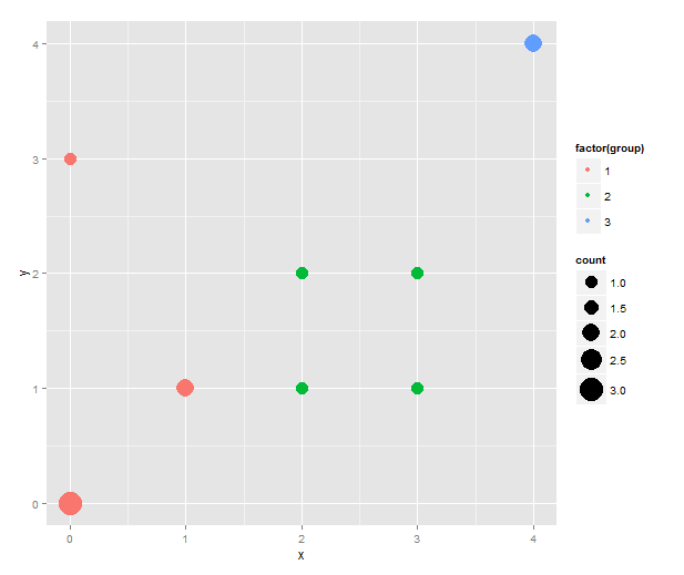
This is the first sizeplot. (The original scale makes single points very tiny. Hence the custom scale for size. Play with the range values to taste!) To add colour, we merge the counts with the original data to get back the group information — and, in true ggplot2 fashion, map the group variable to colour.

counts.and.groups <- merge(counts, unique(data))
sizeplot.colour <- qplot(x=x, y=y, size=count,
                         colour=factor(group), data=counts.and.groups) +
                     scale_size(range=c(5, 10))

sizeplot_2

One thing that this simple script does not handle well is if points that should have different colour happen to overlap. (As it stands, this code will actually plot two points both the size of the total number of overlapping points in different colours on top of each other. That must be wrong in several ways.) However, I don’t know what would be the best behaviour in this instance. Maybe to count the number of overlaps separately and plot both points while adding some transparency to the points?

Morning coffee: tables

(Note: ‘Morning coffee’ will be short musings about science-related topics.)

coffee

I don’t like tables. Or, more precisely: I don’t like tables that I have to read, but I love telling my computer to read tables for me. Tables made for human eyes tend to have certain features — I don’t know whether they really help facilitate human understanding, but people seem to think they do — such as merged cells or omission of repeated values, footnotes indicated by superscript symbols and sometimes colouring that conveys meaning. There is a conflict between keeping the number of columns small enough to be readable and putting in all the statistics that readers want. Someone might want the coefficient of determination while someone who of information theoretic persuasion wants the AIC. It is more convenient for the human reader to see the table close to the text, while the computer user would probably like it in a text file. Some journals do this almost right: right below the table there is a link to download it as comma separated values. I think ideally any data would be presented as a summary table — or even better a graph! — and the underlying computer-readable data would be the click of a link away.