In part I, we looked at importing data into R and simple ways to manipulate data frames. Once we’ve gotten our data safely into R, the first thing we want to do is probably to make some plots.
Below, we’ll make some simple plots of the made-up comb gnome data. If you want to play along, load the same file we used for part I.
data <- read.csv("comb_gnome_data.csv")
This table contains masses of 99 comb gnomes at four time points. Gnomes come in two varieties, and are divided into two groups with exposed to different treatment. Of course, I already know what kinds of effects and features are present in the data, since I generated them. However, please bear with me while we explore a little. The point is to show some useful things R can do for you.
4. Making simple plots with ggplot2
R is often used for graphics, with R plots gracing poster sessions all over the world with their presence. Base R can make pretty nice plots — mainly with the plot() function — but there are also several additional graphics packages. For this introduction, I will use ggplot2 by Hadley Wickham, because it’s my favourite and if you start learning one of them it might as well be ggplot2.
ggplot2 has a rather special syntax that allows a lot of fancy things, but for now we will stick to using the quick plot function, qplot(), which works pretty similar to base R graphics.
Before we can use the package, though, we need to install it. To install a package from CRAN (the comprehensive R archive network), simply give an install.packages() command:
install.packages("ggplot2")
A window opens (by the way, it is beyond me why R feels the need to open a window for this task, since it almost never does, but sure why not) that asks you to select a mirror. Choose the one closest to you. The package downloads, installs, and also installs some other packages that ggplot2 needs.
CRAN, by the way, contains binaries and source for lots and lots of packages. Bioinformatics packages, though, are usually installed through Bioconductor, which has its own system. Some packages live on R Forge, a community platform. You can also install packages manually. Remember though, R packages are software, so don’t just install unknown stuff.
We need to load a package to use it. The next time you use ggplot2, you only need to do this step:
library(ggplot2)
Let’s get on with it. This is how to quickly make a scatterplot, a boxplot and a histogram. The graphs will open in a new window, or in your plot if you’re using Rstudio.
qplot(x=mass0, y=mass50, data=data)

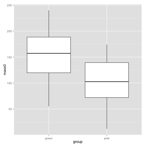
qplot(x=group, y=mass0, geom="boxplot", data=data)
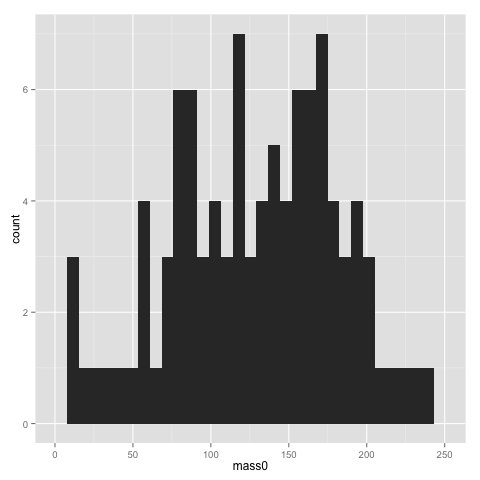
qplot(x=mass0, data=data)
The x and y parameters of course refer to the x and y axis of the graph. geom is the parameter for selecting a particular type of graph. See the ggplot2 documentation for all available geoms. If you don’t specify a geom, ggplot2 will guess it based on what types of variables you supply.
The width of bins of a histogram can be problematic — the histogram may look rather different with different bins. Putting a binwidth parameter in qplot() allows you to change the bins.
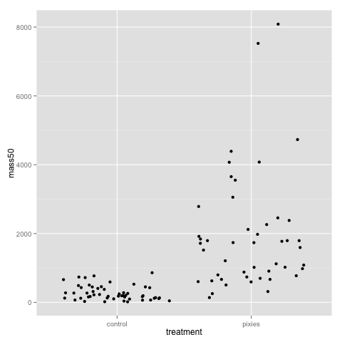
The above plots suggest that pink and green comb gnomes differ in weight at time 0. A nice alternative to the boxplot is the dotplot (jittered to reduce overplotting). We make one with mass at time 50 by treatment:
qplot(x=treatment, y=mass50, geom="jitter", data=data)

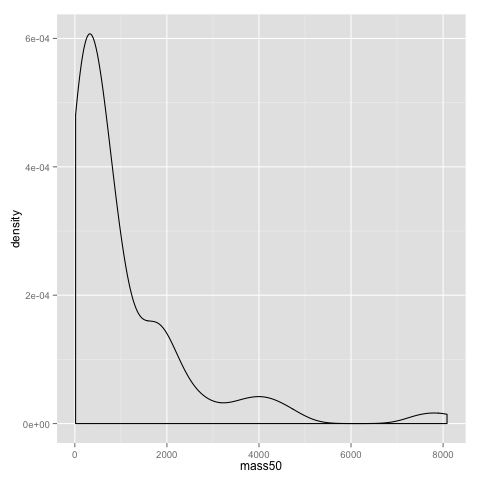
An alternative to the histogram is a density plot:
qplot(x=mass50, geom="density", data=data)

Both the dotplot and the density plot show that the distribution of comb gnome masses at time 50 is skewed to the left, with many individuals with low mass, and a few very heavy ones.
Some of the more useful parameters to qplot() are xlab, ylab, xlim, ylim, and main. They allow you to set the title of the graph (main), the x and y axis labels (xlab and ylab), and adjust the scales (xlim and ylim). In this example changing the scales make little sense, but it is sometimes useful. (These are the same parameters as you would use in the base R plot() fuction, by the way.)
qplot(x=mass0, y=mass50, data=data, xlim=c(0,350), ylim=c(0,10000), xlab="mass at birth", ylab="mass at age 50", main="Comb gnome mass")
Some style options are very easy to change, and can help visualising structure of data. Here, we use the colour of the dots for treatment, and the shape for group.
qplot(x=mass0, y=mass50, colour=treatment, shape=group, data=data)

This plot, as well as the above jittered dotplot makes it perfectly clear that there is a difference in growth between comb gnomes that are exposed to pixietails and those who are not, but also huge variation within the group of exposed comb gnomes. We can also discern the difference in initial mass between green and pink comb gnomes.
5. Reshaping data, and some more plots
Now, let’s take the opportunity to introduce another wonderful package by Hadley Wickham: reshape2. It is best described with an example. reshape2 should have been installed with ggplot2. Load it like so:
library(reshape2)
The reshape2 package centers around the concept of ‘melting’ and ‘casting’ a data frame (or array). First, recall the form our data frame is in:
head(data)
  group treatment  mass0    mass10   mass25    mass50    id
1 green control    180.9564 217.1795 285.5527  450.6075  1
2 green pixies     140.1157 279.0560 784.3293  4390.4606 2
3 green control    119.0070 125.7097 136.4782  156.5143  3
4 green pixies     220.7838 366.5834 784.2983  2786.0915 4
5 green pixies     210.7911 430.9156 1259.5120 7525.7961 5
6 green control    200.7478 249.3120 345.0496  593.0786  6
Then, look at this type of table:
head(melt(data))
  group treatment variable value
1 green control   mass0    180.9564
2 green pixies    mass0    140.1157
3 green control   mass0    119.0070
4 green pixies    mass0    220.7838
5 green pixies    mass0    210.7911
6 green control   mass0    200.7478
The second format is the what reshape2 and ggplot2 calls ‘melted’ — each row is one value with a few indicator variables (id variables) that tell you which groups a data point belongs to. The ‘variable’ column contains the name of the columns of data — in this case masses at time 0, 10, 25, and 50, as well as id, which reshape2 guessed is one of the data columns; we’ll have to fix that below — and ‘value’ their values.
Imagine making a multiple regression — this is a bit like the format you would want then. The value would be the response, and the id variables would be predictors. This is very useful not only for regression modelling, but also for plots. Look at this one for instance, that comes quite naturally once the data have been melted.
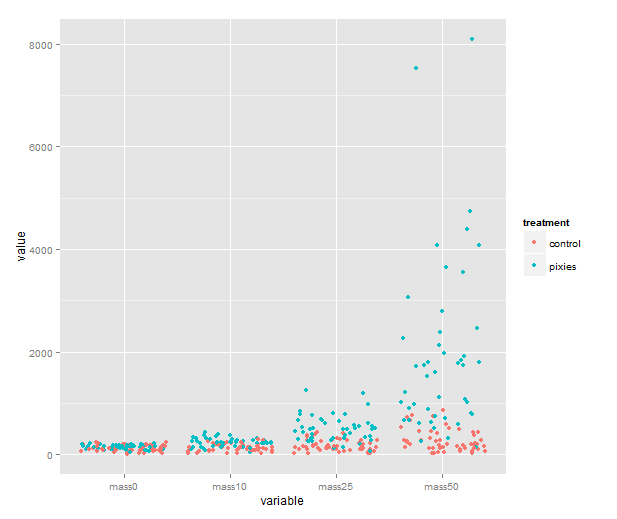
melted <- melt(data, id.vars=c("id", "group", "treatment"))
qplot(x=variable, y=value, color=treatment, geom="jitter", data=melted)
We could of course show them as boxplots instead, with geom=”boxplot”. If time was really a categorical variable with four levels, that would be great. I don’t know about you, however, but I would like to see individual growth trajectories of the comb gnomes. To accomplish this, we make a new column in the melted data frame.
melted$time <- 0
It’s about time to introduce the which() function. which() gives you the indices of the elements of a vector that satisfy some logical expression. We get the indices of elements that belong to mass10, mass25 and mass50 and use them to assign the proper number to those elements of the time column.
(Note the ”==” here, used to denote equality in logical expressions. The logical equals sign must be double, or bad things will happen — i.e. R will understand the expression as an assignment rather than a comparision.)
melted$time[which(melted$variable=="mass10")] <- 10

melted$time[which(melted$variable=="mass25")] <- 25

melted$time[which(melted$variable=="mass50")] <- 50
Since the comb gnome ids are numbers, R imported them as a numeric column. We will need the id column shortly, so let’s make sure it is treated as categorical:
melted$id <- factor(melted$id)
We’re almost there. Looking at previous plots, comb gnome growth looks a lot like an exponential function. So let’s try taking the natural logarithm. If you don’t want to change your data frame, functions can be applied in the qplot() call:
> qplot(x=time, y=log(value), geom=”line”, color=id, data=melted)

This is a busy plot, and the legend doesn’t help. You can remove it with the following line. (This is a taste of the finer details of ggplot2. Actually, the output of qplot() is an object that can be manipulated with the addition operator.)
qplot(x=time, y=log(value), geom="line", color=id, data=melted) + theme(legend.position="none")
Anyway, there seems to be method to the madness — the growth of each comb gnome appears roughly linear on a log scale.
We’re done with that for now. I hope this gave a taste of the usefulness of melting data. Even better, once you have melted data, you can ‘cast’ it into some other tabular format. This is particularly useful for data that are provided in a ‘melted’ format, when you really want a cross-table.
We do this with dcast(). The ‘d’ stands for data frame. (There is also an acast() for arrays.) dcast() needs a melted data frame and a formula, consisting of the variables you want in rows, a tilde ”~”, and the variables you want in columns. Try these:
head(dcast(melted, variable ~ id))

head(dcast(melted, id ~ variable))

head(dcast(melted, id + group + treatment ~ variable))
In cases where the variables on one side do not uniquely identify data points, you can use dcast() for data summaries, by choosing some appropriate aggregation function:
dcast(melted, group + treatment ~ variable, fun.aggregate=mean)

dcast(melted, group + treatment ~ variable, fun.aggregate=sum)
Overall, reshape2 can save you a lot of time and headache, even though it’s not always completely intuitive. It’s not something you will use every day, but keep it in mind when the problem arises.
6. Saving data
Before we move any further, let’s talk about saving data:
1. Saving graphics. Depending on what platform you work on, there will be different interface features to save the plot you’re looking at. In the windows R interface, you can right click to get a menu that allows you to copy the graph. On mac OS X, you can save the graph with an option in the menu bar. In RStudio, you can press the export button above the plot area. On windows and unix, you can write
savePlot(file="plot.png", type="png")
with several image types. See help file for details. On any platform, you can redirect the graphics from the screen to a file, run your plot commands and then send control back to the screen:
pdf("some_filename.pdf")

qplot(x=mass10, y=mass25, data=data)

dev.off()
2. Saving tables. If you have modified a data frame and want to save it to a file (for instance, you might like to use R to melt or cast a table for some other software that needs a particular format), you can use write.table() or write.csv().
write.csv(melted, file="melted_data.csv", row.names=F, quote=F)
3. Saving R objects. This is useful when you want to switch between scripts and sessions. Just write
save(data, melted, file="comb.gnome.data.Rdata")
to save the content of variables ”data” and ”melted”. You can list several variables or just one. If you want to continue with the next part, save the melted data to a file like that. When you reopen R, you can load them with:
load("comb.gnome.data.Rdata")
4. Saving the entire workspace. You can also save the entire contents of your workspace: all the variables you currently have assigned and the history of commands that you’ve given. But frankly, I don’t recommend it. Saving your workspace means that you can pick up exactly where you left off, but the workspace quickly turns into a mess of forgotten variables, and it’s very difficult to retrace the train of thought in an unannotated command history.
I much prefer saving selected variables on files, and making each analysis a self-contained script. In the next part, I’ll try to show you how. Now that we’ve covered a few useful thing one can do with R, it is time to have a look at how to organise R code into simple scripts, and introduce Sweave.