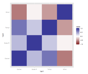
Apparently, this turned out to be my most popular post ever. Of course there are lots of things to say about the heatmap (or quilt, tile, guilt plot etc), but what I wrote was literally just a quick celebratory post to commemorate that I’d finally grasped how to combine reshape2 and ggplot2 to quickly make this colourful picture of a correlation matrix.
However, I realised there is one more thing that is really needed, even if just for the first quick plot one makes for oneself: a better scale. The default scale is not the best for correlations, which range from -1 to 1, because it’s hard to tell where zero is. We use the airquality dataset for illustration as it actually has some negative correlations. In ggplot2, it’s very easy to get a scale that has a midpoint and a different colour in each direction. It’s called scale_colour_gradient2, and we just need to add it. I also set the limits to -1 and 1, which doesn’t change the colour but fills out the legend for completeness. Done!
data <- airquality[,1:4]
library(ggplot2)
library(reshape2)
qplot(x=Var1, y=Var2, data=melt(cor(data, use="p")), fill=value, geom="tile") +
   scale_fill_gradient2(limits=c(-1, 1))

Pingback: Momento R do Dia – Motéis, Cinemas, Jogos e Capitanias Hereditárias | De Gustibus Non Est Disputandum
Fantastic. I love the conciseness of using melt and cor to calculate the correlation matrix. Here’s a version using geom_text to add labels:
This file contains hidden or bidirectional Unicode text that may be interpreted or compiled differently than what appears below. To review, open the file in an editor that reveals hidden Unicode characters.
Learn more about bidirectional Unicode characters
R CorPlot with labels.R
hosted with ❤ by GitHub
Thank you! I also really like the way plyr/reshape2/ggplot2 work together. (And I’m looking forward to playing with dplyr and ggvis.)