From my halftime seminar

A couple of weeks ago I presented my halftime seminar at IFM Biology, Linköping university. The halftime at our department isn’t a particularly dramatic event, but it means that after you’ve been going for two and a half years (since a typical Swedish PhD programme is four years plus 20% teaching to a total of five years), you get to talk about what you’ve been up to and discuss it with an invited opponent. I talked about combining genetic mapping and gene expression to search for quantitative trait genes for chicken domestication traits, and the work done so far particularly with relative comb mass. To give my esteemed readers an overview of what my project is about, here come a few of my slides about the mapping work — it is described in detail in Johnsson & al (2012). Yes, it does feel very good to write that — shout-outs to all the coauthors! This is part what I said on the seminar, part digression more suited for the blog format. Enjoy!

Slide04(Photo: Dominic Wright)

The common theme of my PhD project is genetic mapping and genetical genomics in an experimental intercross of wild and domestic chickens. The photo shows some of them as chicks. Since plumage colour is one of the things that segregate in this cross, their feathers actually make a very nice illustration of what is going on. We’re interested in traits that differ between wild and domestic chickens, so we use a cross based on a Red Jungefowl male and three domestic White Leghorn females. Their offspring have been mated with each other for several generations, giving rise to what is called an advanced intercross line. Genetic variants that cause differences between White Leghorn and Red Jungefowl chickens will segregate among the birds of the cross, and are mixed by recombination at meiosis. Some of the birds have the Red Junglefowl variant and some have the White Leghorn variant at a given part of their genome. By measuring traits that vary in the cross, and genotyping the birds for a map of genetic markers, we can find chromosomal chunks that are associated with particular traits, i.e. regions of the genome where we’re reasonably confident harbour a variant affecting the trait. These chromosomal chunks tend to be rather large, though, and contain several genes. My job is to use gene expression measurements from the cross to help zero in on the right genes.

The post continues below the fold! Fortsätt läsa

From Lisbon, part 2

ESEB 2013 is over. I’ve had a great time, met with a lot of cool people and actually coped reasonably well with the outdoor temperature. As a wimpy Swede, I find anything above 30 degrees Celsius rather unpleasant. There have been too many talks and posters to mention all the good stuff, but here are a few more highlights:

Trudy Mackay’s plenary on epistasis in quantitative traits in D. melanogaster: Starting with the Drosophila Genetic Reference Panel and moving on to the Flyland advanced intercross population, Mackay’s group found what appeared to be extensive epistasis in several quantitative traits. Robert Anholt spoke later the same day about similar results in olfactory behaviour. While most of the genetic variance on the population level is still effectively additive, there seems to be a lot of interaction at the level of gene action, and it hinders QTL detection. The variants that did show up appeared to be involved in common networks. Again, we ask ourself how big these networks are and how conserved they might be among different species.

How did all this epistasis come about then? Mackay’s answer is phenotypic buffering or canalisation (as we say in the Nordic countries: a beloved child has many names). That is, that the organism has a certain buffering capacity against mutations, and that the effect of many of them are only revealed on a certain genetic background where buffering has been broken. See their paper: Huang et al (2012). Mackay mentioned some examples in answer to a question: potentially damaging exonic mutations travelled together with compensatory mutations that possibly made them less damaging. It would be really fun to see an investigation of the molecular basis of some examples.

(Being a domestication genetics person, this immediately brings me to Belyaev’s hypothesis about domestication. Belyaev started the famousic farm fox domestation experiment, selecting foxes for reduced fear of humans. And pretty quickly, the foxes started to become in many respects similar to dogs. Belyaev’s hypothesis is that ‘destabilising selection’ for tameness changed some regulatory system (probably in the hypothalamus–pituitary–adrenal axis) that exposed other kinds of variation. I think it’s essentially a hypothesis about buffering.)

Laurent Excoffier about detecting recent polygenic adaptation in humans. Very impressive! The first part of the talk presented a Fst outlier test applied to whole pathways together instead of individual loci. This seems to me analogous to gene set enrichment tests that calculate some expression statistic on predefined gene sets, instead of calculating the statistic individually and then applying term enrichment tests. In both cases, the point is to detect more subtle changes on the pathway as a whole. As with many other enrichment methods, particularly in humans, it is not that obvious what to do next with the list of annotation terms. Even when the list makes good biological sense — really, is there a gene list that wouldn’t seem to make at least a bit of biological sense? The results do (again) imply epistasis in human immune traits, and that is something that could potentially be tested. Though it would be a heroic amount of work, I hope someone will use this kind of methods in some organism where it is actually possible to test the function and compare locally adapted populations.

Alison Wright’s talk on Z chromosome evolution. She works with Judith Mank, and I’ve heard a bit about it before, but sex chromosomes and the idea that you can trace the ‘strata’ of chromosome evolution are always fascinating. Wright also presented some interesting differences in the male hypermethylated region between birds with different mating systems.

William Jeffery on blind cavefish: I’ve been thinking for ages that I should blog about the blind cavefish (for popular/science and in Swedish, that is), because it’s such a beautiful example. The case for eye regression as an adaptive trait rather than just the loss of an unnecessary structure seems pretty convincing! Making an eye regress at the molecular level seems at once rather simple — removal of the lens (by apoptosis in the blind cavefish) seems to be all that is needed — and complex (it’s polygenic and apparently not achieved the same way in all blind cavefish populations).

Virpi Lummaa’s plenary about using parish records from preindustrial Finland to investigate hypotheses about reproduction, longevity and menopause. I heard about the Grandmother hypothesis ages ago, so I knew about it, but I didn’t know to what extent there was empirical support for it. Unfortunately, that many of the cases where I’ve heard a nice hypothesis but don’t know the empirical support turn out to be disappointments. Not this time, however! On top of all the good stuff in the talk, Lummaa had very pretty slides with old photos and paintings by Albert Edelfelt. The visual qualities were surpassed only by Rich FitzJohn’s slides.

Edelfelt_Larin_Paraske

(Larin Paraske by Albert Edelfelt)

Two things that were not so great:

The poster sessions. Now my poster session on Friday turned out very well for me, but many others weren’t so lucky. I don’t know why half of the posters were hung facing the wall with hardly enough space for people to walk by the poster board, but it was a terrible idea and must have stopped a lot of people from seeing more posters.

The gender balance. According to Julia Schroeder only 27% of invited speakers were women. I don’t know how it worked behind the scenes and what the instructions to symposium organisers were, and there might not be an easy fix, but this urgently needs fixing.

Of course, there were many more good talks and posters than the handful I’ve mentioned, and apart from them, the twitter feed and tweetup, the social gatherings and the fact that there were actually several interesting people that came to my poster to chat were highlights for me. I come home with a long list of papers to read and several pages of things to try. Good times!

lisbon

From Lisbon

Dear diary,

I’m at the Congress of the European Society for Evolutionary Biology in Lisbon. It’s great, of course and I expected nothing less, but there is so much of it! Every session at ESEB has nine symposia running in parallel, so there are many paths through the conference programme. Mine contains a lot of genomics for obvious reasons.

Some highlights so far:

Juliette de Meaux’s plenary: while talking about molecular basis of adaptations in Arabidopsis thaliana — one study based on a candidate gene and one on a large-effect QTL — de Meaux brought up two fun concepts that would recur in Thomas Mitchel-Olds’ talk and elsewhere:

1) The ‘mutational target’ and how many genes there are that could possibly be perturbed to change a trait in question. The size of the mutational target and the knowledge of the mechanisms underlying the trait of course affects whether it is fruitful to try any candidate gene approaches. My intuition is to be skeptical of candidate gene studies for complex traits, but as in the case of plant pathogen defense (or melanin synthesis for pigmentation — another example that got a lot of attention in several talks), if there is only one enzyme pathway to synthesise a compound and only one step that controls the rate of the reaction, there will be very few genes that can physically be altered to affect the trait.

2) Some of both de Meaux’s and Mitchel-Olds’ work exemplify the mapping of intermediate molecular phenotypes to get at small-effect variants for organismal traits — the idea being that while there might be many loci and large environmental effects on the organismal traits, they will act through different molecular intermediates and the intermediate traits will be simpler. The intermediate traits might be flagellin bindning, flux through an enzymatic pathway or maybe transcript abundance — this is a similar line of thinking as the motivations for using genetical genomics and eQTL mapping.

The ”Do QTN generally exist?” symposium: my favourite symposium so far. (Note: QTN stands for Quantitative Trait Nucleotide, and it means nothing more than a known causal sequence variant for some quantitative trait. Very few actual QTN featured in the session, so maybe it should’ve been called ”Do QTG generally exist?” Whatever.) I’ve heard both him and Annalise Paaby present their RNA inference experiments revealing cryptic genetic variation in C. elegans before, but Matt Rockman also talked about some conceptual points (”things we all know but sometimes forget” [I’m paraphrasing from memory]): adaptation does not require fixation; standing variation matters; effect-size is not an intrinsic feature of an allele. There was also a very memorable question at the end, asking whether the answer to the questions Rockman posed at the beginning, ”What number of loci contribute to adaptive evolution?” and ”What is the effect-size distribution?” should be ”any number of loci” and ”any distribution” … To which Rockman answered that those were pretty much his views.

In the same symposium, Luisa Pallares, showed some really nice genome wide association result for craniofacial morphology from natural hybrid mice. As someone who works on an experimental cross of animals, I found the idea very exciting, and of course I immediately started dreaming about hybrid genetical genomics.

Dieter Ebert’s plenary: how they with lots of work seem to have found actual live Red Queen dynamics with Daphnia magna and Pasteuria ramosa.

Larry Young and Hanna Kokko: Young and Kokko had two very different invited talks back to back in the sex role symposium, Young about the neurological basis of pair-bonding in the famous monogamous voles, and Kokko about models of evolution of some aspects of sex roles.

Susan Johnston‘s talk: about how heterozygote advantage maintains variation at a horn locus in the Soay sheep of St Kilda. Simply awesome presentation and results. Published yesterday!

On to our stuff! Dominic Wright had a talk presenting our chicken comb work in the QTN session, and on Friday I will have a poster on display about the behaviour side of the project. There’s actually quite a few of us from the AVIAN group here, most of them also presenting posters on Friday (Anna-Carin, Johan, Amir, Magnus, Hanne, Rie). And (though misspelled) my name is on the abstract of Per Jensen‘s talk as well, making this my personal record for conference contribution.

The poster sessions are very crowded and a lot of the posters are hung facing the wall with very little space for walking past, and some of them behind pillars. In all probability there’s a greater than 0.5 chance that my poster will be in a horrible spot. But if you happen to be curious feel free to grab me anywhere you see me, or tweet at me.

I looke like this when posing with statues or when I’m visibly troubled by the sunlight. If you’re into genetical genomics for QTG identification, domestication and that kind of stuff, this is the hairy beast you should talk too.

martin_eseb

Summer in the lab

Dear diary,

The best thing about summer in the lab is that one can blast the Sweeny Todd and Rocky Horror Picture Show soundtracks as loud as one pleases *. Blogging has been and will be a bit sparse, but I’m having a fun summer so far in the lab finishing up the lab work of my second slightly bigger project. We’re also working through our last paper that got some really knowledgeable, thorough, and quite critical review comments …

My halftime seminar will be in August. That’s a pretty scary thought. Well, the seminar itself is decidedly non-scary; it’s rather the fact that I’ve been going for two and a half years. I’m tempted to write it up as a blog post, but I think I’ll wait and write something when the next paper comes out!

Also, I’m attending the Congress of the European Society for Evolutionary Biology in Lisbon in August. If you’re there, stop by my poster for domestication genomics goodness and to say hello to me and my crocheted chicken mascot!

anna_hona

(Made and photographed by Anna Nygren.)

*) That is, I’m not alone here, but everyone here this week has good taste.

Using R: Two plots of principal component analysis

PCA is a very common method for exploration and reduction of high-dimensional data. It works by making linear combinations of the variables that are orthogonal, and is thus a way to change basis to better see patterns in data. You either do spectral decomposition of the correlation matrix or singular value decomposition of the data matrix and get linear combinations that are called principal components, where the weights of each original variable in the principal component are called loadings and the transformed data are called scores. Spurred by this question, I thought I’d share my favourite PCA plots. Of course, this example uses R and ggplot2, but you could use anything you like.

First, let us generate some nonsense data — 50 samples and 70 variables in groups of ten. Variables in the same group are related, and there is relationship between values of the variables and sample group numbers. I didn’t worry too much about the features of the data, except I wanted some patterns and quite a bit of noise. The first principal component explains approximately 20% of the variance.

sample.groups <- c(rep(1, 10), rep(2, 10), rep(3, 10),
  rep(4, 10), rep(5, 10))
variable.groups <- c(rep(1, 10), rep(2, 10), rep(3, 10),
  rep(4, 10), rep(5, 10), rep(6, 10),
  rep(7, 10))

data <- matrix(nrow=length(sample.groups), ncol=70)
base.data <- matrix(nrow=length(sample.groups), ncol=7)

for (j in 1:ncol(base.data)) {
  mu <- rnorm(1, 0, 4)
  sigma <- runif(1, 5, 10)
  base.data[,j] <- sample.groups*mu +
  rnorm(length(sample.groups), 0, sigma)
}

for (j in 1:ncol(data)) {
  mu <- runif(1, 0, 4)
  data[,j] <- base.data[,variable.groups[j]] +
  rnorm(length(sample.groups), mu, 10)
}

Here is the typical correlation heatmap of the variables:

pca_heatmap

heatmap <- qplot(x=Var1, y=Var2, data=melt(cor(data)), geom="tile",
fill=value)

Maybe what we want to know is what variables go together, and if we can use a few of the principal components to capture some aspect of the data. So we want to know which variables have high loading in which principal components. I think that small multiples of barplots (or dotplots) of the first few principal components does this pretty well:

library(reshape2)
library(ggplot2)

pca <- prcomp(data, scale=T)
melted <- cbind(variable.group, melt(pca$rotation[,1:9]))

barplot <- ggplot(data=melted) +
  geom_bar(aes(x=Var1, y=value, fill=variable.group), stat="identity") +
  facet_wrap(~Var2)

pca_barplot

As usual, I haven’t put that much effort into the look. If you were to publish this plot, you’d probably want to use something other than ggplot2 defaults, and give your axes sensible names. In cases where we don’t have a priori variable groupings we can just omit the fill colour. Maybe sorting the bars by loading could be useful to quickly identify the most influential variables.

In other applications we’re more interested in graphically looking for similarities between samples, and then we have more use for the scores. For instance, in genetics a scatterplot of the first principal components is typically used to show for patterns of genetic similarity between individuals drawn from different populations. This is a component of the so-called biplot.

scores <- data.frame(sample.groups, pca$x[,1:3])
pc1.2 <- qplot(x=PC1, y=PC2, data=scores, colour=factor(sample.groups)) +
  theme(legend.position="none")
pc1.3 <- qplot(x=PC1, y=PC3, data=scores, colour=factor(sample.groups)) +
  theme(legend.position="none")
pc2.3 <- qplot(x=PC2, y=PC3, data=scores, colour=factor(sample.groups)) +
  theme(legend.position="none")

pca_scatterplots

In this case, small multiples are not as easily made with facets, but I used the multiplot function by Winston Chang.

Slides and exercise from my second R intro seminar

This week I held the second introductory seminar on R, and I think it went pretty well — though I guess you really should ask my colleagues if you want to know. The first seminar was a lecture, and this seminar was a tutorial where we made some plots and calculated a few of the usual statistics. Of course the only real way to learn R is to play with it, but I hope this couple of hours provided a decent opening to getting started with R.

I actually think RStudio made it quite a bit easier. One important thing that I certainly should’ve stressed more, though, is organising code into scripts. I mentioned it in the first seminar, but I should have included it into the exercise. Maybe the first section should be something like ”Start a new script file for your analysis: Select File > New > R script to open the editor area. Save the script as unicorn_analysis.R, and for the rest of the tutorial, write your code in that window.”

Files from the seminar:

Slides about common statistical functions in R (again, ugly walls of text meant more as notes for future reference than actual slides)

Exercises for the tutorial and the associated dataset

My suggested solutions to the exercises

Slides from my R intro seminar

Here are my slides from a short introductory seminar on R (essentially going through part I of the R tutorial) last week. As magic lantern pictures go, they’re hideously ugly, but they were mostly there for future reference. Most of the seminar was spent showing RStudio. This Friday, we’ll practice some uses of qplot and make some linear models.

(I took out the Modern Major-General quote from the presentation, but you can enjoy him here instead. Don’t ask.)

From Uppsala

On a personal note, I had a great time at the Genetics of Adaptations symposium in Uppsala last Saturday. Pretty much everything was interesting, and I particularly enjoyed the following:

  • Bruce Walsh himself explaining G-matrices and how they can put constraints on evolution. The G-matrix is one of those things I’d very much like to understand, and listening to someone like Bruce Walsh certainly helps. (See e.g. this paper by Walsh & Blows)
  • Matt Rockman talked about some serious QTN work on awesomley weird phenotypes: worms depositing copulatory plugs on each other’s and their own heads. (See e.g. Palopoli et al.)
  • Saunak Sen spoke about mapping of function-valued traits, probably the most interesting talk to me. He concentrated on traits that are functions of one variable, namely time. (See Xiong et al.) However the most interesting to me (as a gene expression enthusiast) would be traits that are, as he put it, ”massively multivariate”, like eQTL data. In that case, there’s not really an obvious analogue of time, i.e. something that the values from one individual are a function of. I eagerly await what people might come up with in that regard.

It was a really fun time, and Uppsala is always nice. I’ll have to make sure to be there when the evolution museum is open some time. I always get the feeling that I should be better at, you know, networking at these things, but I had a couple of interesting conversations about making sense of gene expression results (incidentally, something that I’m very likely to blog about in the near future).

A slightly different introduction to R, part IV

Now, after reading in data, making plots and organising commands with scripts and Sweave, we’re ready to do some numerical data analysis. If you’re following this introduction, you’ve probably been waiting for this moment, but I really think it’s a good idea to start with graphics and scripting before statistical calculations.

We’ll use the silly comb gnome dataset again. If you saved an Rdata file in part II, you can load it with

load("comb_gnome_data.Rdata")

If not, you can run this. Remind yourself what the changes to the melted data mean:

data <- read.csv("comb_gnome_data.csv")
library(reshape2)
melted <- melt(data, id.vars=c("id", "group", "treatment"))
melted$time <- 0
melted$time[which(melted$variable=="mass10"] <- 10
melted$time[which(melted$variable=="mass25")] <- 25
melted$time[which(melted$variable=="mass50")] <- 50
melted$id <- factor(melted$id)

We’ve already looked at some plots and figured out that there looks to be substantial differences in mass between the green and pink groups, and the control versus treatment. Let’s try to substantiate that with some statistics.

9. Mean and covariance

Just like anything in R, statistical tools are functions. Some of them come in special packages, but base R can do a lot of stuff out of the box.

Comparsion of two means: We’ve already gotten means from the mean() function and from summary(). Variance and standard deviation are calculated with var() and sd() respectively. Comparing the means betweeen two groups with a t-test or a Wilcoxon-Mann-Whitney test is done with t.test() and wilcox.test(). The functions have the word test in their names, but t-test gives not only the test statistics and p-values, but also estimates and confidence intervals. The parameters are two vectors of values of each group (i.e. a column from the subset of a data frame), and some options.

Looking back at this plot, I guess no-one is surprised by a difference in birthweigh between pink and green comb gnomes:

plot2

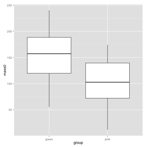
t.test(subset(data, group=="pink")$mass0, subset(data, group=="green")$mass0)
	Welch Two Sample t-test

data:  subset(data, group == "pink")$mass0 and subset(data, group == "green")$mass0 
t = -5.397, df = 96.821, p-value = 4.814e-07
alternative hypothesis: true difference in means is not equal to 0 
95 percent confidence interval:
 -69.69294 -32.21577 
sample estimates:
mean of x mean of y 
 102.3755  153.3298

That is, we feed in two pieces of data (two vectors, really, which is what you get pulling out a column from a data frame). The above is the typical situation when you have all data points in one column and a group indicator in another. Hence you begin by subsetting the data frame to get the right rows, and pull out the right columns with the $. t.test also does paired tests, with the additional parameter paired=T.

wilcox.test(subset(data, group=="pink")$mass50, subset(data, group=="green")$mass50)
	Wilcoxon rank sum test with continuity correction

data:  subset(data, group == "pink")$mass50 and subset(data, group == "green")$mass50 
W = 605, p-value = 1.454e-05
alternative hypothesis: true location shift is not equal to 0

Recalling histograms for the comb gnome weights, the use of the Wilcoxon-Mann-Whitney for masses at tim 50 and a t-test for the masses at birth (t=0) probably makes sense. However, we probably want to make use of all the time points together rather than doing a test for each time point, and we also want to deal with both the colour and the treatment at the same time.

Before we get there, let’s look at correlation:

cor(data$mass10, data$mass25)
cor(data$mass0, data$mass50, method="spearman")
cor.test(data$mass10, data$mass25)

The cor() function gives you correlation coefficients, both Pearson, Spearman and Kendall. If you want the covariance, cov() is the function for that. cor.test() does associated tests and confidence intervals. One thing to keep in mind is missing values. This data set is complete, but try this:

some.missing <- data$mass0
some.missing[c(10, 20, 30, 40:50)] <- NA
cor(some.missing, data$mass25)
cor(some.missing, data$mass10, use="pairwise")

The use parameter decides what values R should include. The default is all, but we can choose pairwise complete observations instead.

If you have a big table of variables that you’d like to correlate with each other, the cor() function works for them as well. (Not cor.test(), though. However, the function can be applied across the rows of a data frame. We’ll return to that.)

10. A couple of simple linear models

Honestly, most of the statistics in biology is simply linear models fit with least squares and tested with a normal error model. A linear model looks like this

yi = b0 + b1x1i + b2x2i + … bnxni + ei

where y is the response variable, the xs are predictors, i is an index over the data points, and ei are the errors. The error is the only part of the equations that is a random variable. b0, …, bn are the coefficients — your main result, showing how the mean difference in the response variable between data points with different values of the predictors. The coefficients are fit by least squares, and by estimating the variance of the error term, we can get some idea of the uncertainty in the coefficients.

Regression coefficients can be interpreted as predictions about future values or sometimes even as causal claims (depending on other assumptions), but basically, they describe differences in mean values.

This is not a text on linear regression — there are many of those; may I suggest the books by Faraway or Gelman and Hill — suffice to say that as long as the errors are independent and have equal variance, least squares is the best unbiased estimate. If we also assume that the errors are normally distributed, the least squares is also the maximum likelihood estimate. (And it’s essentially the same as a Bayesian version of the linear model with vague priors, just for the record.)

In R, the lm() function handles linear models. The model is entered as a formula of the type response ~ predictor + predictor * interacting predictors. The error is implicit, and assumed to be normally distributed.

model <- lm(mass0 ~ group + treatment, data=data)
summary(model)
Call:
lm(formula = mass0 ~ group + treatment, data = data)

Residuals:
    Min      1Q  Median      3Q     Max 
-86.220 -32.366  -2.847  35.445  98.417 

Coefficients:
                Estimate Std. Error t value Pr(>|t|)    
(Intercept)      141.568      7.931  17.850  < 2e-16 ***
grouppink        -49.754      9.193  -5.412 4.57e-07 ***
treatmentpixies   23.524      9.204   2.556   0.0122 *  
---
Signif. codes:  0 ‘***’ 0.001 ‘**’ 0.01 ‘*’ 0.05 ‘.’ 0.1 ‘ ’ 1 

Residual standard error: 45.67 on 96 degrees of freedom
Multiple R-squared:  0.28,    Adjusted R-squared: 0.265 
F-statistic: 18.67 on 2 and 96 DF,  p-value: 1.418e-07

The summary gives the coefficients, their standard errors, the p-value of a t-test of the regression coefficient, and R squared for the model. Factors are encoded as dummy variables, and R has picked the green group and the control treatment as baseline so the coefficient ”grouppink” describes how the mean of the pink group differs from the green. Here are the corresponding confidence intervals:

confint(model)
                     2.5 %    97.5 %
(Intercept)     125.825271 157.31015
grouppink       -68.001759 -31.50652
treatmentpixies   5.254271  41.79428

(These confidence intervals are not adjusted to control the family-wise error rate, though.) With only two factors, the above table is not that hard to read, but let’s show a graphical summary. Jared Lander’s coefplot gives us a summary of the coefficients:

install.packages("coefplot") ##only the first time
library(coefplot)
coefplot(model)

statplot3

The bars are 2 standard deviations. This kind of plot gives us a quick look at the coefficients, and whether they are far from zero (and therefore statistically significant). It is probably more useful for models with many coefficients.

There is a bunch of diagnostic plots that you can make to check for gross violations of the above assumptions of the linear model. Two useful ones are the normal quantile-quantile plot of residuals, and the residuals versus fitted scatterplot:

library(ggplot2)
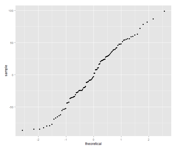
qplot(sample=residuals(model), stat="qq")

statplot1

The quantile plot compares the distribution of the residual to the quantiles of a normal distribution — if the residuals are normally distributed it will be a straight line.

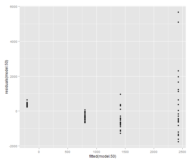
qplot(fitted(model), residuals(model))

statplot2

Variance should be roughly equal fitted values, and there should not be obvious patterns in the data.

If these plots look terrible, a common approach is to try to find a transformation of the data that allows the linear model to be used anyway. For instance, it often helps to take the logarithm of the response variable. Why is that so useful? Well, with some algebraic magic:

log(yi) = b0 + b1x1i + b2x2i + … + bnxni + ei, and as long as no y:s are zero,

yi = exp(b0) * exp(b1x1i) * exp(b2x2i) * .. * exp(bnxni) * exp(ei)

We have gone from a linear model to a model where the b:s and x:es multiplied together. For some types of data, this will stabilise the variance of the errors, and make the distribution closer to a normal distribution. It’s by no means a panacea, but in the comb gnome case, I hope the plots we made in part II have already convinced you that an exponential function might be involved.

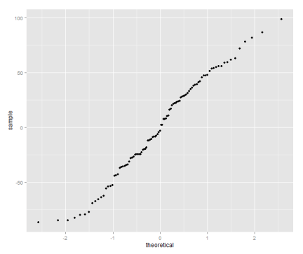
Let’s look at a model where these plots look truly terrible: the weight at time 50.

model.50 <- lm(mass50 ~ group + treatment, data=data)
qplot(sample=residuals(model.50), stat="qq")
qplot(fitted(model.50), residuals(model.50))

statplot4

statplot5

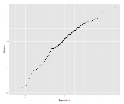
Let’s try the log transform:

model.log.50 <- lm(log(mass50) ~ group + treatment, data=data)
qplot(sample=residuals(model.log.50), stat="qq")
qplot(fitted(model.log.50), residuals(model.log.50))
coefplot(model.log.50)

statplot6

statplot7

coefplot_log50

In both the above models both predictors are categorical. When dealing with categorical predictors, you might prefer the analysis of variance formalism. Anova is the same kind of linear model as regression (but sometimes parameterised slightly differently), followed by F-tests to check whether each predictor explains a significant amount of the variance in the response variable. In all the above models, the categorical variables only have two levels each, so interpretation is easy by just looking a coefficients. When you get to bigger models with lots of levels, F-tests let you test the effect of a ‘batch’ of coefficients corresponding to a variable. To see the (type II, meaning that we test each variable against the model including all other variables) Anova table for a linear model in R, do this:

comb.gnome.anova <- aov(log(mass50) ~ group + treatment, data=data)
drop1(comb.gnome.anova)
Single term deletions

Model:
log(mass50) ~ group + treatment
          Df Sum of Sq     RSS     AIC F value    Pr(>F)    
<none>                  47.005 -67.742                      
group      1    30.192  77.197 -20.627  61.662 5.821e-12 ***
treatment  1    90.759 137.764  36.712 185.361 < 2.2e-16 ***
---
Signif. codes:  0 ‘***’ 0.001 ‘**’ 0.01 ‘*’ 0.05 ‘.’ 0.1 ‘ ’ 1

More Haskell: a bootstrap

So my playing around with Haskell goes on. You can follow the progress of the little bootstrap exercise on github. Now it’s gotten to the point where it actually does a bootstrap interval for the mean of a sample. Consider the following R script:

n <- 100
fake.data <- data.frame(group=rep(1, n), data=rpois(n, 10))
write.table(fake.data, quote=F, row.names=F, col.names=F,
            sep=",", file="fake_data.csv")

library(plyr)
bootstrap.replicates <- llply(vector("list", 100),
                              sample, x=fake.data$data,
                              replace=T, size=n)
bootstrap.means <- unlist(llply(bootstrap.replicates, mean))
print(mean(fake.data$data))
print(quantile(bootstrap.means, c(0.025, 0.975)))
[1] 10.31
    2.5%    97.5% 
 9.72475 10.85200

So, that was a simple bootstrap in R: we get some draws from a Poisson distribution, sample 100 times from the data with replacement, and summarise the replicates.  This is my Haskell thing running in GHCi:

*Main> main
"boot"
"will eventually bootstrap, if martin knows his stuff"
fake_data.csv
[8,6,11,16,5,11,12,12,7,9,13,13,12,7,13,7,7,11,9,14,14,13,10,14,17,12,8,
10,15,12,13,13,7,10,9,6,7,8,10,12,10,10,10,12,11,8,16,12,13,13,12,15,7,
7,8,9,5,7,13,10,12,11,8,6,12,14,12,14,6,9,10,9,10,6,9,7,6,12,13,7,11,7,
13,15,10,10,9,12,12,6,10,6,8,10,13,8,9,13,12,13]
10.31
(9.8,10.83)

It’s certainly not the prettiest thing in the world (for one thing, it will crash if there is an extra line break at the end of the file). Next stop: type declarations! Haskell will infer the types for me, but it is probably a good idea to declare the intended types. Or at least to be able to do so is. Then the plan is to make some use of the first column in the data file, i.e. group the sample belongs to, to add a second sample and make a comparison between the means. And then it’s pretty much done and maybe I’ll move on to something more useful. I’m thinking that implementing least squares linear models would be a decent exercise?