”It depends on what you want to do with it”

Note to self: ”It depends on what you want to do with it” is the stereotypical answer to questions about method and data analysis. Ask what genetic analysis software you should use to do X, how you should filter the variants you’ve detected from sequencing, whether to mark duplicates on your aligned reads, what a genetic parameter estimate means … I just wrote a version of this answer in an email. Mea maxima culpa.

Admittedly, it is probably often the technically correct answer, but it’s also useless without qualification. It always depends. Everything is everything-dependent. Goddag yxskaft. Moreover, I suspect that it often means ”I don’t know” or ”it doesn’t matter” — but you can’t say that, can you? That would sound unprofessional.

Here is what to ask either the supposed expert who blurted out this non-answer, or yourself if you are about to: What are the alternatives? A couple will do to give an idea of what the field of solutions and answers is like. What does it depend on? An idea of why one want to choose one alternative over the other will do. What do we need to know? Sometimes we need preliminary data, a huge modelling effort … or just that I go read some papers before I say anything more.

A plot of genes on chromosomes

Marta Cifuentes and Wayne Crismani asked on Twitter if there is a web tool similar to the Arabidopsis Chromosome Map Tool that makes figures of genes on chromosomes for humans. This will not really be an answer to the question — not a web tool, not conveniently packaged — but I thought that would be a nice plot to make in R with ggplot2. We will use the ggrepel package to help with labelling, and get information from the Ensembl REST API with httr and jsonlite.

The plot and the final code to generate it

Below I will go through the functions that get us there, but here is the end product. The code is on GitHub as usual.

## Some Ensembl genes to test with

ensembl_genes <- c("ENSG00000125845", ## BMP2
                   "ENSG00000181690", ## PLAG1
                   "ENSG00000177508", ## IRX3
                   "ENSG00000140718") ## FTO

chr_sizes <- get_chromosome_sizes_from_ensembl(species = "homo_sapiens")

coords <- get_coordinates_from_ensembl(ensembl_genes)

plot_genes_test <- plot_genes(coords,
                              chr_sizes)

We will use Ensembl and access the genes via Ensembl Gene IDs. Here, I’ve looked up the Ensembl Gene IDs for four genes I like (in humans).

We need to know how long human chromosomes are in order to plot them, so we have a function for that; we also need to get coordinates for the genes, and we have a function for that. They are both below. These functions call up the Ensembl REST API to get the data from the Ensembl database.

Finally, there is a plotting function that takes the coordinates and the chromosome sizes as input and return a ggplot2 plot.

Getting the data out of the Ensembl REST API

Now, starting from the top, we will need to define those functions to interact with the Ensembl REST API. This marvellous machine allows us to get data out of the Ensembl database over HTTP, writing our questions in the URL. It is nicely described with examples from multiple languages on the Ensembl REST API website.

An alternative to using the REST API would be to download gene locations from BioMart. This was my first thought. BioMart is more familiar to me than the REST API, and it also has the nice benefit that it is easy to download every gene and store it away for the future. However, there isn’t a nice way to get chromosome lengths from BioMart, so we would have to download them from somewhere else. This is isn’t hard, but I thought using the REST API for both tasks seemed nicer.

## Plot showing the location of a few genomes on chromosomes

library(httr)
library(jsonlite)
library(ggplot2)
library(ggrepel)
library(purrr)

## Get an endpoint from the Ensembl REST api and return parsed JSON

get_from_rest_api <- function(endpoint_string,
                              server = "https://rest.ensembl.org/") {
  rest <- GET(paste(server, endpoint_string, sep = ""),
              content_type("application/json"))
  
  stop_for_status(rest)
  
  fromJSON(toJSON(content(rest)))
}

This first function gets content by sending a request, checking whether it worked (and stopping with an error if it didn’t), and then unpacking the content into an R object.

## Get chromosomes sizes from the Ensembl REST API

get_chromosome_sizes_from_ensembl <- function(species) {

  json <- get_from_rest_api(paste("info/assembly/", species, sep = ""))

  data.frame(name = as.character(json$top_level_region$name),
             length = as.numeric(json$top_level_region$length),
             stringsAsFactors = FALSE)
}

This second function asks for the genome assembly information for a particular species with the GET info/assembly/:species endpoint, and extracts the chromosome lengths into a data frame. The first part of data gathering is done, now we just need the coordinates fort the genes of interest.

## Get coordinates from Ensembl ids

get_coordinates_from_ensembl <- function(ensembl_ids) {
 
  map_dfr(ensembl_ids,
          function(ei) {
            json <- get_from_rest_api(paste("lookup/id/", ei, sep = ""))
            
            data.frame(position = (json$start + json$end)/2,
                       chr = json$seq_region_name,
                       display_name = json$display_name,
                       stringsAsFactors = FALSE)
          })
}

This function asks for the gene information for each gene ID we’ve given it with the GET lookup/id/:id endpoint, and extracts the rough position (mean of start and end coordinate), chromosome name, and the ”display name”, which in the human case will be a gene symbol. (For genes that don’t have a gene symbol, we would need to set up this column ourselves.)

At this point, we have the data we need in two data frames. That means it’s time to make the plot.

Plotting code

We will build a plot with two layers: first the chromosomes (as a geom_linerange) and then the gene locations (as a geom_text_repel from the ggrepel package). The text layer will move the labels around so that they don’t overlap even when the genes are close to each other, and by setting the nudge_x argument we can move them to the side of the chromosomes.

Apart from that, we change the scale to set he order of chromosomes and reverse the scale of the y-axis so that chromosomes start at the top of the plot.

The function returns a ggplot2 plot object, so one can do some further customisation after the fact — but for some features one would have to re-write things inside the function.

plot_genes <- function(coordinates,
                       chromosome_sizes) {

  ## Restrict to chromosomes that are in data  
  chrs_in_data <-
    chromosome_sizes[chromosome_sizes$name %in% coordinates$chr,]
  chr_order <- order(as.numeric(chrs_in_data$name))
  
  ggplot() +
    geom_linerange(aes(x = name,
                       ymin = 1,
                       ymax = length/1e6),
                   size = 2,
                   colour = "grey",
                   data = chrs_in_data) +
    geom_text_repel(aes(x = chr,
                        y = position/1e6,
                        label = display_name),
                    nudge_x = 0.33,
                    data = coordinates) +
    scale_y_reverse() +
    ## Fix ordering of chromosomes on x-axis
    scale_x_discrete(limits = chrs_in_data$name[chr_order],
                     labels = chrs_in_data$name[chr_order]) +
    theme_bw() +
    theme(panel.grid = element_blank()) +
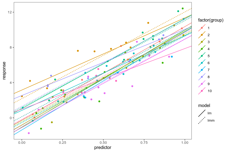
    xlab("Chromosome") +
    ylab("Position (Mbp)")
  
}

Possible extensions

One feature from the Arabidopsis inspiration that is missing here is the position of centromeres. We should be able to use the option ?bands=1 in the GET info/assembly/:species to get cytogenetic band information and separate p and q arms of chromosomes. This will not be universal though, i.e. not available for most species I care about.

Except to make cartoons of gene positions, I think this might be a nice way to make plots of genome regions with very course resolution, i.e. linkage mapping results, where one could add lines to show genomic confidence intervals, for example.

Journal club of one: ”A unifying concept of animal breeding programmes”

The developers of the MoBPS breeding programme simulators have published three papers about it over the last years: one about the MoBPS R package (Pook et al. 2020), one about their web server MoBPSweb (Pook et al. 2021), and one that discusses the logic of the specification for breeding programmes they use in the web interface (Simianer et al. 2021). The idea is that this specification can be used to describe breeding programmes in a precise and interoperable manner. The latter — about breeding programme specification — reads as if the authors had a jolly good time thinking about what breeding and breeding programmes are; at least, I had such feelings while reading it. It is accompanied by an editorial by Simianer (2021) talking about what he thinks are the important research directions for animal breeding research. Using simulation to aid breeding programme design is one of them.

Defining and specifying breeding programmes

After defining a breeding programme in a narrow genetic sense as a process achieving genetic change (more about that later), Simianer et al. (2021) go on to define a specification of such a breeding programme — or more precisely, of a model of a breeding programme. They use the word ”definition” for both things, but they really talk about two different things: defining what ”a breeding programme” is and specifying a particular model of a particular breeding programme.

Here, I think it is helpful to think of Guest & Martin’s (2020) distinction, borrowed from psychology, between a specification of a model and an implementation of a model. A specification is a description of a model based in natural language or math. Breeding programme modelling often takes the shape of software packages, where the software implementation is the model and a specification is quite vague. Simianer et al. (2021) can be seen as a step towards a way of writing specifications, on a higher level in Guest & Martin’s hierarchy, of what such a breeding programme model should achieve.

They argue that such a specification (”formal description”) needs to be comprehensive, unambiguous and reproducible. They claim that this can be achieved with two parts: the breeding environment and the breeding structure.

The breeding environment includes:

  • founder populations,
  • quantitative genetic parameters for traits,
  • genetic architectures for traits,
  • economic values for traits in breeding goal,
  • description of genomic information,
  • description of breeding value estimation methods.

Thus, the ”formal” specification depends on a lot of information that is either unknowable in practice (genetic architecture), estimated with error (genetic parameters), hard to describe other than qualitatively (founder population) and dependent on particular software implementations and procedures (breeding value estimation). This illustrates the need to distinguish the map from the territory — to the extent that the specification is exact, it describes a model of a breeding programme, not a real breeding programme.

The other part of their specification is the graph-based model of breeding structure. I think this is their key new idea. The breeding structure, in their specification, consists of nodes that represent groups of elementary objects (I would say ”populations”) and edges that represent transformations that create new populations (such as selection or mating) or are a shorthand for repeating groups of edges and nodes.

The elementary objects could be individuals, but they also give the example of gametes and genes (I presume they mean in the sense of alleles) as possible elementary objects. One could also imagine groups of genetically identical individuals (”genotypes” in a plant breeding sense). Nodes contain a given number of individuals, and can also have a duration.

Edges are directed, and correspond to processes such as ageing, selection, reproduction, splitting or merging populations. They will carry attributes related to the transformation. Edges can have a time associated with them that it takes for the transformation to happen (e.g. for animals to gestate or grow to a particular age). Here is an example from Pook et al. (2021) of a breeding structure graph for dairy cattle:

If we ignore the red edges for now, we can follow the flow of reproduction (yellow edges) and selection (green edges): The part on the left is what is going on in the breeding company: cows (BC-Cows) reproduce with selected bulls (BC-SelectedBulls), and their offspring become the next generation of breeding company cows and bulls (BC-NextCows and BC-NextBulls). On the right is the operation of a farm, where semen from the breeding company is used to inseminate cows and heifers (heifer, cow-L1, cow-L2, cow-L3) to produce calfs (calf-h, calf-L1, calf-L2, calf-L3). Each cycle each of these groups, through a selection operation, give rise to the next group (heifers becoming cows, first lactation cows becoming second lactation cows etc).

Breeding loops vs breeding graphs vs breeding forms

Except for the edges that specify breeding operations, there is also a special meta-edge type, the repeat edge, that is used to simplify breeding graphs with repeated operations.

A useful edge class to describe breeding programmes that are composed of several breeding cycles is ”repeat.” It can be used to copy resulting nodes from one breeding cycle into the nodes of origin of the next cycle, assuming that exactly the same breeding activities are to be repeated in each cycle. The “repeat” edge has the attribute “number of repeats” which allows to determine the desired number of cycles.

In the MoBPSweb paper (Pook et al. 2020), they describe how it is implemented in MoBPS: Given a breeding specification in MoBPSweb JSON format, the simulator will generate a directed graph by copying the nodes on the breeding cycle as many times as is specified by the repeat number. In this way, repeat edges are eliminated to make the breeding graph acyclic.

The conversion of the breeding scheme itself is done by first detecting if the breeding scheme has any “Repeat” edges (Simianer et al. 2020), which are used to indicate that a given part of the breeding programme is carried out multiple times (breeding cycles). If that is the case, it will subsequently check which nodes can be generated without the use of any repeat. Next, all repeats that can be executed based on the already available nodes are executed by generating copies of all nodes between the node of origin and the target node of the repeat (including the node of origin and excluding the target node). Nodes generated via repeat are serial-numbered via “_1,” “_2” etc. to indicate the repeat number. This procedure is repeated until all repeat edges are resolved, leading to a breeding programme without any repeats remaining.

There are at least three ways to specify the breeding structures for breeding programme simulations: these breeding graphs, breeding loops (or more generally, specifying breeding in a programming language) and breeding forms (when you get a pre-defined breeding structure and are allowed fill in the numbers).

If I’m going to compare the graph specification to what I’m more familiar with, this is how you would create a breeding structure in AlphaSimR:

library(AlphaSimR)

## Breeding environment

founderpop <- runMacs(nInd = 100,
                      nChr = 20)
simparam <- SimParam$new(founderpop)
simparam$setSexes("yes_sys")
simparam$addTraitA(nQtlPerChr = 100)
simparam$setVarE(h2 = 0.3)

## Breeding structure

n_time_steps <- 10

populations <- vector(mode = "list",
                      length = n_time_steps + 1)

populations[[1]] <- newPop(founderpop,
                           simParam = simparam)

for (gen_ix in 2:(n_time_steps + 1)) {

  ## Breeding cycle happens here

}

In the AlphaSimR script, the action typically happens within the loop. You apply different functions on population objects to make your selection, move individuals between parts of the breeding programme, create offspring etc. That is, in the MoBPS breeding structure, populations are nodes and actions are edges. In AlphaSimR, populations are objects and operations are functions. In order to not have to copy paste your breeding code, you use the control flow structures of R to make a loop (or some functional equivalent). In MoBPS graph structure, in order to not have to create every node and edge manually, you use the Repeat edge.

Breeding graphs with many repeat edges with different times attached to them have the potential to be complicated, and the same is true of breeding loops. I would have to use both of them more to have an opinion about what is more or less intuitive.

Now that we’ve described what they do in the paper, let’s look at some complications.

Formal specifications only apply to idealised breeding programmes

The authors claim that their concept provides a formal breeding programme specification (in their words, ”formal description”) that can be fully understood and implemented by breeders. It seems like the specification fails to live up to this ambition, and it appears doubtful whether any type of specification can. This is because they do not distinguish between specifying a model of a breeding programme and specifying a real implementation of a breeding programme.

First, as mentioned above, the ”breeding environment” as described by them, contains information that can never be specified for any real population, such as the genetic architecture of complex traits.

Second, their breeding structure is described in terms of fixed numbers, which will never be precise due to mortality, conception rates, logistics and practical concerns. They note such fluctuations in population size as a limitation in the Discussion. To some extent, random mortality, reproductive success etc an be modelled by putting random distributions on various parameters. (I am not sure how easy this is to do in the MoBPS framework; it is certainly possible.) However, this adds uncertainty about what these hyperparameter should be and whether they are realistic.

Such complications would just be nit-picking if the authors had not suggested that their specification can be used to communicate breeding programmes between breeders and between breeders and authorities, such as when a breeding programme is seeking approval. They acknowledge that the authorities, for example in the EU, want more detailed information that are beyond the scope of their specification.

And the concept is not very formal in the first place

Despite the claimed formality, every class of object in the breeding structure is left open, with many possible actions and many possible attributes that are never fully defined.

It is somewhat ambiguous what is to be the ”formal” specification — it cannot be the description in the paper as it is not very formal or complete; it shouldn’t be the implementation in MoBPS and MoBPSweb, as the concept is claimed to be universal; maybe it is the JSON specification of the breeding structure and background as described in the MoBPSweb paper (Pook et al. 2020). The latter seems the best candidate for a well-defined formal way to specify breeding programme models, but then again, the JSON format appears not to have a published specification, and appears to contain implementation-specific details relating to MoBPS.

This also matters to the suggested use of the specification to communicate real breeding programme designs. What, precisely, is it that will be communicated? Are breed societies and authorities expected to communicate with breeding graphs, JSON files, or with verbal descriptions using their terms (e.g. ”breeding environment”, ”breeding structure”, their node names and parameters for breeding activities)?

There is almost never a need for a definition

As I mentioned before, the paper starts by asking what a breeding programme is. They refer to different descriptions of breeding programme design from textbooks, and a legal definition from EU regulation 2016/1012; article 2, paragraph 26, which goes:

‘breeding programme’ means a set of systematic actions, including recording, selection, breeding and exchange of breeding animals and their germinal products, designed and implemented to preserve or enhance desired phenotypic and/or genotypic characteristics in the target breeding population.

There seems to be some agreement that a breeding programme, in addition to being the management of reproduction of a domestic animal population, also is systematic and goal-directed activity. Despite these descriptions of breeding programmes and their shared similarity, the authors argue that there is no clear formal definition of what a breeding programme is, and that this would be useful to delineate and specify breeding programmes.

They define a breeding programme as an organised process that aims to change the genetic composition in a desired direction, from one group of individuals to a group of individuals at a later time. The breeding programme comprises those individuals and activities that contribute to this process. For example, crossbred individuals in a multiplier part of a terminal crossbreeding programme would be included to the extent that they contribute information to the breeding of nucleus animals.

We define a breeding programme as a structured, man-driven process in time that starts with a group of individuals X at time t_1 and leads to a group of individuals Y at time t_2 > t_1. The objective of a breeding programme is to transform the genetic characteristics of group X to group Y in a desired direction, and a breeding programme is characterized by the fact that the implemented actions aim at achieving this transformation.

They actually do not elaborate on what it means that a genetic change has direction, but since they want the definition to apply both to farm animal and conservation breeding programmes, the genetic goals could be formulated both in terms of changes in genetic values for traits and in terms of genetic relationships.

Under many circumstances, this is a reasonable proxy also for an economic target: The breeding structures and interventions considered in theoretical breeding programme designs can often be evaluated in terms of their effect on the response to selection, and if the response improves, so will the economic benefit. However, this definition seems a little unnecessary and narrow. If you wanted to, say, add a terminal crossbreeding step to the simulation and evaluate the performance in terms of the total profitability of the crossbreeding programme (that is, something that is outside of the breeding programme in the sense of the above definition), nothing is stopping you, and the idea is not in principle outside of the scope of animal breeding.

Finally, an interesting remark about efficiency

When discussing the possibility of using their concept to communicate breeding programmes to authorities when seeking approval the authors argue that authorities should not take efficiency of the breeding programme into account when they evaluate breeding programmes for approval. They state this point forcefully without explaining their reasoning:

It should be noted, though, that an evaluation of the efficiency of breeding programme is not, and should never be, a precondition for the approval of a breeding programme by the authorities.

This raises the question: why not? There might be both environmental, economical and animal ethical reasons to consider not approving breeding programmes that can be shown to make inefficient use of resources. Maybe such evaluation would be impractical — breeding programme analysis and simulation might have to be put on a firmer scientific grounding and be made more reproducible and transparent before we trust it to make such decisions — but efficiency does seem like an appropriate thing to want in a breeding scheme, also from the perspective of society and the authorities.

I am not advocating any particular new regulation for breeding programmes here, but I wonder where the ”should never” came from. This reads like a comment added to appease a reviewer — the passage is missing from the preprint version.

Literature

Pook, T., Schlather, M., & Simianer, H. (2020a). MoBPS-modular breeding program simulator. G3: Genes, Genomes, Genetics, 10(6), 1915-1918. https://academic.oup.com/g3journal/article/10/6/1915/6026363

Pook, T., Büttgen, L., Ganesan, A., Ha, N. T., & Simianer, H. (2021). MoBPSweb: A web-based framework to simulate and compare breeding programs. G3, 11(2), jkab023. https://academic.oup.com/g3journal/article/11/2/jkab023/6128572

Simianer, H., Büttgen, L., Ganesan, A., Ha, N. T., & Pook, T. (2021). A unifying concept of animal breeding programmes. Journal of Animal Breeding and Genetics, 138 (2), 137-150. https://onlinelibrary.wiley.com/doi/full/10.1111/jbg.12534

Simianer, H. (2021), Harvest Moon: Some personal thoughts on past and future directions in animal breeding research. J Anim Breed Genet, 138: 135-136. https://doi.org/10.1111/jbg.12538

Guest, O., & Martin, A. E. (2020). How computational modeling can force theory building in psychological science. Perspectives on Psychological Science, 1745691620970585. https://journals.sagepub.com/doi/full/10.1177/1745691620970585

Paper: ”Genetic variation in recombination rate in the pig”

Our paper on genetic variation in recombination in the pig just came out the other week. I posted about it already when it was a preprint, but we dug a little deeper into some of the results in response to peer review, so let us have a look at it again.

Summary

Recombination between chromosomes during meiosis leads to shuffling of genetic material between chromosomes, creating new combinations of alleles. Recombination rate varies, though, between parts of the genome, between sexes, and between individuals. Illustrating that, here is a figure from the paper showing how recombination rate varies along the chromosomes of the pig genome. Female recombination rate is higher than male recombination rate on most chromosomes, and in particular in regions of higher recombination rate in the middle of certain chromosomes.

Fig 2 from the paper: average recombination rate in 1 Mbp windows along the pig genome. Each line is a population, coloured by sexes.

In several other vertebrates, part of that individual variation in recombination rate (in the gametes passed on by that individual) is genetic, and associated with regions close to known meiosis-genes. It turns out that this is the case in the pig too.

In this paper, we estimated recombination rates in nine genotyped pedigree populations of pigs, and used that to perform genome-wide association studies of recombination rate. The heritability of autosomal recombination rate was around 0.07 in females, 0.05 in males.

The major genome-wide association hit on chromosome 8, well known from other mammals, overlapped the RNF212 gene in most populations in females, and to a lesser extent in males.

Fig 6 from the paper, showing genome-wide association results for eight of the populations (one had too few individuals with recombination rate estimates after filtering for GWAS). The x-axis is position in the genome, and the y-axis is the negative logarithm of the p-value from a linear mixed model with repeated measures.

One of the things we added after the preprint is a meta-analysis of genome-wide association over all the populations (separated by sex). In total, there were six associated regions, five of which are close to known recombination genes: RNF212, SHOC1, SYCP2, MSH4 and HFM1. In particular, several of the candidates are genes involved in whether a double strand break resolves as a crossover or non-crossover. However, we do not have the genomic resolution to know whether these are actually the causative genes; there are significant markers overlapping many genes, and the candidate genes are not always the closest gene.

How well does the recombination landscape agree with previous maps?

The recombination landscapes accord pretty well with Tortereau et al.’s (2012) maps. We find a similar sex difference, with higher recombination in females on all autosomes except chromosome 1 and 13, and a stronger association with GC content in females. However, our recombination rates tend to be higher, possibly due to some overestimation. Different populations, where recombinations are estimated independently, also have similar recombination landscapes.

But it doesn’t agree so well with Lozada-Soto et al. (2021), does it?

No, that is true. Between preprint and finished version, Lozada-Soto et al. (2021) published a genome-wide association study of recombination rate in the pig. They found heritabilities of recombination rate of a similar magnitude as we did, but their genome-wide association results are completely different. We did not find the hits that they found, and they did not find the hits we found, or any previously known candidate genes for recombination. To be honest, I don’t have a good explanation for these differences.

How about recombination hotspots and PRDM9?

At a very fine scale, most recombination tends to occur in hotspots of around a few kilobasepairs. As this study used pedigrees and SNP chips with much coarser density than this, we cannot say much about the fine-scale recombination landscape. We work, at the finest, with windows of 1 Mbp. However, as the pig appears to have a working and rapidly evolving PRDM9 gene (encoding a protein that is responsible for recombination hotspot targeting), the pig probably has a PRDM9-based landscape of hotspots just like humans and mice (Baker et al. 2019).

Tortereau et al. (2012) found a positive correlation between counts of the PRDM9 DNA-binding motif and recombination rate, which is biologically plausible, as more PRDM9 motifs should mean more hotspots. So, we estimated this correlation for comparison, but found only a very weak relationship — this is one point where our results are inconsistent with previous maps. This might be because of changes in improved pig genome assembly we use, or it might be an indication that we have worse genomic resolution due to the genotype imputation involved in our estimation. However, one probably shouldn’t expect to find strong relationships between a process at the kilobasepair-scale when using windows of 1 Mbp in the first place.

Can one breed for increased recombination to improve genetic gain?

Not really. Because recombination breaks up linkage disequlibrium between causative variants, higher recombination rate could reveal genetic variation for selection and improve genetic gain. However, previous studies suggest that recombination rate needs to increase quite a lot (two-fold or more) to substantially improve breeding (Battagin et al. 2016). We made some back of the envelope quantitative genetic calculations on the response to selection for recombination, and it would be much smaller than that.

Literature

Johnsson M*, Whalen A*, Ros-Freixedes R, Gorjanc G, Chen C-Y, Herring WO, de Koning D-J, Hickey JM. (2021) Genetics variation in recombination rate in the pig. Genetics Selection Evolution (* equal contribution)

Tortereau, F., Servin, B., Frantz, L., Megens, H. J., Milan, D., Rohrer, G., … & Groenen, M. A. (2012). A high density recombination map of the pig reveals a correlation between sex-specific recombination and GC content. BMC genomics, 13(1), 1-12.

Lozada‐Soto, E. A., Maltecca, C., Wackel, H., Flowers, W., Gray, K., He, Y., … & Tiezzi, F. (2021). Evidence for recombination variability in purebred swine populations. Journal of Animal Breeding and Genetics, 138(2), 259-273.

Baker, Z., Schumer, M., Haba, Y., Bashkirova, L., Holland, C., Rosenthal, G. G., & Przeworski, M. (2017). Repeated losses of PRDM9-directed recombination despite the conservation of PRDM9 across vertebrates. Elife, 6, e24133.

Battagin, M., Gorjanc, G., Faux, A. M., Johnston, S. E., & Hickey, J. M. (2016). Effect of manipulating recombination rates on response to selection in livestock breeding programs. Genetics Selection Evolution, 48(1), 1-12.

Preprint: ”Genetics of tibia bone properties of crossbred commercial laying hens in different housing systems”

We have a new preprint posted to Biorxiv looking into the genetic basis of bone strength and other bone properties in crossbred laying hens in two different housing environments (furnished cages and floor pens).

Here are the citation and abstract:

Martin Johnsson, Helena Wall, Fernando A Lopes Pinto, Robert H. Fleming, Heather A. McCormack, Cristina Benavides-Reyes, Nazaret Dominguez-Gasca, Estefania Sanchez-Rodriguez, Ian C. Dunn, Alejandro B. Rodriguez-Navarro, Andreas Kindmark, Dirk-Jan de Koning (2021) Genetics of tibia bone properties of crossbred commercial laying hens in different housing systems. bioRxiv 2021.06.21.449243

Osteoporosis and bone fractures are a severe problem for the welfare of laying hens, with genetics and environment, such as housing system, each making substantial contributions to bone strength. In this work, we performed genetic analyses of bone strength, bone mineral density and bone composition, as well as body weight, in 860 commercial crossbred laying hens from two different companies, kept in either furnished cages or floor pens. We compared bone traits between housing systems and crossbreds, and performed a genome-wide association study of bone properties and body weight.

As expected, the two housing systems produced a large difference in bone strength, with layers housed in floor pens having stronger bones. These differences were accompanied by differences in bone geometry, mineralisation and chemical composition. Genome-scans either combining or independently analysing the two housing systems revealed no genome-wide significant loci for bone breaking strength. We detected three loci for body weight that were shared between the housing systems on chromosomes 4, 6 and 27 (either genome-wide significant or suggestive when the housing systems were analysed individually) and these coincide with associations for bone length.

In summary, we found substantial differences in bone strength, content and composition between hens kept in floor pens and furnished cages that could be attributed to greater physical activity in pen housing. We found little evidence for large-effect loci for bone strength in commercial crossbred hens, consistent with a highly polygenic architecture for bone strength in the production environment. The lack of consistent genetic associations between housing systems in combination with the differences in bone phenotypes support gene-by-environment interactions with housing system.

The background is that bone quality is a serious problem for laying hens; that housing systems that allow for more movement are known to lead to stronger bones; and that previous work on the genetics of bone parameters comes mostly from pure lines or from experimental intercrosses between divergent lines. Here, we study commercial crossbred laying hens from two different companies.

Being housed in a floor pen, where there is more opportunity for physical activity, or in a furnished cage makes a big difference to bone breaking strength. For comparison, we also show body weight, which is not much different between the housing environments. This difference was accompanied by differences in bone composition (see details in the paper).

And here are the Manhattan plots from genome-wide association: bone strength shows no major loci, as opposed to body weight, which has strong associations that are shared between the housing systems.

And if we compare the genome-wide associations, marker for marker, between the housing systems, there is nothing in common between the suggestive associations for bone strength. (Body weight below for comparison.)

This includes not detecting major loci for bone strength that have been found in pure lines of chickens. We think this is due to gene-by-environment interactions with housing (i.e. physical activity). This might be a complication for genomic selection for bone quality, as selection might need to be targeted to different housing systems.

Finally, the three strong association for body weight shown above overlap previously detected loci on chromosomes 4, 6, and 27. We do not have the genomic resolution to nominate candidate genes with any confidence, but the chromosome 4 locus overlaps both the CCKAR gene, which is a strong candidate for growth and body mass in the chicken and the LCORL/NCAPG locus, which has been associated with body size in several species. These regions (plus a fourth one) are also associated with bone length:

Convincing myself about the Monty Hall problem

Like many others, I’ve never felt that the solution to the Monty Hall problem was intuitive, despite the fact that explanations of the correct solution are everywhere. I am not alone. Famously, columnist Marilyn vos Savant got droves of mail from people trying to school her after she had published the correct solution.

The problem goes like this: You are a contestant on a game show (based on a real game show hosted by Monty Hall, hence the name). The host presents you with three doors, one of which contains a prize — say, a goat — and the others are empty. After you’ve made your choice, the host opens one of the doors, showing that it is empty. You are now asked whether you would like to stick to your initial choice, or switch to the other door. The right thing to do is to switch, which gives you 2/3 probability of winning the goat. This can be demonstrated in a few different ways.

A goat is a great prize. Image: Casey Goat by Pete Markham (CC BY-SA 2.0)

So I sat down to do 20 physical Monty Hall simulations on paper. I shuffled three cards with the options, picked one, and then, playing the role of the host, took away one losing option, and noted down if switching or holding on to the first choice would have been the right thing to do. The results came out 13 out of 20 (65%) wins for the switching strategy, and 7 out of 20 (35%) for the holding strategy. Of course, the Monty Hall Truthers out there must question whether this demonstration in fact happened — it’s too perfect, isn’t it?

The outcome of the simulation is less important than the feeling that came over me as I was running it, though. As I was taking on the role of the host and preparing to take away one of the losing options, it started feeling self-evident that the important thing is whether the first choice is right. If the first choice is right, holding is the right strategy. If the first choice is wrong, switching is the right option. And the first choice, clearly, is only right 1/3 of the time.

In this case, it was helpful to take the game show host’s perspective. Selvin (1975) discussed the solution to the problem in The American Statistician, and included a quote from Monty Hall himself:

Monty Hall wrote and expressed that he was not ”a student of statistics problems” but ”the big hole in your argument is that once the first box is seen to be empty, the contestant cannot exchange his box.” He continues to say, ”Oh, and incidentally, after one [box] is seen to be empty, his chances are no longer 50/50 but remain what they were in the first place, one out of three. It just seems to the contestant that one box having been eliminated, he stands a better chance. Not so.” I could not have said it better myself.

A generalised problem

Now, imagine the same problem with a number d number of doors, w number of prizes and o number of losing doors that are opened after the first choice is made. We assume that the losing doors are opened at random, and that switching entails picking one of the remaining doors at random. What is the probability of winning with the switching strategy?

The probability of picking the a door with or without a prize is:

\Pr(\text{pick right first}) = \frac{w}{d}

\Pr(\text{pick wrong first}) = 1 - \frac{w}{d}

If we picked a right door first, we have w – 1 winning options left out of d – o – 1 doors after the host opens o doors:

\Pr(\text{win\textbar right first}) = \frac{w - 1}{d - o - 1}

If we picked the wrong door first, we have all the winning options left:

\Pr(\text{win\textbar wrong first}) = \frac{w}{d - o - 1}

Putting it all together:

\Pr(\text{win\textbar switch}) = \Pr(\text{pick right first}) \cdot \Pr(\text{win\textbar right first}) + \\   + \Pr(\text{pick wrong first}) \cdot \Pr(\text{win\textbar wrong first}) = \\  = \frac{w}{d} \frac{w - 1}{d - o - 1} + (1 - \frac{w}{d}) \frac{w}{d - o - 1}

As before, for the hold strategy, the probability of winning is the probability of getting it right the first time:

\Pr(\text{win\textbar hold}) = \frac{w}{d}

With the original Monty Hall problem, w = 1, d = 3 and o = 1, and therefore

\Pr(\text{win\textbar switch}) = \frac{1}{3} \cdot 0 + \frac{2}{3} \cdot 1

Selvin (1975) also present a generalisation due to Ferguson, where there are n options and p doors that are opened after the choice. That is, w = 1, d = 3 and o = 1. Therefore,

\Pr(\text{win\textbar switch}) = \frac{1}{n} \cdot 0 + (1 - \frac{1}{n}) \frac{1}{n - p - 1} =  \frac{n - 1}{n(n - p - 1)}

which is Ferguson’s formula.

Finally, in Marilyn vos Savant’s column, she used this thought experiment to illustrate why switching is the right thing to do:

Here’s a good way to visualize what happened. Suppose there are a million doors, and you pick door #1. Then the host, who knows what’s behind the doors and will always avoid the one with the prize, opens them all except door #777,777. You’d switch to that door pretty fast, wouldn’t you?

That is, w = 1 still, d = 106 and o = 106 – 2.

\Pr(\text{win\textbar switch}) = 1 - \frac{1}{10^6}

It turns out that the solution to the generalised problem is that it is always better to switch, as long as there is a prize, and as long as the host opens any doors. One can also generalise it to choosing sets of more than one door. This makes some intuitive sense: as long as the host takes opens some doors, taking away losing options, switching should enrich for prizes.

Some code

To be frank, I’m not sure I have convinced myself of the solution to the generalised problem yet. However, using the code below, I did try the calculation for all combinations of total number of doors, prizes and doors opened up to 100, and in all cases, switching wins. That inspires some confidence, should I end up on a small ruminant game show.

The code below first defines a wrapper around R’s sampling function, which has a very annoying alternative behaviour when fed a vector of length one, to be able to build a computational version of my physical simulation. Finally, we have a function for the above formulae. (See whole thing on GitHub if you are interested.)

## Wrap sample into a function that avoids the "convenience"
## behaviour that happens when the length of x is one

sample_safer <- function(to_sample, n) {
  assert_that(n <= length(to_sample))
  if (length(to_sample) == 1)
    return(to_sample)
  else {
    return(sample(to_sample, n))
  }
}


## Simulate a generalised Monty Hall situation with
## w prizes, d doors and o doors that are opened.

sim_choice <- function(w, d, o) {
  ## There has to be less prizes than unopened doors
  assert_that(w < d - o) 
  wins <- rep(1, w)
  losses <- rep(0, d - w)
  doors <- c(wins, losses)
  
  ## Pick a door
  choice <- sample_safer(1:d, 1)
  
  ## Doors that can be opened
  to_open_from <- which(doors == 0)
  
  ## Chosen door can't be opened
  to_open_from <- to_open_from[to_open_from != choice]
  
  ## Doors to open
  to_open <- sample_safer(to_open_from, o)
  
  ## Switch to one of the remaining doors
  possible_switches <- setdiff(1:d, c(to_open, choice))
  choice_after_switch <- sample_safer(possible_switches , 1)
  
  result_hold <- doors[choice]
  result_switch <- doors[choice_after_switch]
  c(result_hold,
    result_switch)
}


## Formulas for probabilities

mh_formula <- function(w, d, o) {
  ## There has to be less prizes than unopened doors
  assert_that(w < d - o) 
  
  p_win_switch <- w/d * (w - 1)/(d - o - 1) +
                     (1 - w/d) * w / (d - o - 1) 
  p_win_hold <- w/d
  c(p_win_hold,
    p_win_switch)
}


## Standard Monty Hall

mh <- replicate(1000, sim_choice(1, 3, 1))
> mh_formula(1, 3, 1)
[1] 0.3333333 0.6666667
> rowSums(mh)/ncol(mh)
[1] 0.347 0.653

The Monty Hall problem problem

Guest & Martin (2020) use this simple problem as their illustration for computational model building: two 12 inch pizzas for the same price as one 18 inch pizza is not a good deal, because the 18 inch pizza contains more food. Apparently this is counter-intuitive to many people who have intuitions about inches and pizzas.

They call the risk of having inconsistencies in our scientific understanding because we cannot intuitively grasp the implications of our models ”The pizza problem”, arguing that it can be ameliorated by computational modelling, which forces you to spell out implicit assumptions and also makes you actually run the numbers. Having a formal model of areas of circles doesn’t help much, unless you plug in the numbers.

The Monty Hall problem problem is the pizza problem with a vengeance; not only is it hard to intuitively grasp what is going on in the problem, but even when presented with compelling evidence, the mental resistance might still remain and lead people to write angry letters and tweets.

Literature

Guest, O, & Martin, AE (2020). How computational modeling can force theory building in psychological science. Preprint.

Selvin, S (1975) On the Monty Hall problem. The American Statistician 29:3 p.134.

Showing a difference in mean between two groups, take 2

A couple of years ago, I wrote about the paradoxical difficulty of visualising a difference in means between two groups, while showing both the data and some uncertainty interval. I still feel like many ills in science come from our inability to interpret a simple comparison of means. Anything with more than two groups or a predictor that isn’t categorical makes things worse, of course. It doesn’t take much to overwhelm the intuition.

My suggestion at the time was something like this — either a panel that shows the data an another panel with coefficients and uncertainty intervals; or a plot that shows the with lines that represent the magnitude of the difference at the upper and lower limit of the uncertainty interval.

Alternative 1 (left), with separate panels for data and coefficient estimates, and alternative 2 (right), with confidence limits for the difference shown as vertical lines. For details, see the old post about these graphs.

Here is the fake data and linear model we will plot. If you want to follow along, the whole code is on GitHub. Group 0 should have a mean of 4, and the difference between groups should be two, and as the graphs above show, our linear model is not too far off from these numbers.

library(broom)

data <- data.frame(group = rep(0:1, 20))
data$response <- 4 + data$group * 2 + rnorm(20)

model <- lm(response ~ factor(group), data = data)
result <- tidy(model)

Since the last post, a colleague has told me about the Gardner-Altman plot. In a paper arguing that confidence intervals should be used to show the main result of studies, rather than p-values, Gardner & Altman (1986) introduced plots for simultaneously showing confidence intervals and data.

Their Figure 1 shows (hypothetical) systolic blood pressure data for a group of diabetic and non-diabetic people. The left panel is a dot plot for each group. The right panel is a one-dimensional plot (with a different scale than the right panel; zero is centred on the mean of one of the groups), showing the difference between the groups and a confidence interval as a point with error bars.

There are functions for making this kind of plot (and several more complex alternatives for paired comparisons and analyses of variance) in the R package dabestr from Ho et al. (2019). An example with our fake data looks like this:

Alternative 3: Gardner-Altman plot with bootstrap confidence interval.

library(dabestr)

bootstrap <- dabest(data,
                    group,
                    response,
                    idx = c("0", "1"),
                    paired = FALSE)

bootstrap_diff <- mean_diff(bootstrap)

plot(bootstrap_diff)

While this plot is neat, I think it is a little too busy — I’m not sure that the double horizontal lines between the panels or the shaded density for the bootstrap confidence interval add much. I’d also like to use other inference methods than bootstrapping. I like how the scale of the right panel has the same unit as the left panel, but is offset so the zero is at the mean of one of the groups.

Here is my attempt at making a minimalistic version:

Alternative 4: Simplified Garner-Altman plot.

This piece of code first makes the left panel of data using ggbeeswarm (which I think looks nicer than the jittering I used in the first two alternatives), then the right panel with the estimate and approximate confidence intervals of plus/minus two standard errors of the mean), adjusts the scale, and combines the panels with patchwork.

library(ggbeeswarm)
library(ggplot2
library(patchwork)

ymin <- min(data$response)
ymax <- max(data$response)

plot_points_ga <- ggplot() +
  geom_quasirandom(aes(x = factor(group), y = response),
                   data = data) +
  xlab("Group") +
  ylab("Response") +
  theme_bw() +
  scale_y_continuous(limits = c(ymin, ymax))

height_of_plot <- ymax-ymin

group0_fraction <- (coef(model)[1] - ymin)/height_of_plot

diff_min <- - height_of_plot * group0_fraction

diff_max <- (1 - group0_fraction) * height_of_plot

plot_difference_ga <- ggplot() +
  geom_pointrange(aes(x = term, y = estimate,
                      ymin = estimate - 2 * std.error,
                      ymax = estimate + 2 * std.error),
                  data = result[2,]) +
  scale_y_continuous(limits = c(diff_min, diff_max)) +
  ylab("Difference") +
  xlab("Comparison") +
  theme_bw()

(plot_points_ga | plot_difference_ga) +
    plot_layout(widths = c(0.75, 0.25))

Literature

Gardner, M. J., & Altman, D. G. (1986). Confidence intervals rather than P values: estimation rather than hypothesis testing. British Medical Journal

Ho, J., Tumkaya, T., Aryal, S., Choi, H., & Claridge-Chang, A. (2019). Moving beyond P values: data analysis with estimation graphics. Nature methods.

Reflektioner om högskolepedagogik: undervisning online

Den senaste i serien högskolepedagogiska kurser var en workshop om e-lärande, alltså undervisning online. Det är användbart både för genuina distanskurser, för kurser som behöver hållas på distans i nödfall därför att det råkar vara pandemi, och för vilka kurser som helst — eftersom varje kurs med självaktning har ett inslag av online-aktiviteter numera. Vi använder ju alltid en digital lärplattform till att dela material, hantera inlämningar, meddelanden och diskussioner, även om kursen också har klassrumsaktiviteter.

Jag har hittils inte behövt spela in några föreläsningar eller demonstrationer, men nu är jag bättre förberedd ifall det skulle behövas. En fördel med att behöva lyssna på mig själv alldeles för noggrant för att kunna skriva textningen: Jag insåg att jag, i min nedkortade föreläsning, gav en ganska torftig förklaring av ett visst genetiskt koncept (för insatta: ja, det var naturligtvis kopplingsojämvikt). Om jag skulle använda den i faktisk undervisning måste jag spela in den delen igen med en bättre förklaring.

Screenshot av mig som spelar in en föreläsning med undertexten 'don't bother to talk to me'

Den automatiska textningen har det inte lätt med min engelska kombinerad med genetisk terminologi. Jag minns inte vad jag sa här, men det var något helt annat.

Annars var det mest intressanta att prata (och i någon mån klaga) med andra deltagare om det senaste årets distansundervisning. Ett återkommande klagomål under det gångna året är hur trist det är att föreläsa för en skärm, jämfört med att göra det inför en publik i ett rum. Jag håller med: Det är både tråkigare och mer stressande att prata till en skärm, och det blir knappast bättre när det är en inspelning på gång. Men å andra sidan, varför är det så viktigt att titta på åhörarnas ansikten? Vet vi att studenterna hänger med för att de ser ut att hänga med — eller att de inte hänger med för att de ser ut att uttråkat titta ut i rymden? Nej, såklart inte. Det är klart att det är trevligt för mig att se dem jag talar till, men jag har svårt att se att det ger mig någon användbar information om vad de förstår och inte, om jag inte frågar dem.

Och på motsatt håll: är det viktigt att studenterna ser mitt ansikte? Även det omvända klassrummet, i all sin påstådda radikalitet, verkar en smula fixerat vid föreläsningar. Å ena sidan känns det seriöst med en videoföreläsning, i alla fall om den inte är för tafflig — att jag tagit tiden och ansträngningen att samla ihop och spela in materialet. Och det finns ett visst underhållningsvärde, som inte är att förakta, i att läraren visar sitt ansikte och har ett personligt tilltal. Å andra sidan, all kritik som finns mot föreläsningsformen (med undantaget att man inte kan spola tillbaka och se den igen) kan riktas mot den förinspelade föreläsningen. Den eventuella lilla interaktivitet som finns i en live-föreläsning försvinner också. Det viktiga är att studenterna lär sig så bra som möjligt, och frågan är om de blir bättre föreberedda för en lektion eller ett seminarium av att få en inspelad föreläsning än de skulle bli av få läsanvisningar eller en förberedelseuppgift.

Journal club of one: ”Genome-wide enhancer maps link risk variants to disease genes”

(Here is a a paper from a recent journal club.)

Nasser et al. (2021) present a way to prioritise potential noncoding causative variants. This is part of solving the fine mapping problem, i.e. how to find the underlying causative variants from genetic mapping studies. They do it by connecting regulatory elements to genes and overlapping those regulatory elements with variants from statistical fine-mapping. Intuitively, it might not seem like connecting regulatory elements to genes should be that hard, but it is a tricky problem. Enhancers — because that is the regulatory element most of this is about; silencers and insulators get less attention — do not carry any sequence that tells us what gene they will act on. Instead, this needs to be measured or predicted somehow. These authors go the measurement route, combining chromatin sequencing with chromosome conformation capture.

This figure from the supplementary materials show what the method is about:

Additional figure 1 from Nasser et al. (2021) showing an overview of the workflow and an example of two sets of candidate variants derived from-fine mapping, each with variants that overlap enhancers connected to IL10.

They use chromatin sequence data (such as ATAC-seq, histone ChIP-seq or DNAse-seq) in combination with HiC chromosome conformation capture data to identify enhancers and connect them to genes (this was developed earlier in Fulco et al. 2019). The ”activity-by-contact model” means to multiply the contact frequency (from HiC) between promoter and enhancer with the enhancer activity (read counts from chromatin sequencing), standardised by the total contact–activity product with all elements within a window. Fulco et al. (2019) previously found that this conceptually simple model did well at connecting enhancers to genes (as evaluated with a CRISPR inhibition assay called CRISPRi-FlowFISH, which we’re not going into now, but it’s pretty ingenious).

In order to use this for fine-mapping, they calculated activity-by-contact maps for every gene combined with every open chromatin element within 5 Mbp for 131 samples from ENCODE and other sources. The HiC data were averaged of contacts in ten cell types, transformed to be follow a power-law distribution. That is, they did not do the HiC analysis per cell type, but use the same average HiC contact matrix combined with chromatin data from different cell types. Thus, the specificity comes from the promoters and enhancers that are called as active in each sample — I assume this is because the HiC data comes from a different (and smaller) set of cell types than the chromatin sequencing. Element–gene pairs that reached above a threshold were considered connected, for a total of about six million connections, involving 23,000 genes and 270,000 enhancers. On average, a gene had 2.8 enhancers and an enhancer connected to 2.7 genes.

They picked putative causative variants by overlapping the variant sets with these activity-by-contact maps and selecting the highest scoring enhancer gene pair.They used fine-mapping results from multiple previous studies. These variants were estimated with different methods, but they are all some flavour of fine-mapping by variable selection. Statistical fine mapping estimate sets of variants, called credible sets, that have high posterior probability of being the causative variant. They included only completely noncoding credible sets, i.e. those that did not include a coding sequence or splice variant. They applied this to 72 traits in humans, generating predictions for ~ 5000 noncoding credible sets of variants.

Did it work?

Variants for fine-mapping were enriched in connected enhancers more than in open chromatin in general, in cell types that are relevant to the traits. In particular, inflammatory bowel disease variants were enriched in enhancers in 65 samples, including immune cell types and gut cells. The strongest enrichment was in activated dendritic cells.

They used a set of genes previously known to be involved in inflammatory bowel disease, assuming that they were the true causative genes for their respective noncoding credible sets, and then compared their activity-by-contact based prioritisation of the causative gene to simply picking the closest gene. Picking the closest gene was right in 30 out of 37 sets. Picking the gene with the highest activity-by-contact score was right in 17 cases out of 18 sets that overlapped an activity-by-contact enhancer. Thus, this method had higher precision but worse recall. They also tested a number of eQTL-based, enrichment and enhancer–gene mapping methods, that did worse.

What it tells us about causative variants

Most of the putative causative variants, picked based on maximising activity-by-contact, were close to the proposed gene (median 13 kbp) and most involved the closest gene (77%). They were often found their putative causative variants to be located in enhancers that were only active in a few cell- or tissue types (median 4), compared to the promoters of the target genes, that were active in a broader set (median 120). For example, in inflammatory bowel disease, there were several examples where the putatively causal enhancer was only active in a particular immune cell or a stimulated state of an immune cell.

My thoughts

What I like about this model is that it is so different to many of the integrative and machine learning methods we see in genomics. It uses two kinds of data, and relatively simple computations. There is no machine learning. There is no sequence evolution or conservation analysis. Instead, measure two relevant quantities, standardise and preprocess them a bit, and then multiply them together.

If the success of the activity-by-contact model for prioritising causal enhancers generalises beyond the 18 causative genes investigated in the original paper, this is an argument for simple biology-based heuristics over machine learning models. It also suggest that, in the absence of contact data, one might do well by prioritising variant in enhancers that are highly active in relevant cell types, and picking the closest gene as the proposed causative gene.

However, the dataset needs to cover the relevant cell types, and possibly cells that are in the relevant stimulated states, meaning that it provides a motivation for rich conditional atlas-style datasets of chromatin and chromosome conformation.

I am, personally, a little bit sad that expression QTL methods seem to doing poorly. On the other hand, it makes some sense that eQTL might not have the genomic resolution to connect enhancers to genes.

Finally, if the relatively simple activity-by-contact model or the ridiculously simple method of ”picking the closest gene” beats machine learning models using the same data types and more, it suggests that the machine learning methods might not be solving theright problem. After all, they are not trained directly to prioritise variants for complex traits — because there are too few known causative variants for complex traits.

Literature

Fulco, C. P., Nasser, J., Jones, T. R., Munson, G., Bergman, D. T., Subramanian, V., … & Engreitz, J. M. (2019). Activity-by-contact model of enhancer–promoter regulation from thousands of CRISPR perturbations. Nature genetics.

Nasser, J., Bergman, D. T., Fulco, C. P., Guckelberger, P., Doughty, B. R., Patwardhan, T. A., … & Engreitz, J. M. (2021). Genome-wide enhancer maps link risk variants to disease genes. Nature.

Researchers in ecology and evolution don’t use Platt’s strong inference, and that’s okay

This paper (Betts et al. 2021) came out about a month ago investigating whether ecology and evolution papers explicitly state mechanistic hypotheses, and arguing that they ought to, preferably multiple alternative hypotheses. It advocates the particular flavour of hypothetico–deductivism expressed by Platt (1964) as ”strong inference”.

The key idea in Platt’s (1964) account of strong inference, that distinguishes it from garden variety accounts of scientific reasoning, is his emphasis on multiple alternative hypotheses and experiments that distinguish between them. He describes science progressing like a decision tree, with experiments as branching points — a ”conditional inductive tree”. He also emphasises theory construction, as he approvingly quotes biologists on the need to think hard about what possibilities there are in order to make the most informative experiments.

The empirical part of Betts et al. (2021) consists of a literature survey, where the authors read 268 empirical articles from ecology, evolution and glam journals published 1991-2018 to look whether they explicitly stated hypotheses (that is, proposed explanations or causes, regardless of whether they used the actual word ”hypothesis”), whether these were mechanistic, and whether there were multiple working hypotheses contrasted against each other. They estimated the slope over time, and the association between hypothesis use and journal impact factor and whether the research was funded by a major grant.

The results suggest that papers with explicit hypotheses are in a minority, that there was no significant change over time, and little association with impact factor or grants. The prevalence of mechanistic hypotheses was 26% and of multiple working hypotheses 6.7%. There were no significant time trends in hypothesis use. There was a significant difference in journal impact factor in one of the comparisons, where papers with mechanistic hypotheses were published in journals with 0.3 higher impact factor on average. There was no association with grants.

The authors go on to discuss how strong inference is still useful both to the scientific community and to individual researchers, arguing that they might not get more grants or fancier papers, but they will feel better and their research will be of higher quality. How to interpret the lack of clear increase or decrease over time depends on one’s level of optimism I guess. An optimistic take could be that the authors’ fear that machine learning and large datasets are turning researchers away from explanation seem not to be a major concern. A pessimistic take could be, like the they suggest in the Discussion, that decades of admonitions to do hypothetico–deductive science have not had much effect.

Thinking about causality is a good thing

I wholeheartedly agree with the authors that thinking about explanations, causality and mechanism is a useful thing to do, and probably something we ought to do more. It is probably useful to spend more time than we do (for me, to spend more time than I do) thinking about how theories map to testable hypotheses, how those hypotheses map to quantities that can be estimated, and how well the methods and data at hand manage to perform that estimation. Some of my best lessons from science over the last years have come from that sort of thing.

I also agree with them that causality is often what scientists are after — even in many cases where we think that the goal is prediction, the most trustworthy explanation for any ability of a prediction model to generalise is going to be an explanation in terms of mechanisms. They don’t go into this too much, but the caption of Figure 1 gives an example of how even when we are interested in prediction, explanations can be handy.

To take an example from my field: genomic prediction, when we fit statistical models to DNA data to predict trait values for breeding, seems like a pure prediction problem. And animal breeders are pragmatic enough to use anything that worked; if tea leaves worked well for breeding value prediction, they would use them (I am sure I have heard or read some animal breeding researcher make that joke, but I can’t find the source now). But why don’t tea leaves work, while single nucleotide markers spaced somewhat evenly across the genome do? Because we have a fairly well established theory for how genetic variants cause trait variation between individuals in a fairly predictable way. That doesn’t automatically mean that the statistical associations and predictions will transfer between situations — in fact they don’t. But there is theory that helps explain why genomic predictions generalise more or less well.

I also like that they, when they define what a hypothesis is (a proposal of a mechanism or cause of a phenomenon), make very clear that statistical hypotheses and null hypotheses don’t count as scientific hypotheses. There is more to explore here about the relationship between statistical inference and scientific hypotheses, and about the rhetorical move to declare something the null or default model, but that is for another day.

If scientists don’t use strong inference, maybe the problem isn’t with the scientists

Given the mostly negative results, the discussion starts as follows:

Overall, the prevalence of hypothesis use in the ecological and evolutionary literature is strikingly low and has been so for the past 25 years despite repeated calls to reverse this pattern […]. Why is this the case?

They don’t really have an answer to this question. They consider whether most work is descriptive fact finding, or purely about making prediction models, but argue that it is unlikely that 75% of ecology and evolution research is like that — and I agree. They consider a lack of individual incentives for formulating hypotheses, and that might be true; there was no striking association between hypotheses, grants or glamorous publications (unless you consider 0.3 journal impact factor units a compelling individual-level incentive). They suggest that there are costs to hypothesising — it ”an feel like a daunting hurdle”. However, they do not consider the option that their proposed model of science isn’t actually a useful method.

To think about that, we should discuss some of the criticisms of strong inference.

O’Donohue & Buchanan (2001) criticise the strong inference model by arguing that there are problems with each step of the method, and that the history of science anecdotes that Platt use to illustrate it actually show little evidence of being based on strong inference.

Specifically, Platt’s first step, devising alternative hypotheses, is problematic both because one might lack the background knowledge to devise many alternative hypotheses, and that there is no sure way to enumerate the plausible alternative hypotheses.

The second step, devicing crucial experiments, is problematic because of the Duhem–Quine problem, namely that experiments are never conclusive; even when the data are inconsistent with a hypothesis, we do not know whether the problem is with the hypothesis or with any number of, sometimes implicit, auxiliary assumptions. (By the way, I love that Betts et al. cite two ecologists called Quinn and Dunham (1983) who wrote about problems with conclusively testing hypotheses in ecology and evolution. I wish they got together to write it just because the names are so perfect for the topic.)

The third step, conducting crucial experiments, is problematic because experimental results may not cleanly separate hypotheses. Then again, would Platt not just reply that one ought to devise a better experiment then? This objection seems weak. Science is hard and it seems perfectly possible that there are lots of plausible alternative hypotheses that can’t be told apart, at least with data that can be realistically gathered.

Finally, O’Donohue & Buchanan (2001) go through some of Platt’s examples given of supposed strong inference, and suggest that Platt did not represent them accurately. And Platt’s paper really reads as a series of hero-worshipping anecdotes about great scientists, who were very successful and therefore must have employed strong inference. It is not convincing history of science.

Bett et al. (2021) instead give two examples of science that they suppose could have been helped by strong inference. The first example is Lamarck who is supposed to have been able to possibly come up with evolution by natural selection if he had entertained multiple working hypotheses. The second is psychologist Amy Cuddy’s power pose work which supposedly could have been more reproducible had it considered more causal mechanisms. They give no analysis of Lamarck’s scientific method or argument for how strong inference might have helped him. The evidence that strong inference could have helped Amy Cuddy is that she said in an interview that she should have considered the psychological mechanisms behind power posing more.

The claim, inherited from Platt, that multiple working hypotheses reduce confirmation bias really cries out for evidence. As far as I can tell, neither Platt nor Betts et al. provide any, beyond the intuition that you get less attached to one hypothesis if you entertain more than one. That doesn’t seem unreasonable to me, but it just shoves the problem to the next step. Now I have several plausible hypotheses, and I need to decide on one of them, that will advance my decision tree of experiments to the next branching point and provide the headline result for my next paper. That choice seem to me to be just as ripe for confirmation bias and perverse incentives than the choice to call the result for or against a particular hypothesis. In cases where there are only two hypotheses that are taken to be mutually exclusive, the distinction seems only rhetorical.

How Betts et al. (2021) themselves use hypotheses

Let us look at how Betts et al. (2021) themselves use hypotheses and whether they successfully use strong inference for the empirical part of the paper.

That the abstract states two hypotheses — that the number of papers with explicit hypotheses could have decreased because of a perceived rise in descriptive big data research; that explicit hypotheses could have increased because of hypotheses being promoted by journals and funders — none of which turn out to be consistent with the data, which shows a steady low prevalence of explicitly stated hypotheses.

One should note that in no way are these two mechanistic accounts mutually exclusive. If the slope of the line had been positive, that would have no logical force to compel us to believe that the rise of machine learning in research did not lead some researchers to abandon hypothesis-driven research — at most, we could conclude that the quantitative effect of accounts that promote and discourage explicit hypotheses balance towards the former.

Thus, we see two of the objections to Platt’s strong inference paradigm in action: the set of alternative hypotheses is by no means covering the whole range of possibilities, and the study in question is not a conclusive test that allows us to exclude any of them.

In the second set of analyses, measuring whether explicitly stating a hypothesis was associated with journal ranking, citations, or funding, the authors predict that hypotheses ought to be associated with these things if they confer academic success. This conform to their ”if–then” pattern for a research hypothesis, so presumably it is a hypothesis. In this case, there is no alternative hypothesis. This illustrates a third problem with Platt’s strong inference, namely that it is seldom actually applied in real research, even by its proponents, presumably because it is difficult to do so.

If we look at these two sets of analyses (considering change over time in explicit hypothesis use and association between hypothesis use and individual-researcher incentives) and the main message of the paper, which is that strong inference is useful and needs to be encouraged, there is a disconnect. The two sets of hypotheses, whether they are examples of strong inference or not, do not in any way test the theory that strong inference is a useful scientific method, or the normative claim that it therefore should be incentivised — rather, they illustrate them. We can ask Platt’s diagnostic question from the 1964 paper about the idea that strong inference is a method that needs to be encouraged — what would disprove this view? Some kind of data, surely, but nothing that was analysed in this paper.

I hypothesise that this is common in scientific papers. A lot of the reasoning goes on at a higher level than the hypothesis — theories, frameworks, normative stances — and the whether individual hypotheses stand and fall have little bearing on these larger structures. This is not necessarily bad or unscientific, even if it does not conform to Platt’s strong inference.

Method angst

Finally, the paper starts out with a strange anecdote: the claim that there is in the beginning of most scientists’ careers a period of ”hypothesis angst” where the student questions the hypothetico–deductive method. This is stated without evidence, and without following through on the cliff-hanger by explaining how the angst resolves. How are early career scientists convinced to come back into the fold? The anecdote becomes even stranger once you realise that, according to their data, explicit hypothesis use isn’t very common. If most research don’t use explicit hypotheses, it seems more likely that students, who have just sat through courses on scientific method, would feel cognitive dissonance, annoyance or angst over the fact that researcher around them don’t state explicit hypotheses or follow the simple schema of hypothetico–deductivism.

Literature

Betts, MG, Hadley, AS, Frey, DW, et al. When are hypotheses useful in ecology and evolution?. Ecol Evol. 2021; 00: 1-15.

O’Donohue, W., & Buchanan, J. A. (2001). The weaknesses of strong inference. Behavior and philosophy, 1-20.

Platt, JR. (1964) Strong Inference: Certain systematic methods of scientific thinking may produce much more rapid progress than others. Science 146 (3642), 347-353.