About blogging

Dear diary,

I’ve had this blog since 2010, but it was not until last year that I started writing anything else than popular/science in Swedish. There is lots of discussion on academic blogs about whether PhD students, or any academics, should write on blogs or not and also quite a bit of fear, uncertainty and doubt going around. This is what I think: I don’t think my blog is such a big deal. It’s just a small hobby project that makes me happy. And while I hope it doesn’t hurt my research or my chances to continue doing science, I don’t think it helps them much either.

Do I have a target audience? There was recently a small survey to find what academics blog about and why; they found that most blogs were directed at peers, not for outreach. I’m not surprised. As I’ve already mentioned, my posts in Swedish are more popular/science, less technical and sometimes deal with things published in Swedish media. I think the target audience is still geeks of some kind, but not necessarily genetics geeks. My posts in English are more directed at academical things, either related to my research and work as a PhD student or about the R language. So my posts are a mix of languages and themes. Is that a problem? From a popularity or readership perspective, probably yes. I can see little reason not to split the posts to two blogs, each concentrated on one theme, except that I don’t feel like running two blogs.

Does blogging hurt me because it hurts my work? I hardly think so. First, blogging is not part of my duties at the university, and I don’t do it instead of writing, working in the lab or analysing data. I do it in the evening after work, or in the case of some posts in the morning before. I’m not convinced blogging makes me in any way a better scientist, but it can hardly make me worse. Thinking about science or how to explain it for another hour now and then can’t hurt. And yes, the time spent blogging could theoretically be spent writing papers or something, but so could theoretically the time spent at the gym, with family or friends. If we grant that academics do other things, blogging could be one of those activities. My blog is not completely disconnected from my work, but I think it’s disconnected enough to be regarded as a fun pastime.

Does blogging hurt my reputation because people might read my blog and disapprove? I don’t think that many people read my blog; actually, I know that not many people do. Still, it is certainly possible that some of the readers might be important to my career and that they don’t like what they see. It will be found when people look me up with a search engine. Maybe someone thinks that I’m wasting my time, or maybe I’ve written something controversial — or more likely, something stupid. I think and say things that are mistaken all the time, and some of those mistakes might end up in a blog post. The point is, though, that expressing my opinion about things I care about is not something I do because I think it’ll further my career. I do it because I want to. If my writing is successful, the things on my blog will be the kinds of things I honestly know, think and believe about science.

More fun with %.% and %>%

The %.% operator in dplyr allows one to put functions together without lots of nested parentheses. The flanking percent signs are R’s way of denoting infix operators; you might have used %in% which corresponds to the match function or %*% which is matrix multiplication. The %.% operator is also called chain, and what it does is rearrange the call to pass its left hand side on as a parameter to the right hand side function. As noted in the documentation this makes function calls read from left to right instead of inside and out. Yesterday we we took a simulated data frame, called data, and calculated some summary statistics. We could put the entire script together with %.%:

library(dplyr)
data %.%
    melt(id.vars=c("treatment", "sex")) %.%
    group_by(sex, treatment, variable) %.%
    summarise(mean(value))

I haven’t figured out what would be the best indentation here, but I think this looks pretty okay. Of course it works for non-dplyr functions as well, but they need to take the input data as their first argument.

data %.% lm(formula=response1 ~ factor(sex)) %.% summary()

As mentioned, dplyr is not the only package that has something like this, and according to a comment from Hadley Wickham, future dplyr will use the magrittr package instead, a package that adds piping to R. So let’s look at magrittr! The magrittr %>% operator works much the same way, except it allows one to put ”.” where the data is supposed to go. This means that the data doesn’t have to be the first argument to the function. For example, we can do this, which would give an error with dplyr:

library(magrittr)
data %>% lm(response1 ~ factor(sex), .) %>% summary()

Moreover, Conrad Rudolph has used the operators %.%, %|>% and %|% in his own package for functional composition, chaining and piping. And I’m sure he is not the only one; there are several more packages that bring more new ways to define and combine functions into R. I hope I will revisit this topic when I’ve gotten used to it and decided what I like and don’t like. This might be confusing for a while with similar and rather cryptic operators that do slightly different things, but I’m sure it will turn out to be a useful development.

Using R: quickly calculating summary statistics (with dplyr)

I know I’m on about Hadley Wickham‘s packages a lot. I’m not the president of his fanclub, but if there is one I’d certainly like to be a member. dplyr is going to be a new and improved ddply: a package that applies functions to, and does other things to, data frames. It is also faster and will work with other ways of storing data, such as R’s relational database connectors. I use plyr all the time, and obviously I want to start playing with dplyr, so I’m going to repeat yesterday’s little exercise with dplyr. Readers should be warned: this is really just me playing with dplyr, so the example will not be particularly profound. The post at the Rstudio blog that I just linked contains much more information.

So, here comes the code to do the thing we did yesterday but with dplyr:

## The code for the toy data is exactly the same
data <- data.frame(sex = c(rep(1, 1000), rep(2, 1000)),
                   treatment = rep(c(1, 2), 1000),
                   response1 = rnorm(2000, 0, 1),
                   response2 = rnorm(2000, 0, 1))

## reshape2 still does its thing:
library(reshape2)
melted <- melt(data, id.vars=c("sex", "treatment"))

## This part is new:
library(dplyr)
grouped <- group_by(melted, sex, treatment)
summarise(grouped, mean=mean(value), sd=sd(value))

When we used plyr yesterday all was done with one function call. Today it is two: dplyr has a separate function for splitting the data frame into groups. It is called group_by and returns the grouped data. Note that no quotation marks or concatenation were used when passing the column names. This is what it looks like if we print it:

Source: local data frame [4,000 x 4]
Groups: sex, treatment, variable

   sex treatment  variable       value
1    1         1 response1 -0.15668214
2    1         2 response1 -0.40934759
3    1         1 response1  0.07103731
4    1         2 response1  0.15113270
5    1         1 response1  0.30836910
6    1         2 response1 -1.41891407
7    1         1 response1 -0.07390246
8    1         2 response1 -1.34509686
9    1         1 response1  1.97215697
10   1         2 response1 -0.08145883

The grouped data is still a data frame, but it contains a bunch of attributes that contain information about grouping.

The next function is a call to the summarise function. This is a new version of a summarise function similar to one in plyr. It will summarise the grouped data in columns given by the expressions you feed it. Here, we calculate mean and standard deviation of the values.

Source: local data frame [8 x 5]
Groups: sex, treatment

  sex treatment  variable         mean        sd
1   1         1 response1  0.021856280 1.0124371
2   1         1 response2  0.045928150 1.0151670
3   1         2 response1 -0.065017971 0.9825428
4   1         2 response2  0.011512867 0.9463053
5   2         1 response1 -0.005374208 1.0095468
6   2         1 response2 -0.051699624 1.0154782
7   2         2 response1  0.046622111 0.9848043
8   2         2 response2 -0.055257295 1.0134786

Maybe the new syntax is slightly clearer. Of course, there are alternative ways of expressing it, one of which is pretty interesting. Here are two equivalent versions of the dplyr calls:

summarise(group_by(melted, sex, treatment, variable),
          mean=mean(value), sd=sd(value))

melted %.% group_by(sex, treatment, variable) %.%
       summarise(mean=mean(value), sd=sd(value))

The first one is nothing special: we’ve just put the group_by call into summarise. The second version, though, is a strange creature. dplyr uses the operator %.% to denote taking what is on the left and putting it into the function on the right. Reading from the beginning of the expression we take the data (melted), push it through group_by and pass it to summarise. The other arguments to the functions are given as usual. This may seem very alien if you’re used to R syntax, or you might recognize it from shell pipes. This is not the only attempt make R code less nested and full of parentheses. There doesn’t seem to be any consensus yet, but I’m looking forward to a future where we can write points-free R.

Using R: quickly calculating summary statistics from a data frame

A colleague asked: I have a lot of data in a table and I’d like to pull out some summary statistics for different subgroups. Can R do this for me quickly?

Yes, there are several pretty convenient ways. I wrote about this in the recent post on the barplot, but as this is an important part of quickly getting something useful out of R, just like importing data, I’ll break it out into a post of its own. I will present a solution that uses the plyr and reshape2 packages. You can do the same with base R, and there’s nothing wrong with base R, but I find that plyr and reshape2 makes things convenient and easy to remember. The apply family of functions in base R does the same job as plyr, but with a slightly different interface. I strongly recommend beginners to begin with plyr or the apply functions, and not what I did initially, which was nested for loops and hard bracket indexing.

We’ll go through and see what the different parts do. First, simulate some data. Again, when you do this, you usually have a table already, and you can ignore the simulation code. Usually a well formed data frame will look something this: a table where each observation is a unit such as an individual, and each column gives the data about the individual. Here, we imagine two binary predictors (sex and treatment) and two continuous response variables.

data <- data.frame(sex = c(rep(1, 1000), rep(2, 1000)),
                   treatment = rep(c(1, 2), 1000),
                   response1 = rnorm(2000, 0, 1),
                   response2 = rnorm(2000, 0, 1))
head(data)
  sex treatment   response1   response2
1   1         1 -0.15668214 -0.13663012
2   1         2 -0.40934759 -0.07220426
3   1         1  0.07103731 -2.60549018
4   1         2  0.15113270  1.81803178
5   1         1  0.30836910  0.32596016
6   1         2 -1.41891407  1.12561812

Now, calculating a function of the response in some group is straightforward. Most R functions are vectorised by default and will accept a vector (that is, a column of a data frame). The subset function lets us pull out rows from the data frame based on a logical expression using the column names. Say that we want mean, standard deviation and a simple standard error of the mean. I will assume that we have no missing values. If you have, you can add na.rm=T to the function calls. And again, if you’ve got a more sophisticated model, these might not be the standard errors you want. Then pull them from the fitted model instead.

mean(subset(data, sex == 1 & treatment == 1)$response1)

sd(subset(data, sex == 1 & treatment == 1)$response1)

sd(subset(data, sex == 1 & treatment == 1)$response1)/
  sqrt(nrow(subset(data, sex == 1 & treatment == 1)))

Okay, but doing this for each combination of the predictors and responses is no fun and requires a lot of copying and pasting. Also, the above function calls are pretty messy with lots of repetition. There is a better way, and that’s where plyr and reshape2 come in. We load the packages. The first time you’ll have to run install.packages, as usual.

library(plyr)
library(reshape2)

First out, the melt function from rehape2. Look at the table above. It’s reasonable in many situations, but right now, it would be better if we put both the response variables in the same column. If it doesn’t seem so useful, trust me and see below. Melt will take all the columns except the ones we single out as id variables and put them in the same column. It makes sense to label each row with the sex and treatment of the individual. If we had an actual unit id column, it would go here as well:

melted <- melt(data, id.vars=c("sex", "treatment"))

The resulting ”melted” table looks like this. Instead of the response variables separately we get a column of values and a column indicating which variable the value comes from.

  sex treatment  variable       value
1   1         1 response1 -0.15668214
2   1         2 response1 -0.40934759
3   1         1 response1  0.07103731
4   1         2 response1  0.15113270
5   1         1 response1  0.30836910
6   1         2 response1 -1.41891407

Now it’s time to calculate the summary statistics again. We will use the same functions as above to do the actual calculations, but we’ll use plyr to automatically apply them to all the subsets we’re interested in. This is sometimes called the split-apply-combine approach: plyr will split the data frame into subsets, apply the function of our choice, and then collect the results for us. The first thing to notice is the function name. All the main plyr functions are called something with -ply. The letters stand for the input and return data type: ddply works on a data frame and returns a data frame. It’s probably the most important member of the family.

The arguments to ddply are the data frame to work on (melted), a vector of the column names to split on, and a function. The arguments after the function name are passed on to the function. Here we want to split in subsets for each sex, treatment and response variable. The function we apply is summarise, which makes a new data frame with named columns based on formulas, allowing us to use the column names of the input data frame in formulas. In effect it does exactly what the name says, summarises a data frame. And in this instance, we want to calculate the mean, standard deviation and standard error of the mean, so we use the above function calls, using value as the input. Run the ddply call, and we’re done!

ddply(melted, c("sex", "treatment", "variable"), summarise,
      mean = mean(value), sd = sd(value),
      sem = sd(value)/sqrt(length(value)))
  sex treatment  variable         mean        sd        sem
1   1         1 response1  0.021856280 1.0124371 0.04527757
2   1         1 response2  0.045928150 1.0151670 0.04539965
3   1         2 response1 -0.065017971 0.9825428 0.04394065
4   1         2 response2  0.011512867 0.9463053 0.04232006
5   2         1 response1 -0.005374208 1.0095468 0.04514830
6   2         1 response2 -0.051699624 1.0154782 0.04541357
7   2         2 response1  0.046622111 0.9848043 0.04404179
8   2         2 response2 -0.055257295 1.0134786 0.04532414

Morning coffee: short papers

kaffe_block

I’m going to quote in full the ”methods summary” from the latest FTO/IRX3 Nature paper (Smemo & al 2014); I think the paper is great and I’m only using it as an example of the format of Nature letters:

For 4C-seq, chromatin was digested with DpnII and Csp6I. Captured DNA was amplified using promoter-specific primers and deep sequenced.
For 3C, nuclei were digested with HindIII. Primer quality was assessed using serial dilutions of BACs encompassing the regions of interest (RP23-268O10, RP23-96F3). The average of four independent experiments is represented graphically (Extended data Fig 2c).

For anyone who hasn’t read the paper: it is not only about chromatin capture. The results rely on gene expression, reporter experiments in mice, phenotyping of knockout mice etc etc etc.

I read quite a lot of Nature and Science papers. Yes, one should be critical of the role of glamorous journals, but they publish a lot of things that either is interesting to me or get a lot of media attention. But the papers are not really papers, are they? They are too short to fit all the details, even with the additional online methods part. What does it say about a journal that it forces authors to cut out the methods, the most important section for judging reliability of the results? What does it say about me as a reader that I often don’t bother going to the supplementary material to read them? It’s not very flattering for any of us, I’m sure. If you suffer from such a shortage of paper that you have to remove a section of each article and hide it online it should be the discussion, not the methods.

Literature

Smemo & al (2014) Obesity-associated variants within FTO form long-range functional connections with IRX3.
Nature

Dagens rekommendation: Vetenskapsmormor

Eller -farmor. Grandma Got STEM är en blogg med äldre kvinnor som sysslar med vetenskap, teknik och matematik. Bara för att påminna om att det finns massor av kvinnor som pysslar med vetenskap och det är inget nytt. En del av dem har hunnit bli mor- och farmödrar. ”Förklara så att din mormor begriper”, är inget vidare bra exempel.

Och apropå det, min favorit-post-it-lapp fotograferad av Adam Gaffin.

På skylten står det: Can you solve one of our puzzles? Can you explain it to your mom?

Någon har satt dit en post-it-lapp: MY MOM HAS A PHD IN MATH

(Dessutom: Notera den fåniga lateraliseringen av hjärnan i annonsen.)

Dagens rekommendation: två berättelser bakom en artikel

Metagenomik handlar om att använda modern massivt parallell sekvensering för att studera vilka gener som finns i en viss miljö. Ta jord till exempel: jorden är full med olika organismer, både bakterier, svampar, små djur, växter och så vidare. Ett sätt att ta reda på vad som finns där är att isolera dna från jorden, oavsett vilka varelser det kommer ifrån, sekvensera det och försöka identifiera var de olika sekvenserna kommer ifrån. Tackling soil diversity with the assembly of large, complex metagenomes (Chuang Howe m.fl. 2014) är ett exempel på detta: författarna har hittat på en rad nya metoder för att passa ihop sekvenserna, dela upp upp dem och hantera mängden data. (Det är sällan i biologi som en får ihop en riktigt stor mängd data, men det här är ett sådant fall.) Både C. Titus Brown, som lett gruppen och Adina Chuang Howe, förstaförfattaren till artikeln har skrivit öppenhjärtiga bloggposter om hur artikeln kom till. Läs dem och titta bakom kulisserna!

Har blandrashundar färre ärftliga sjukdomar än rashundar?

Ungefär såhär löd frågan:

Ärver blandrashundar samma ärftliga sjukdomar som de renrasiga hundar de härstammar ifrån?

Det är såklart svårt att säga något allmängiltigt. Hybrider, alltså korsningar av individer från olika populationer, kan nämligen bli väldigt annorlunda jämfört med sina föräldrar. I hybriderna träffas ju ibland genetiska varianter som vanligtvis inte brukar förekomma tillsammans i samma individ, och hybrider tenderar att bli heterozygota för många varianter. Så om varianterna ifråga råkar fungera så att heterozygoten får någon speciell egenskap eller att de interagerar med varandra på något sätt kan hybrider bli extrema på något sätt. Hybrider kan till exempel bli sjuka på något sätt (se ett exempel med hybridinkompatibilitet i gyckelblommor); om de blir särskilt starka och friska kallas det heteros.

När det gäller sjukdomsanlag beror det så klart på hur vanligt anlaget är i de olika populationer som blandrashundens föräldrar kommer ifrån. Om det är en sjukdomsvariant med enkelt dominant/recessivt arv så måste individen få anlaget från båda föräldrarna för att bli sjuk. Om det gäller en polygen sjukdom med många riskvarianter så minskar så klart risken ju färre av dem individen bär på. Så om det olika genetiska sjukdomar som är vanliga i olika raser, vilket verkar rimligt, så borde risken generellt bli mindre för blandrashundar än för rashundar.

Det var ungefär vad jag svarade då, om än väldigt mycket kortare, för jag var ganska trött. Så långt min spekulation: här kommer lite empiriska data! Bellumori & co (2013), Prevalence of inherited disorders among mixed-breed and purebreed dogs: 27,245 cases (1995-2010). Författarna har tittat veterinärjournaler från blandrashundar och rashundar som vårdats vid University of California-Davis Veterinary Medical Teaching Hospital och som haft olika sjukdomar med en genetisk komponent. Av 24 sjukdomar var det tio som var vanligare i renrasiga hundar, 13 ingen märkbar skillnad och en som var vanligare hos blandrashundar.

Sedan är det här en observationsstudie som kan påverkas av andra systematiska skillnader mellan hur många hundar som blir diagnostiserade grupperna än genetik. Till exempel är det inte orimligt att de som har en rashund kan vara mer på sin vakt efter sjukdomar som är vanliga i den rasen. Det kan också påverka resultaten av undersökningen.

Litteratur

Bellumori, Thomas P., et al. (2013) Prevalence of inherited disorders among mixed-breed and purebred dogs: 27,254 cases (1995–2010). Journal of the American Veterinary Medical Association 242 1549-1555.

ps.

Personen svarar: ”Om någon som studerat genetik säger ”borde väl” bevisar det att personen inte har så bra koll dessvärre…”

Förlåt, men om du vill ha svar utan ”kanske” och ”väl”, fråga inte en doktorand …

Epigenetik: epimutanter i backtrav

Cytosinmetylering av dna är den klassiska molekylära epigenetiska mekanismen: alltså, någonting som inte ändrar dna-sekvensen men som ändå kan gå i arv: från modercell till dottercell vid celldelning och ibland till och mellan geneationerna vid sexuell reproduktion. Det som händer är att en av de fyra kvävebaserna i dna (cytosin, C) kan ha en extra metylgrupp eller inte. Metyleringsstatusen förs vidare när dna kopieras. Så, varför kallas cytosinmetylering inte en sekvensändring? Det ändrar bevisligen på dna-molekylens kemiska sammansättning. Jo, men det ändrar inte komplementariteten mellan baserna; C passar fortfarande med G och inte med de andra. Det ändrar inte heller på aminosyrasekvensen i kodande sekvenser när de skrivs av till rna och sedan används till proteinsyntes. Däremot kan de ändra hur andra proteiner binder till dna och på så sätt fungera genreglerande. Inte för inte tittar epigenetiska studier väldigt ofta på dna-metylering.

Arabidopsis_thaliana

(Arabidopsis thaliana. Foto: Marco Roepers CC:BY-SA 3.0)

Epigenetik är intressant av flera anledningar: dels för att förstå hur celltyper i olika delar av organismen blir som de blir, dels för att det öppnar för intressanta transgenerationseffekter där saker som hänt föräldrarna eventuellt kan påverka avkomman och dels för den spännande tanken att dna-metylering skulle funka som ett extra lager av ärftlighet. Det skulle kunna fungera ungefär som genetik, men inte baserat på skillnader i dna-sekvens mellan individer utan på stabila skillnader i dna-metylering. Det finns några exempel, både hos djur och växter (Cubas m. fl. 1999), men de är en smula obskyra.

Häromveckan kom en artikel (Cortijo m.fl 2014) jag har väntat på sen i somras: den senaste i en serie experiment med en helt bisarr experimentpopulation som några galna (på ett bra sätt!) vetenskapare har kommit på. De har tagit fram en korsning av backtrav där alla individerna är genetiskt identiska (nästan helt) men har olika dna-metyleringsmönster. Detta därför att en av ursprungsväxterna i korsningen är en transgen planta som saknar en viktig gen som metylerar dna. Transgenen har de korsat ut, så avkomman har normal dna-metylering, men de har ändå ärvt olika metyleringsmönster från den ursprungsväxten. Det visar sig att flera egenskaper skiljer sig mellan individer med samma dna men olika dna-metylering, bland annat blomningstid och rotlängd. Det betyder att de egenskaperna kan påverkas av ärftliga dna-metyleringsskillnader. Även om de här skillnaderna är framtagna i labbet i en ganska artificiell situation visar det på att en skillnader i de här egenskaperna kan förklaras av epigenetik.

I den här artikeln har författarna gjort en metyleringsbaserad variant av genetisk kartläggning. De har alltså testat dna-metyleringen på regioner jämt utspridda i genomet (epigenetiska markörer!) och letat efter markörer associerade med egenskaperna. På så sätt hittar de kromosombitar som bör innehålla någon variant, i det här fallet en dna-metyleringsvariant, som orsakar en skillnad i egenskapen. Det är precis som genetisk kartläggning men med epigenetiska varianter istället för genetiska. Sedan får författarna precis samma svårigheter som en alltid får med genetisk kartläggning: de har associerade regioner på kromosomer. Vilken av alla gener i området är det som påverkats av en variant? Och, i det här fallet, vilken sekvens är det som är metylerad eller inte metylerad och får något att hända? Hur som helst kan de kartlägga de stabila epigenetiska varianter som kan förklara skillnader mellan individer i komplexa egenskaper som blomningstid. Nu börjar det likna något.

Litteratur

Cortijo, Sandra, et al. (2014) Mapping the Epigenetic Basis of Complex Traits. Science 343 1145-1148.

Using R: barplot with ggplot2

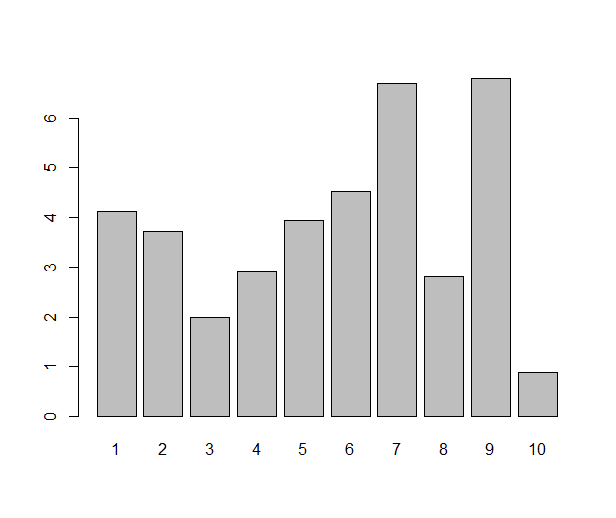
Ah, the barplot. Loved by some, hated by some, the first graph you’re likely to make in your favourite office spreadsheet software, but a rather tricky one to pull off in R. Or, that depends. If you just need a barplot that displays the value of each data point as a bar — which is one situation where I like a good barplot — the barplot( ) function does just that:

some.data <- rnorm(10, 4, 1.5)
names(some.data) <- 1:10
barplot(some.data)

barplot

Done? Not really. The barplot (I know some people might not use the word plot for this type of diagram, but I will) one typically sees from a spreadsheet program has some gilding: it’s easy to get several variables (”series”) of data in the same plot, and often you’d like to see error bars. All this is very possible in R, either with base graphics, lattice or ggplot2, but it requires a little more work. As usual when it gets a bit more fancy, I prefer ggplot2 over the alternatives. Once upon a time when I started with ggplot2, I tried googling for this, and lots of people have answered this question. I was still confused, though. So, if you’re a new user and reading this, please bear with me and I’ll try to demonstrate what all the steps are good for. Whether it’s a good statistical graph or not, the barplot is actually a nice example of ggplot2 in action and will demonstrate some R principles.

Let us take an example: Say that we start with a pretty typical small dataset with two variables that we’ve measured in four groups. Now we’d like a barplot of the group means and error bars for the means.

0. Start a script

Making the plot will take more than a couple of lines, so it’s a good idea to put everything in a script. Below I will split the script into chunks, but the whole thing is on github. We make a new R file and load ggplot2, plyr and reshape2, the packages we will need:

library(ggplot2)
library(plyr)
library(reshape2)

1. Simulate some data

In the case of real barplot this is where you load your data. You will probably have it in a text file that you read with the read.table( ) family of functions or RStudios Import dataset button (which makes the read.table call for you; if you don’t feel like late nights hunched over the read.table manual page, I recommend it). Simulating data might look something like this:

n <- 10
group <- rep(1:4, n)
mass.means <- c(10, 20, 15, 30)
mass.sigma <- 4
score.means <- c(5, 5, 7, 4)
score.sigma <- 3
mass <- as.vector(model.matrix(~0+factor(group)) %*% mass.means) +
  rnorm(n*4, 0, mass.sigma)
score <- as.vector(model.matrix(~0+factor(group)) %*% score.means) +
  rnorm(n*4, 0, score.sigma)
data <- data.frame(id = 1:(n*4), group, mass, score)

This code is not the tersest possible, but still a bit tricky to read. If you only care about the barplot, skip over this part. We define the number of individuals per group (10), create a predictor variable (group), set the true mean and standard deviation of each variable in each group and generate values from them. The values are drawn from a normal distribution with the given mean and standard deviation. The model.matrix( ) function returns a design matrix, what is usually called X in a linear model. The %*% operator is R’s way of denoting matrix multiplication — to match the correct mean with the predictor, we multiply the design matrix by the vector of means. Now that we’ve got a data frame, we pretend that we don’t know the actual values set above.

  id group       mass    score
1  1     1  4.2367813 5.492707
2  2     2 16.4357254 1.019964
3  3     3 19.2491831 6.936894
4  4     4 23.4757636 3.845321
5  5     1  0.9533737 1.852927
6  6     2 19.9142350 5.567024

2. Calculate means

The secret to a good plot in ggplot2 is often to start by rearranging the data. Once the data is in the right format, mapping the columns of the data frame to the right element of the plot is the easy part. In this case, what we want to plot is not the actual data points, but a function of them — the group means. We could of course subset the data eight times (four groups times two variables), but thankfully, plyr can do that for us. Look at this piece of code:

melted <- melt(data, id.vars=c("id", "group"))
means <- ddply(melted, c("group", "variable"), summarise,
               mean=mean(value))

First we use reshape2 to melt the data frame from tabular form to long form. The concept is best understood by comparing the output and input of melt( ). Compare the rows above to these rows, which are from the melted data frame:

   id group variable      value
1   1     1     mass  4.2367813
2   2     2     mass 16.4357254
3   3     3     mass 19.2491831
4   4     4     mass 23.4757636

We’ve gone from storing two values per row (mass and score) to storing one value (mass or score), keeping the identifying variables (id and group) in each row. This might seem tricky (or utterly obvious if you’ve studied database design), but you’ll soon get used to it. Trust me, if you do, it will prove useful!

The second row uses ddply (”apply from data frame to data frame”) to split up the melted data by all combinations of group and variable and calculate a function of the value, in this case the mean. The summarise function creates a new data frame from an old; the arguments are the new columns to be calculated. That is, it does exactly what it says, summarises a data frame. If you’re curious, try using it directly. It’s not very useful on its own, but very good in ddply calls.

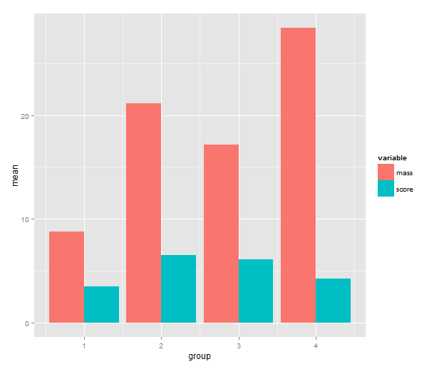
3. Barplot of the means

Time to call on ggplot2! One has a choice between using qplot( ) or ggplot( ) to build up a plot, but qplot is the easier. We map the mean to y, the group indicator to x and the variable to the fill of the bar. The bar geometry defaults to counting values to make a histogram, so we need to tell use the y values provided. That’s what setting stat= to ”identity” is good for. To make the bars stand grouped next to each other instead of stacking, we tell set position=.

means.barplot <- qplot(x=group, y=mean, fill=variable,
                       data=means, geom="bar", stat="identity",
                       position="dodge")

means.barplot

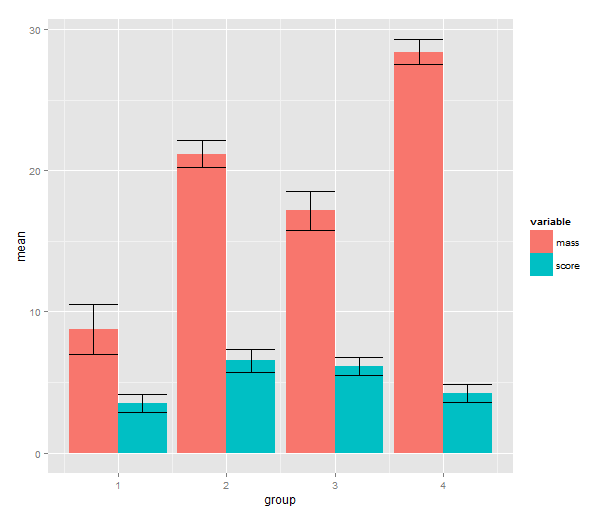
4. Standard error of the mean

Some people can argue for hours about error bars. In some cases you will want other types of error bars. Maybe the inferences come from a hierarchical model where the standard errors are partially pooled. Maybe you’re dealing with some type of generalised linear model or a model made with transformed data. See my R tutorial for a simple example with anova. The point is that from the perspective of ggplot2 input to the error bars is data, just like anything else, and we can use the full arsenal of R tools to create them.

means.sem <- ddply(melted, c("group", "variable"), summarise,
                   mean=mean(value), sem=sd(value)/sqrt(length(value)))
means.sem <- transform(means.sem, lower=mean-sem, upper=mean+sem)

First, we add a standard error calculation to the ddply call. The transform function adds colums to a data frame; we use it to calculate the upper and lower limit to the error bars (+/- 1 SEM). Then back to ggplot2! We add a geom_errorbar layer with the addition operator. This reveals some of the underlying non-qplot syntax of ggplot2. The mappings are wrapped in the aes( ), aesthetics, function and the other settings to the layer are regular arguments. The data argument is the data frame with interval limits that we made above. The only part of this I don’t like is the position_dodge call. What it does is nudge the error bars to the side so that they line up with the bars. If you know a better way to get this behaviour without setting a constant, please write me a comment!

means.barplot + geom_errorbar(aes(ymax=upper,
                                  ymin=lower),
                              position=position_dodge(0.9),
                              data=means.sem)

barplot.means.sem

Does this seem like a lot of code? If we look at the actual script and disregard the data simulation part, I don’t think it’s actually that much. And if you make this type of barplot often, you can package this up into a function.