(This post was originally written on 2013-03-23. Since then, it has persistently remained one of my most visited posts, and I’ve decided to revisit and update it. I may do the same to some other old R-related posts that people still arrive on through search engines. There was also this follow-up, which I’ve now incorporated here.)
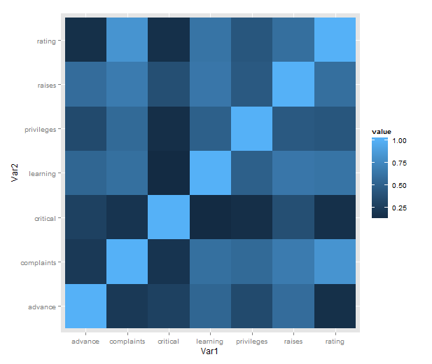
Just a short post to celebrate when I learned how incredibly easy it is to make a heatmap of correlations with ggplot2 (with some appropriate data preparation, of course). Here is a minimal example using the reshape2 package for preparation and the built-in attitude dataset:
library(ggplot2)
library(reshape2)
qplot(x = Var1, y = Var2,
      data = melt(cor(attitude)),
      fill = value,
      geom = "tile")
What is going on in that short passage?
- cor makes a correlation matrix with all the pairwise correlations between variables (twice; plus a diagonal of ones).
- melt takes the matrix and creates a data frame in long form, each row consisting of id variables Var1 and Var2 and a single value.
- We then plot with the tile geometry, mapping the indicator variables to rows and columns, and value (i.e. correlations) to the fill colour.
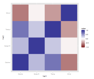
However, there is one more thing that is really need, even if just for the first quick plot one makes for oneself: a better scale. The default scale is not the best for correlations, which range from -1 to 1, because it’s hard to tell where zero is. Let’s use the airquality dataset for illustration as it actually has some negative correlations. In ggplot2, a scale that has a midpoint and a different colour in each direction is called scale_colour_gradient2, and we just need to add it. I also set the limits to -1 and 1, which doesn’t change the colour but fills out the legend for completeness. Done!
data <- airquality[,1:4]
qplot(x = Var1, y = Var2,
      data = melt(cor(data, use = "p")),
      fill = value,
      geom = "tile") +
   scale_fill_gradient2(limits = c(-1, 1))
Finally, if you’re anything like me, you may be phasing out reshape2 in favour of tidyr. If so, you’ll need another function call to turn the matrix into a data frame, like so:
library(tidyr)

correlations <- data.frame(cor(data, use = "p"))
correlations$Var1 <- rownames(correlations)
melted <- gather(correlations, "value", "Var2", -Var1)

qplot(x = Var1, y = Var2,
      data = melted,
      fill = value,
      geom = "tile") +
   scale_fill_gradient2(limits = c(-1, 1))
The data preparation is no longer a oneliner, but, honestly, it probably shouldn’t be.
…
Okay, you won’t stop reading until we’ve made a solution with pipes? Sure, we can do that! It will be pretty gratuitous and messy, though. From the top!
library(magrittr)

airquality %>%
    '['(1:4) %>%
    data.frame %>%
    transform(Var1 = rownames(.)) %>%
    gather("Var2", "value", -Var1) %>%
    ggplot() +
        geom_tile(aes(x = Var1,
                      y = Var2,
                      fill = value)) +
        scale_fill_gradient2(limits = c(-1, 1))


Very nice- I knew there would be a quick way to get a correlation table out of ggplot2, but I hadn’t pursued it. Adding in the value of each correlation is pretty simple, starting from the base you’ve provided:
cor_melt = melt(cor(attitude))
ggplot(cor_melt, aes(Var1, Var2, fill=value, label=round(value, 2))) +
scale_fill_gradient(low=”#FEE0D2″, high=”#FB6A4A”) +
geom_tile() +
geom_text()
I just started to think about how to plot correlations with ggplot, too. 🙂 An alternative approach might be points that indicate the correlation strength:
# add point size, by multiplying the correlation value
corr =0.999)] <- 0
ggplot(data=corr, aes(x=Var1, y=Var2, fill=value)) +
geom_point(aes(fill=value), shape=21, size=corr$psize) +
geom_text(aes(x=Var1, y=Var2), label=c(round(corr$value,2)), colour="white")
A question still remains: how to deal with negative correlations? Would be nice to have, e.g., red to black for correlations from -1 to 0 and black to blue for positive correlations from 0 to 1. So, the darker the color, the weaker the correlation, and red/blue indicating negative or positive correlations.
Seems like some lines of code were not accepted:
# add point size to data frame, by multiplying the correlation value
corr = cbind(corr, psize=c(exp(abs(corr$value))*20))
# use this if you want to hide the diagonal 1-correlations
corr$psize[which(corr$value>=0.999)] = 0
Ok, got a solution for the negative value thing:
ggplot(data=corr, aes(x=Var1, y=Var2, fill=value)) +
geom_point(shape=21, size=corr$psize) +
scale_fill_gradientn(colours=c(”#ff9999”, ”#ff6666”, ”#cc4444”, ”black”, ”#3355cc”, ”#4488ff”, ”#6699ff”), limits=c(-1,1)) +
geom_text(label=c(round(corr$value,2)), colour=”white”)
The color gradient is not very optimal, could be better. The ”limits”-attribute makes sure that the colour range is always from -1 to +1, independent from lowest and highest correlation coefficients.
Hi!
Thank you for your contributions! In the above I didn’t think a lot about the presentation, so I haven’t changed any of the default theme settings. Adding the correlation in text is very useful though, even for the first exploratory graphs you make for yourself.
In my opinion, mapping numbers to the area of something is often a bit iffy, so I think I prefer the heatmap style. But I’m no graphics whiz, and opinions differ 🙂
Cheers,
m.
Hi, I really appreciate your code, it will be very helpful to my research. Quick question: do you know how to remove ‘var1’ and ‘var2’ from the plot please?
this is how you remove var1, var2 from the plot. add this to your plot code:
+theme(axis.title=element_blank())
thank you again!
Hi!
Yes, there are plenty of options that you can set depending on how you like your plots. See ggplot2 documentation at http://docs.ggplot2.org/current/
Cheers,
m.
Pingback: Schaver.com
Pingback: Examples for sjPlotting functions, including correlations and proportional tables with ggplot #rstats | Strenge Jacke!
Pingback: … ridiculously photogenic factors (heatmap with p-values) | Tales of R
Pingback: Using R: correlation heatmap, take 2 | There is grandeur in this view of life
Pingback: How to create a simple heatmap in R | FYTRO SPORTS
Pingback: It seems dplyr is overtaking correlation heatmaps | On unicorns and genes