A slightly different introduction to R, part V: plotting and simulating linear models

In the last episode (which was quite some time ago) we looked into comparisons of means with linear models. This time, let’s visualise some linear models with ggplot2, and practice another useful R skill, namely how to simulate data from known models. While doing this, we’ll learn some more about the layered structure of a ggplot2 plot, and some useful thing about the lm function.

11. Using points, lines and error bars to show predictions from linear models

Return to the model of comb gnome mass at time zero. We’ve already plotted the coefficient estimates, but let us just look at them with the coef() function. Here the intercept term is the mean for green comb gnomes subjected to the control treatment. The ‘grouppink’ and ‘treatmentpixies’ coefficients are the mean differences of pink comb gnomes and comb gnomes exposed to pixies from this baseline condition. This way of assigning coefficients is called dummy coding and is the default in R.

model <- lm(mass0 ~ group + treatment, data)
coef(model)[1]
    (Intercept)       grouppink treatmentpixies 
      141.56771       -49.75414        23.52428

The estimate for a pink comb gnome with pixies is:

coef(model)[1] + coef(model)[2] + coef(model)[3]

There are alternative codings (”contrasts”) that you can use. A common one in Anova is to use the intercept as the grand mean and the coefficients as deviations from the mean. (So that the coefficients for different levels of the same factor sum to zero.) We can get this setting in R by changing the contrasts option, and then rerun the model. However, whether the coefficients are easily interpretable or not, they still lead to the same means, and we can always calculate the values of the combinations of levels that interest us.

Instead of typing in the formulas ourself as above, we can get predictions from the model with the predict( ) function. We need a data frame of the new values to predict, which in this case means one row for each combination of the levels of group and treatment. Since we have too levels each there are only for of them, but in general we can use the expand.grid( ) function to generate all possible factor levels. We’ll then get the predictions and their confidence intervals, and bundle everything together to one handy data frame.

levels <- expand.grid(group=c("green", "pink"), treatment=c("control", "pixies"))
predictions <- predict(model, levels, interval="confidence")
predicted.data <- cbind(levels, predictions)
  group treatment       fit       lwr      upr
1 green   control 141.56771 125.82527 157.3101
2  pink   control  91.81357  76.48329 107.1439
3 green    pixies 165.09199 149.34955 180.8344
4  pink    pixies 115.33785  98.93425 131.7414

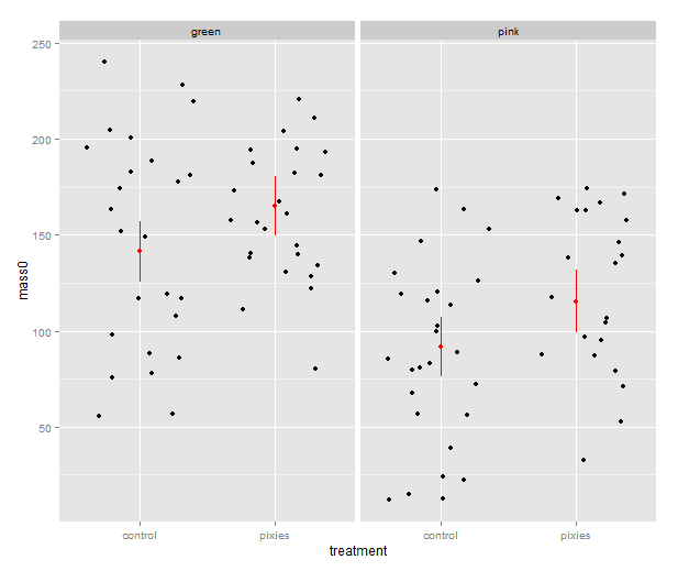
Now that we have these intervals in a data frame we can plot them just like we would any other values. Back in part II, we put several categorical variables into the same plot by colouring the points. Now, let’s introduce nice feature of ggplot2: making small multiples with faceting. qplot( ) takes facets argument which is a formula where the left hand side, before the tilde (‘~’), will be used to split the plot vertically, and the right hand side will split the plot horizontally. In this case, we split horizontally, each panel representing one level of the treatment variable. Also, we use a new geometry: pointrange, which draws a point with bars above and below it and is quite suitable for the intervals we’ve got.

qplot(x=treatment, facets=~group,
      y=fit, ymax=upr, ymin=lwr
      geom="pointrange", data=predicted.data)

model_lineranges

That’s good, but combining the predictions from the model and the actual data in the same plot would be nice. In ggplot2, every plot is an object that can be saved away to a variable. Then we can use the addition operator to add layers to the plot. Let’s make a jittered dotplot like the above and then add a layer with the pointrange geometry displaying confidence intervals. The scatter of the data points around the confidence intervals reminds us that there is quite a bit of residual variance. The coefficient of determination, as seen in the summary earlier, was about 0.25.

qplot(x=treatment, y=mass0, facets=~group, geom="jitter", data=data) +
    geom_pointrange(aes(y=fit, ymax=upr, ymin=lwr), colour="red", data=predicted.data)

model_jitter

In the above, we make use of ggplot2’s more advanced syntax for specifying plots. The addition operator adds layers. The first layer can be set up with qplot(), but the following layers are made with their respective functions. Mapping from variables to features of the plot, called aesthetics, have to be put inside the aes() function. This might look a bit weird in the beginning, but it has its internal logic — all this is described in Hadley Wickham’s ggplot2 book.

We should probably try a regression line as well. The abline geometry allows us to plot a line with given intercept and slope, i.e. the coefficients of a simple regression. Let us simplify a little and look at the mass at time zero and the log-transformed mass at time 50 in only the green group. We make a linear model that uses the same slope for both treatments and a treatment-specific intercept. (Exercise for the reader: look at the coefficients with coef( ) and verify that I’ve pulled out the intercepts and slope correctly.) Finally, we plot the points with qplot and add the lines one layer at the time.

green.data <- subset(data, group=="green")
model.green <- lm(log(mass50) ~ mass0 + treatment, green.data)
intercept.control <- coef(model.green)[1]
intercept.pixies <- coef(model.green)[1]+coef(model.green)[3]
qplot(x=mass0, y=log(mass50), colour=treatment, data=green.data) +
   geom_abline(intercept=intercept.pixies, slope=coef(model.green)[2]) +
   geom_abline(intercept=intercept.control, slope=coef(model.green)[2])

regression_lines

12. Using pseudorandom numbers for sanity checking

There is a short step from playing with regression functions that we’ve fitted, like we did above, to making up hypothetical regression functions and simulating data from them. This type of fake-data simulation is very useful to for testing how designs and estimation procedures behave and check things like the control of false positive rate and the power to accurately estimate a known model.

The model will be the simplest possible: a single categorical predictor with only two levels and normally distributed equal error variance, i.e. a t-test. There is a formula for the power of the t-test and an R function, power.t.test( ), that calculates it for us without the need for simulation. However, a nice thing about R is that we can pretty easily replace the t-test with more complex procedures. Any model fitting process that you can program in R can be bundled into a function and applied to pseudorandom simulated data. In the next episode we will go into how to make functions and apply them repeatedly.

Let us start out with a no effect model: 50 observations in two groups drawn from the same distribution. We use the mean and variance of the green control group. This first part just sets up the variables:

mu <- mean(subset(data, group=="green" & treatment=="control")$mass0)
sigma <- sd(subset(data, group=="green" & treatment=="control")$mass0)
treatment <- c(rep(1, 50), rep(0, 50))

The rnorm( ) function generates numbers from a normal distribution with specified mean and standard deviation. Apart from drawing numbers from it, R can of course pull out various table values, and it knows other distributions as well. Look at the documentation in ?distributions. Finally we perform a t-test. Most of the time, it should not show a significant effect, but sometimes it will.

sim.null <- rnorm(100, mu, sigma)
t.test(sim.null ~ treatment)$p.value

We can use the replicate( ) function to evaluate an expression multiple times. We put the simulation and t-test together into one expression, rinse and repeat. Finally, we check how many of the 1000 replicates gave a p-value below 0.05. Of course, it will be approximately 5% of them.

sim.p <- replicate(1000, t.test(rnorm(100, mu, sigma) ~ treatment)$p.value)
length(which(sim.p < 0.05))/1000
[1] 0.047

Let us add an effect! Say we’re interested in an effect that we expect to be approximately half the difference between the green and pink comb gnomes:

d <- mean(subset(data, group=="green" & treatment=="control")$mass0) -
     mean(subset(data, group=="pink" & treatment=="control")$mass0)
sim.p.effect <- replicate(1000, t.test(treatment * d/2 +
                                       rnorm(100, mu, sigma) ~ treatment)$p.value)
length(which(sim.p.effect < 0.05))/1000
[1] 0.737

We see that with 50 individuals in each group and this effect size we will detect a significant difference about 75% of the time. This is the power of the test. If you are able to find nice and trustworthy prior information about the kind of effect sizes and variances you expect to find in a study, design analysis allows you to calculate for instance how big a sample you need to have good power. Simulation can also give you an idea of how badly a statistical procedure will break if the assumptions don’t hold. We can try to simulate a situation where the variances of the two groups differs quite a bit.

sim.unequal <- replicate(1000, t.test(c(rnorm(50, mu, sigma),
                                        rnorm(50, mu, 2*sigma)) ~ treatment)$p.value)
length(which(sim.unequal < 0.05))/1000
[1] 0.043
sim.unequal.effect <- replicate(1000, t.test(c(rnorm(50, mu+d/2, sigma),
                                               rnorm(50, mu, 2*sigma)) ~ treatment)$p.value)
length(which(sim.unequal.effect < 0.05))/1000
[1] 0.373

In conclusion, the significance is still under control, but the power has dropped to about 40%. I hope that has given a small taste of how simulation can help with figuring out what is going on in our favourite statistical procedures. Have fun!

R intro seminars, take 2: some slides about data frames, linear models and statistical graphics

I am doing a second installment of the lunch seminars about data analysis with R for the members of the Wright lab. It’s pretty much the same material as before — data frames, linear models and some plots with ggplot2 — but I’ve sprinkled in some more exercises during the seminars. I’ve tried emphasising scripting a bit more than last time, and made a lot of use of RStudio. Going through this first part has taken four hours, but that includes each seminar a quick review of what we did last time and lots of questions. Next week we’ll get started on gene expression microarray data, and I’ll try introducing both limma and plyr.

(My previous introduction materials are posted here. Comments, suggestions and ideas about teaching R to biologists are always welcome!)

Power overwhelming II: hur vilseledande är små studier?

Alla vet att stickprovsstorlek spelar roll: stora undersökningar och experiment är i allmänhet trovärdigare än små. Frågan är bara: hur stora och hur trovärdiga? I den förra posten skrev jag lite om klassiska styrkeberäkningar och tog som exempel en studie av Raison m. fl. om antiinflammatoriska antikroppar mot depression. (Spoiler: det verkar inte ha någon större effekt.) Nyss såg jag en kort förhandspublicerad artikel av Andrew Gelman och John Carlin som utvecklar ett lite annat sätt att se på styrka — eller designanalys, som de skriver — med två nya mått på studiers dålighet. Föreställ dig ett experiment som fungerar ungefär som det med antikropparna: två grupper av deprimerade patienter får en ny medicin (här: antikroppen infliximab) eller placebo, och det som intresserar oss är skillnaden mellan grupperna är efter en tids behandling.

I klassiska styrkeberäkningar handlar det om kontrollera risken att göra så kallat typ 2-fel, vilket betyder att missa en faktisk skillnad mellan grupperna. Typ 1-fel är att råka se en skillnad som egentligen inte finns där. Det här sättet att resonera har Gelman inte mycket till övers för. Han (och många andra) brukar skriva att vi oftast redan vet redan från början att skillnaden inte är noll: det vi behöver veta är inte om det finns en skillnad mellan de som fått infliximab och de andra, utan i vilken riktning skillnaden går — är patienterna som blivit behandlade friskare eller sjukare? — och ifall skillnaden är stor nog att vara trovärdig och betydelsefull.

Därför föreslår Gelman & Carlin att vi ska titta på två andra typer av fel, som de kallar typ S, teckenfel, och typ M, magnitudfel. Teckenfel är att säga att skillnaden går åt ena hållet när den i själva verket går åt det andra. Magnitudfel är att säga att en skillnad är stor när den i själva verket är liten — Gelman & Carlin mäter magnitudfel med en exaggeration factor, som är den skattade skillnaden i de fall där det är stort nog att anses signifikant skild från noll dividerat med den verkliga skillnaden.

Låt oss ta exemplet med infliximab och depression igen. Gelman & Carlin understryker hur viktigt det är att inte ta sina antaganden om effektstorlek ur luften, så jag har letat upp några artiklar som är sammanställningar av många studier av antidepressiva mediciner. Om vi antar att utgångsläget är 24 enheter på Hamiltons depressionsskala (vilket är ungefär vad patienterna hade i början av experimentet) motsvarar medeleffekten i Kahn & cos systematiska litteraturstudie en skillnad på 2.4 enheter. Det överensstämmer ganska väl med Gibbons & cos metaanalys av fluoxetine and venlafaxine där skillnaden överlag var 2.6 enheter. Storosum & cos metaanalys av tricykliska antidepressiva medel har en skillnad på 2.8 enheter. Det är såklart omöjligt att veta hur stor effekt infliximab skulle ha ifall det fungerar, men det verkar väl rimligt att anta något i samma storleksordning som fungerande mediciner? I antikroppsstudiens styrkeberäkning kom de fram till att de borde ha en god chans att detektera en skillnad på 5 enheter. Den uppskattningen verkar ha varit ganska optimistisk.

Precis som med den första styrkeberäkningen så har jag gjort simuleringar. Jag har prövat skillnader på 1 till 5 enheter. Det är 60 deltagare i varje grupp, precis som i experimentet, och samma variation som författarna använt till sin styrkeberäkning. Jag låter datorn slumpa fram påhittade datamängder med de parametrarna och sedan är det bara att räkna ut risken för teckenfel och överskattningsfaktorn.

typM_typS

Det här diagrammet visar chansen att få ett signifikant resultat (alltså styrkan) samt risken för teckenfel vid olika verkliga effektstorlekar. Den grå linjen markerar 2.5 enheter. Jämfört med Gelmans & Carlins exempel ser risken för teckenfel inte så farlig ut: den är väldigt nära noll vid realistiska effekter. Styrkan är fortfarande sådär, knappa 30% för en effekt på 2.5 enheter.

exaggeration

Det här diagrammet är överskattningsfaktorn vid olika effektstorlekar — jag försökte demonstrerar samma sak med histogram i förra posten. Vid 5 enheter, som är den effektstorlek författarna räknat med, har kurvan hunnit plana ut nära ett, alltså ingen större överskattning. Men vid 2.5 får vi ändå räkna med att skillnaden ser ut att vara dubbelt så stor som den är. Sammanfattningsvis: författarna bör kunna utesluta stora effekter som fem enheter på Hamiltonskalan, men dagens antidepressiva mediciner verkar ha betydligt mindre effekt än så. Alltså finns det risk att missa realistiska effekter och ännu värre blir det förstås när de börjar dela upp försöket i mindre undergrupper.

Litteratur

Gelman A & Carlin J (2013) Design analysis, prospective or retrospective, using external information. Manuskript på Gelmans hemsida.

Storosum JG, Elferink AJA, van Zwieten BJ, van den Brink W, Gersons BPR, van Strik R, Broekmans AW (2001) Short-term efficacy of tricyclic antidepressants revisited: a meta-analytic study European Neuropsychopharmacology 11 pp. 173-180 http://dx.doi.org/10.1016/S0924-977X(01)00083-9.

Gibbons RD, Hur K, Brown CH, Davis JM, Mann JJ (2012) Benefits From Antidepressants. Synthesis of 6-Week Patient-Level Outcomes From Double-blind Placebo-Controlled Randomized Trials of Fluoxetine and Venlafaxine. Archives of General Psychiatry 69 pp. 572-579 doi:10.1001/archgenpsychiatry.2011.2044

Khan A, Faucett J, Lichtenberg P, Kirsch I, Brown WA (2012) A Systematic Review of Comparative Efficacy of Treatments and Controls for Depression. PLoS ONE  e41778 doi:10.1371/journal.pone.0041778

Raison CL, Rutherford RE, Woolwine BJ, Shuo C, Schettler P, Drake DF, Haroon E, Miller AH (2013) A Randomized Controlled Trial of the Tumor Necrosis Factor Antagonist Infliximab for Treatment-Resistant DepressionJAMA Psychiatry 70 pp. 31-41. doi:10.1001/2013.jamapsychiatry.4

Kod

Gelman & Carlin skriver om en R-funktion för felberäkningarna, men jag hittar den inte. För min simulering, se github.

Populär/vetenskapligt föredrag om hönskammar imorgon

Jag har helt missat att göra reklam för detta, men imorgon klockan fyra ska jag hålla ett kort föredrag om hönskammen som en del av Linköpings universitetsbiblioteks Fängslande forskning på femton minuter. Jag kommer använda kammen, som är ett sexuellt ornament hos höns, som exempel för att berätta om hur vi försöker reda ut den genetiska grunden för skillnader mellan tama och vilda höns. Orden ”Redan Charles Darwin …” kommer nämnas. Dessutom miljöteknik, medicinsk teknik och tunnfilmsfysik. Jag utgår ifrån att allt kommer vara roligt, men jag vet att Anette Karlssons forskning om muskler i magnetkamera ensamt skulle varit värt ett besök.

Slide03Slide06Slide07

From my halftime seminar

A couple of weeks ago I presented my halftime seminar at IFM Biology, Linköping university. The halftime at our department isn’t a particularly dramatic event, but it means that after you’ve been going for two and a half years (since a typical Swedish PhD programme is four years plus 20% teaching to a total of five years), you get to talk about what you’ve been up to and discuss it with an invited opponent. I talked about combining genetic mapping and gene expression to search for quantitative trait genes for chicken domestication traits, and the work done so far particularly with relative comb mass. To give my esteemed readers an overview of what my project is about, here come a few of my slides about the mapping work — it is described in detail in Johnsson & al (2012). Yes, it does feel very good to write that — shout-outs to all the coauthors! This is part what I said on the seminar, part digression more suited for the blog format. Enjoy!

Slide04(Photo: Dominic Wright)

The common theme of my PhD project is genetic mapping and genetical genomics in an experimental intercross of wild and domestic chickens. The photo shows some of them as chicks. Since plumage colour is one of the things that segregate in this cross, their feathers actually make a very nice illustration of what is going on. We’re interested in traits that differ between wild and domestic chickens, so we use a cross based on a Red Jungefowl male and three domestic White Leghorn females. Their offspring have been mated with each other for several generations, giving rise to what is called an advanced intercross line. Genetic variants that cause differences between White Leghorn and Red Jungefowl chickens will segregate among the birds of the cross, and are mixed by recombination at meiosis. Some of the birds have the Red Junglefowl variant and some have the White Leghorn variant at a given part of their genome. By measuring traits that vary in the cross, and genotyping the birds for a map of genetic markers, we can find chromosomal chunks that are associated with particular traits, i.e. regions of the genome where we’re reasonably confident harbour a variant affecting the trait. These chromosomal chunks tend to be rather large, though, and contain several genes. My job is to use gene expression measurements from the cross to help zero in on the right genes.

The post continues below the fold! Fortsätt läsa

From Lisbon, part 2

ESEB 2013 is over. I’ve had a great time, met with a lot of cool people and actually coped reasonably well with the outdoor temperature. As a wimpy Swede, I find anything above 30 degrees Celsius rather unpleasant. There have been too many talks and posters to mention all the good stuff, but here are a few more highlights:

Trudy Mackay’s plenary on epistasis in quantitative traits in D. melanogaster: Starting with the Drosophila Genetic Reference Panel and moving on to the Flyland advanced intercross population, Mackay’s group found what appeared to be extensive epistasis in several quantitative traits. Robert Anholt spoke later the same day about similar results in olfactory behaviour. While most of the genetic variance on the population level is still effectively additive, there seems to be a lot of interaction at the level of gene action, and it hinders QTL detection. The variants that did show up appeared to be involved in common networks. Again, we ask ourself how big these networks are and how conserved they might be among different species.

How did all this epistasis come about then? Mackay’s answer is phenotypic buffering or canalisation (as we say in the Nordic countries: a beloved child has many names). That is, that the organism has a certain buffering capacity against mutations, and that the effect of many of them are only revealed on a certain genetic background where buffering has been broken. See their paper: Huang et al (2012). Mackay mentioned some examples in answer to a question: potentially damaging exonic mutations travelled together with compensatory mutations that possibly made them less damaging. It would be really fun to see an investigation of the molecular basis of some examples.

(Being a domestication genetics person, this immediately brings me to Belyaev’s hypothesis about domestication. Belyaev started the famousic farm fox domestation experiment, selecting foxes for reduced fear of humans. And pretty quickly, the foxes started to become in many respects similar to dogs. Belyaev’s hypothesis is that ‘destabilising selection’ for tameness changed some regulatory system (probably in the hypothalamus–pituitary–adrenal axis) that exposed other kinds of variation. I think it’s essentially a hypothesis about buffering.)

Laurent Excoffier about detecting recent polygenic adaptation in humans. Very impressive! The first part of the talk presented a Fst outlier test applied to whole pathways together instead of individual loci. This seems to me analogous to gene set enrichment tests that calculate some expression statistic on predefined gene sets, instead of calculating the statistic individually and then applying term enrichment tests. In both cases, the point is to detect more subtle changes on the pathway as a whole. As with many other enrichment methods, particularly in humans, it is not that obvious what to do next with the list of annotation terms. Even when the list makes good biological sense — really, is there a gene list that wouldn’t seem to make at least a bit of biological sense? The results do (again) imply epistasis in human immune traits, and that is something that could potentially be tested. Though it would be a heroic amount of work, I hope someone will use this kind of methods in some organism where it is actually possible to test the function and compare locally adapted populations.

Alison Wright’s talk on Z chromosome evolution. She works with Judith Mank, and I’ve heard a bit about it before, but sex chromosomes and the idea that you can trace the ‘strata’ of chromosome evolution are always fascinating. Wright also presented some interesting differences in the male hypermethylated region between birds with different mating systems.

William Jeffery on blind cavefish: I’ve been thinking for ages that I should blog about the blind cavefish (for popular/science and in Swedish, that is), because it’s such a beautiful example. The case for eye regression as an adaptive trait rather than just the loss of an unnecessary structure seems pretty convincing! Making an eye regress at the molecular level seems at once rather simple — removal of the lens (by apoptosis in the blind cavefish) seems to be all that is needed — and complex (it’s polygenic and apparently not achieved the same way in all blind cavefish populations).

Virpi Lummaa’s plenary about using parish records from preindustrial Finland to investigate hypotheses about reproduction, longevity and menopause. I heard about the Grandmother hypothesis ages ago, so I knew about it, but I didn’t know to what extent there was empirical support for it. Unfortunately, that many of the cases where I’ve heard a nice hypothesis but don’t know the empirical support turn out to be disappointments. Not this time, however! On top of all the good stuff in the talk, Lummaa had very pretty slides with old photos and paintings by Albert Edelfelt. The visual qualities were surpassed only by Rich FitzJohn’s slides.

Edelfelt_Larin_Paraske

(Larin Paraske by Albert Edelfelt)

Two things that were not so great:

The poster sessions. Now my poster session on Friday turned out very well for me, but many others weren’t so lucky. I don’t know why half of the posters were hung facing the wall with hardly enough space for people to walk by the poster board, but it was a terrible idea and must have stopped a lot of people from seeing more posters.

The gender balance. According to Julia Schroeder only 27% of invited speakers were women. I don’t know how it worked behind the scenes and what the instructions to symposium organisers were, and there might not be an easy fix, but this urgently needs fixing.

Of course, there were many more good talks and posters than the handful I’ve mentioned, and apart from them, the twitter feed and tweetup, the social gatherings and the fact that there were actually several interesting people that came to my poster to chat were highlights for me. I come home with a long list of papers to read and several pages of things to try. Good times!

lisbon

From Lisbon

Dear diary,

I’m at the Congress of the European Society for Evolutionary Biology in Lisbon. It’s great, of course and I expected nothing less, but there is so much of it! Every session at ESEB has nine symposia running in parallel, so there are many paths through the conference programme. Mine contains a lot of genomics for obvious reasons.

Some highlights so far:

Juliette de Meaux’s plenary: while talking about molecular basis of adaptations in Arabidopsis thaliana — one study based on a candidate gene and one on a large-effect QTL — de Meaux brought up two fun concepts that would recur in Thomas Mitchel-Olds’ talk and elsewhere:

1) The ‘mutational target’ and how many genes there are that could possibly be perturbed to change a trait in question. The size of the mutational target and the knowledge of the mechanisms underlying the trait of course affects whether it is fruitful to try any candidate gene approaches. My intuition is to be skeptical of candidate gene studies for complex traits, but as in the case of plant pathogen defense (or melanin synthesis for pigmentation — another example that got a lot of attention in several talks), if there is only one enzyme pathway to synthesise a compound and only one step that controls the rate of the reaction, there will be very few genes that can physically be altered to affect the trait.

2) Some of both de Meaux’s and Mitchel-Olds’ work exemplify the mapping of intermediate molecular phenotypes to get at small-effect variants for organismal traits — the idea being that while there might be many loci and large environmental effects on the organismal traits, they will act through different molecular intermediates and the intermediate traits will be simpler. The intermediate traits might be flagellin bindning, flux through an enzymatic pathway or maybe transcript abundance — this is a similar line of thinking as the motivations for using genetical genomics and eQTL mapping.

The ”Do QTN generally exist?” symposium: my favourite symposium so far. (Note: QTN stands for Quantitative Trait Nucleotide, and it means nothing more than a known causal sequence variant for some quantitative trait. Very few actual QTN featured in the session, so maybe it should’ve been called ”Do QTG generally exist?” Whatever.) I’ve heard both him and Annalise Paaby present their RNA inference experiments revealing cryptic genetic variation in C. elegans before, but Matt Rockman also talked about some conceptual points (”things we all know but sometimes forget” [I’m paraphrasing from memory]): adaptation does not require fixation; standing variation matters; effect-size is not an intrinsic feature of an allele. There was also a very memorable question at the end, asking whether the answer to the questions Rockman posed at the beginning, ”What number of loci contribute to adaptive evolution?” and ”What is the effect-size distribution?” should be ”any number of loci” and ”any distribution” … To which Rockman answered that those were pretty much his views.

In the same symposium, Luisa Pallares, showed some really nice genome wide association result for craniofacial morphology from natural hybrid mice. As someone who works on an experimental cross of animals, I found the idea very exciting, and of course I immediately started dreaming about hybrid genetical genomics.

Dieter Ebert’s plenary: how they with lots of work seem to have found actual live Red Queen dynamics with Daphnia magna and Pasteuria ramosa.

Larry Young and Hanna Kokko: Young and Kokko had two very different invited talks back to back in the sex role symposium, Young about the neurological basis of pair-bonding in the famous monogamous voles, and Kokko about models of evolution of some aspects of sex roles.

Susan Johnston‘s talk: about how heterozygote advantage maintains variation at a horn locus in the Soay sheep of St Kilda. Simply awesome presentation and results. Published yesterday!

On to our stuff! Dominic Wright had a talk presenting our chicken comb work in the QTN session, and on Friday I will have a poster on display about the behaviour side of the project. There’s actually quite a few of us from the AVIAN group here, most of them also presenting posters on Friday (Anna-Carin, Johan, Amir, Magnus, Hanne, Rie). And (though misspelled) my name is on the abstract of Per Jensen‘s talk as well, making this my personal record for conference contribution.

The poster sessions are very crowded and a lot of the posters are hung facing the wall with very little space for walking past, and some of them behind pillars. In all probability there’s a greater than 0.5 chance that my poster will be in a horrible spot. But if you happen to be curious feel free to grab me anywhere you see me, or tweet at me.

I looke like this when posing with statues or when I’m visibly troubled by the sunlight. If you’re into genetical genomics for QTG identification, domestication and that kind of stuff, this is the hairy beast you should talk too.

martin_eseb

Summer in the lab

Dear diary,

The best thing about summer in the lab is that one can blast the Sweeny Todd and Rocky Horror Picture Show soundtracks as loud as one pleases *. Blogging has been and will be a bit sparse, but I’m having a fun summer so far in the lab finishing up the lab work of my second slightly bigger project. We’re also working through our last paper that got some really knowledgeable, thorough, and quite critical review comments …

My halftime seminar will be in August. That’s a pretty scary thought. Well, the seminar itself is decidedly non-scary; it’s rather the fact that I’ve been going for two and a half years. I’m tempted to write it up as a blog post, but I think I’ll wait and write something when the next paper comes out!

Also, I’m attending the Congress of the European Society for Evolutionary Biology in Lisbon in August. If you’re there, stop by my poster for domestication genomics goodness and to say hello to me and my crocheted chicken mascot!

anna_hona

(Made and photographed by Anna Nygren.)

*) That is, I’m not alone here, but everyone here this week has good taste.

Power overwhelming: inflammation, depression och varför det är ett sådant tjat om stickprovsstorlek

förekommen anledning och vid närmare eftertanke tänkte jag utveckla varför det svaga positiva resultatet i den nyliga studien (Raison m fl 2013) av immunhämmande antikroppar mot depression inte är så trovärdigt — och varför författarna själva är mycket försiktiga i sina slutsatser. Observera — det här är inte en kritik av författarna. Jag använder bara deras artikel som räkneexempel. De är garanterat väl medvetna om problemet, men dock skyldiga till att ha uttryckt sig lite väl optimistiskt. Forskare är ofta lite väl optimistiska när de pratar om sina egna resultat.

Det finns flera lite olika sätt att räkna statistisk osäkerhet, men i den här artikeln angriper de huvudexperimentet med klassisk statistik. De mäter upp en skillnad (i det här fallet: minskning i Hamiltons depressionsskala under behandlingens gång) mellan två grupper (de som fått infliximab och placebo) och prövar om den är skild från noll. Det är ganska typiskt att säga att ett värde är signifikant skilt från noll om det är 5% chans att se ett så extremt värde av en slump ifall ingen skillnad finns. Å andra sidan, för att inte missa skillnader behöver vi göra ett experiment med tillräcklig sannolikhet att se en effekt om den faktiskt finns där. Detta kallas styrka. Små försök är inte trovärdiga därför att de har låg styrka.

I artikeln ifråga presenterar författarna en styrkeberäkning av sitt huvudexperiment: de vill visa att under rimliga antaganden om variation och effektstorlek så räcker 60 deltagare för att ha god chans att visa en effekt om den finns där (se Methods i artikeln). Med 5% signifikansnivå och en variation hämtad från litteraturen har de 80% chans att detektera en skillnad på 5 enheter på Hamiltonskalan. Så om det finns en skillnad som de missat är den antagligen betydligt mindre än så.

Sedan valde de att begränsa sig till deltagare med ”hög CRP”. Skillnaden på 3.1 enheter (se Comment och figur 3 i artikeln) är inte statistisk signifikant: alltså, osäkerheten är så stor att den skulle kunna vara noll eller mindre än noll. Hur stort borde uppföljningsförsöket vara för att kunna säga något hyfsat säkert om den här effekten? För att ha 80% styrka att detektera den skillnaden behöver de 162 deltagare, alltså hundra människor fler än första gången. Men det finns goda nyheter också: det är förstås möjligt att de genom att kontrollera CRP och begränsa sig till människor med mycket inflammation faktiskt minskar variationen jämfört med vad de antog i sin styrkeberäkning, så siffrorna behöver kanske inte vara fullt så pessimistiska.

Men antag att vi hittar en signifikant skillnad genom att bryta ner materialet i grupper och göra vidare analyser på dessa mindre grupper. Det finns två anledningar att vara lite skeptisk. Det första är att ju fler jämförelser och olika analyser vi prövar, desto större är risken att prata känslor med en död lax: alltså att råka på en tillräckligt stor skillnad bara av en slump. Även osannolika saker händer, efter hand. För det andra är det inte nog med att studier med liten styrka har liten chans att hitta något; om de hittar något tenderar resultaten att vara överskattningar.

Det kan vi se genom att simulera en situation med låg styrka: ett experiment med 22 deltagare, samma variation som ovan och en effekt på 5 enheter. Sedan låter vi datorn upprepa experimentet 1000 gånger. Resultaten varierar naturligtvis lite på grund av slumpen, men följande fick jag fram: 367 gånger var skillnaden signifikant skild från noll på 5%-nivån, vilket stämmer bra med den uppskattade styrkan på 36%. Histogrammen nedan visar den uppskattade effekten i de fall där skillnaden var signifikant. Oftast är den betydligt större än fem; när styrkan är låg är signifikanta resultat oftast överskattningar. Om vi testar att öka stickprovsstorleken, först till 60 och sedan till 100 blir problemet mindre.

infliximab_power_hist

Litteratur

Charles L. Raison, Robin E. Rutherford, Bobbi J. Woolwine, Chen Shuo, Pamela Schettler, Daniel F. Drake, Ebrahim Haroon, Andrew H. Miller. (2013) A Randomized Controlled Trial of the Tumor Necrosis Factor Antagonist Infliximab for Treatment-Resistant Depression. JAMA Psychiatry 70 ss. 31-41. doi:10.1001/2013.jamapsychiatry.4

Kod

För den intresserade finns R-kod för mina styrkeberäkningar på github.

Immunhämmande antikroppar hjälper nog inte mot depression

Det var ett tag sedan jag skrev något om medicin, för medicin är inte riktigt min grej. Svt och DN hade i alla fall häromdagen artiklar om en studie som testat effekten av det biologiska läkemedlet infliximab på svårbehandlad depression. Båda artiklarna beskrev också från början denna speciella (och dyra) immunhämmande antikropp som en värktablett, men det har efterhand korrigerats nästan överallt. So called science skrev om den och letade också fram den vetenskapliga artikeln: A Randomized Controlled Trial of the Tumor Necrosis Factor Antagonist Infliximab for Treatment-Resistant Depression (tyvärr bakom betalvägg).

Författarnas hypotes är att inflammation orsakar åtminstone en del fall av depression och att ett immunhämmande medel som infliximab skulle kunna hjälpa vissa som leder av svårbehandlad depression. Tyvärr verkar resultatet vara att det inte hjälper. Infliximab är en biotekniskt tillverkad antikropp som angriper TNF-alfa, ett signalämne som är inblandat i inflammation. Så 60 människor med depression blev behandlade med infliximab eller placebo. De mätte depression med Hamiltons depressionsskala och som mått på inflammation mätte de koncentrationen av bland annat CRP, ett protein som finns i blodet och går upp vid inflammation — det senare för att se till att det fanns människor med inflammation jämnt fördelade i båda grupperna. Här är det på sin plats att erkänna att varken depression eller inflammation är mitt ämne, så jag läser helt enkelt artikeln och litar på författarna.

Efter tolv veckor med tre dropp med antikroppar hade båda grupperna blivit bättre (minskat i medeltal typ 7 poäng på skalan), men det var ingen skillnad på de som fått antikroppar och de som fått placebo. Huvudresultatet är negativt. Så vad kommer de påstått positiva resultaten ifrån? Jo, i efterhand gjorde de andra analyser för att se om det kanske finns någon effekt i någon mindre delmängd av patienterna, någon ny hypotes att titta närmare på i ett nytt experiment. Där fann de att människor med hög halt CRP i blodet (alltså mycket inflammation i kroppen) kanske svarar något bättre på infliximab (figur 3 och 4 i artikeln), men osäkerheten är fortfarande mycket stor. Enligt diagrammet i figur 3 kan effekten mycket väl vara noll eller negativ. Deras gräns för ”hög CRP” sattes ju genom att titta på resultaten i samma studie, och när de bara jämför de människor som har hög CRP finns det bara 22 deltagare kvar. Om författarna själva tror på det här och har pengar kommer de förhoppningsvis göra någon uppföljning som prövar effekten av infliximab endast på människor med hög CRP.

Det var också ett tag sedan jag klagade på bristen på källhänvisningar när tidningar skriver om vetenskapliga artiklar. Men bara för protokollet: varken DN eller Svt lyckas lägga in en länk till artikeln ifråga, och det är aldrig okej. Om det funnits en länk till originalartikeln hade vi kunnat klicka vidare och, utan att ens behöva ha tillgång till själva artikeln, kunnat läsa följande mening i sammanfattningen:

Results  No overall difference in change of HAM-D scores between treatment groups across time was found.

Litteratur

Charles L. Raison, Robin E. Rutherford, Bobbi J. Woolwine, Chen Shuo, Pamela Schettler, Daniel F. Drake, Ebrahim Haroon, Andrew H. Miller. (2013) A Randomized Controlled Trial of the Tumor Necrosis Factor Antagonist Infliximab for Treatment-Resistant Depression. JAMA Psychiatry 70 ss. 31-41. doi:10.1001/2013.jamapsychiatry.4